FOCUS: Seurat, Colour and Water
Download the PDF: Seurat, Colour and Water
About the resource
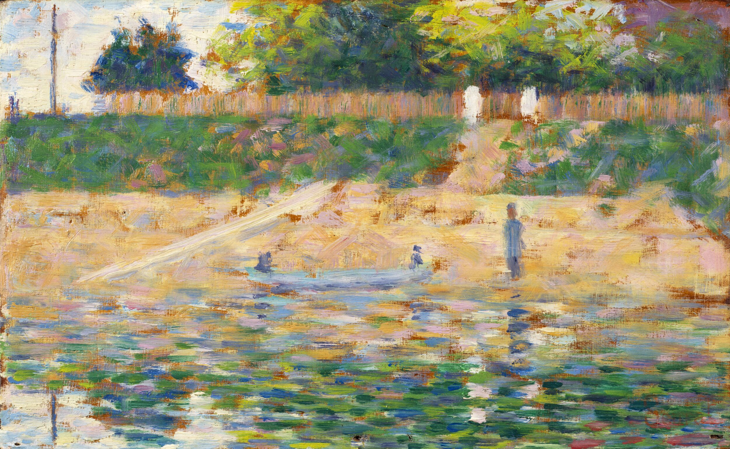
This resource explores two small painted studies in the Courtauld Collection by the French artist Georges Seurat (1859–1891). Both capture pivotal moments in his career – Boat by the Riverbank (around 1883) as he transitioned towards a radical new way of painting called Neo-Impressionism, and The Beach at Gravelines (1890) that demonstrates this technique of applying pure colour in a dot-like manner fully
developed. These artworks show that water, with its unique ability to diffuse and reflect light, was a central motif for Seurat.
Seurat died at the age of 31, leaving behind fewer than 50 canvases. Boat by the Riverbank and The Beach at Gravelines belong to a separate group of around 160 small paintings on wooden panel that Seurat produced alongside his more famous, larger exhibition canvases. Many of these panels hung in his Paris studio and according to one friend were the artist’s ‘greatest joy’.
Though Seurat left few written clues about his working methods, we can uncover his innovations by looking closely at the artworks and considering their historical impact. Use the discussion and creative activities below to investigate his colourful processes.
All activities in this resource are suitable for both the Gallery and Classroom with the exception of Classroom ‘Croquetons’ (pages 6-7) which requires paint which is not permitted within the Gallery.
Materials: Students will need a pencil, colouring pencils, 2-3 sheets of A4 paper.
How to view the artworks
Virtually:
- Courtauld Gallery Collection Online : Zoom in close to the details of the brushwork.
- Boat by the Riverbank
- The Beach at Gravelines
- The Courtauld Gallery Virtual Tour: This allows you to see the artworks as they are displayed in the permanent collection on the Third Floor.
In person:
Visit the Courtauld Gallery (Third Floor) to see these works:
- Boat by the Riverbank: On display in the Permanent Collection .
- The Beach at Gravelines: Currently featured in the special exhibition, Seurat and the Sea (13 February – 17 May 2026).
Working en plein air
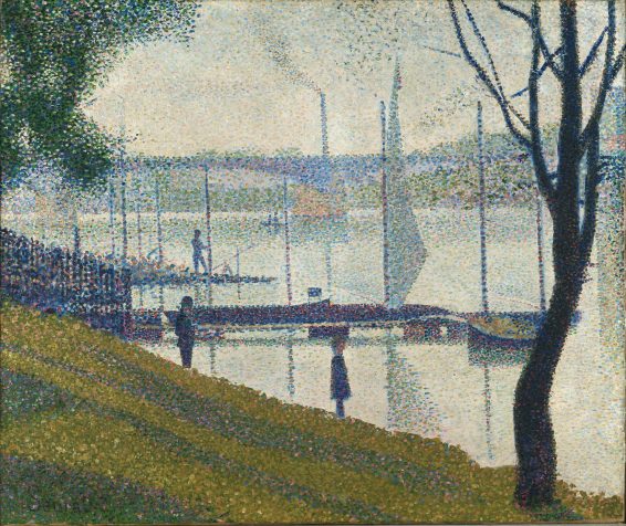
Seurat’s small panel paintings are known as ‘croquetons’ (from ‘croquis’ or ‘sketch’). The panels were purchased readymade and all measure around 16 x 25 cm, which was ideal for emphasising a long horizontal stretch of river or sea. The panels were designed to slot into the lid of a travel paint box, with a palette, paint tubes and turpentine stored in the base. Such boxes were widely available in artist supply catalogues and enabled Seurat’s generation to paint outdoors or en plein air.
The ‘croquetons’ show Seurat at his most free and experimental. Some were produced in preparation for large exhibition canvases – Boat by the Riverbank is one of fourteen studies for Bathers at Asnières (1884), Seurat’s first major work, which depicts working class people at rest on an industrial stretch of the River Seine.
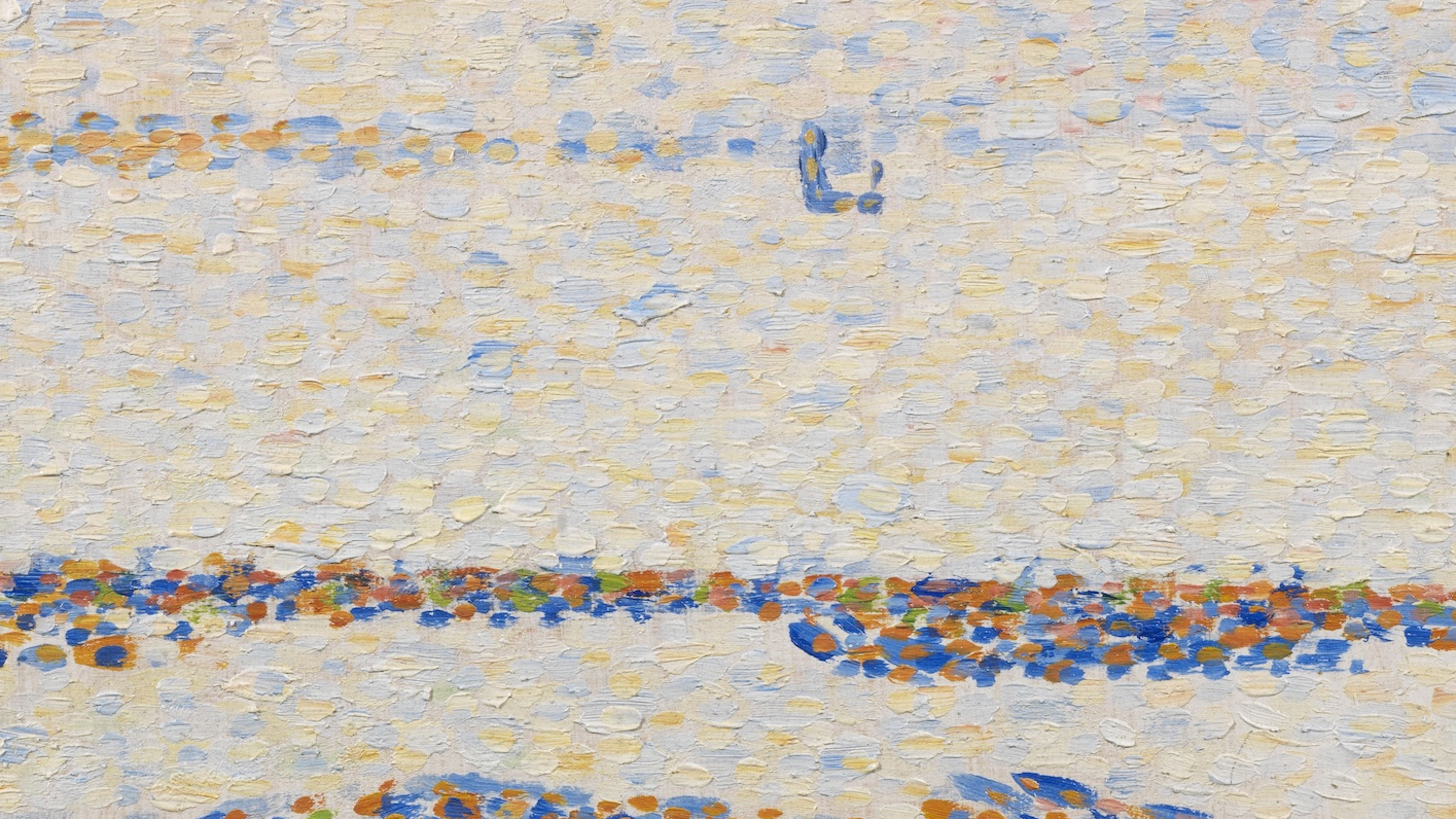
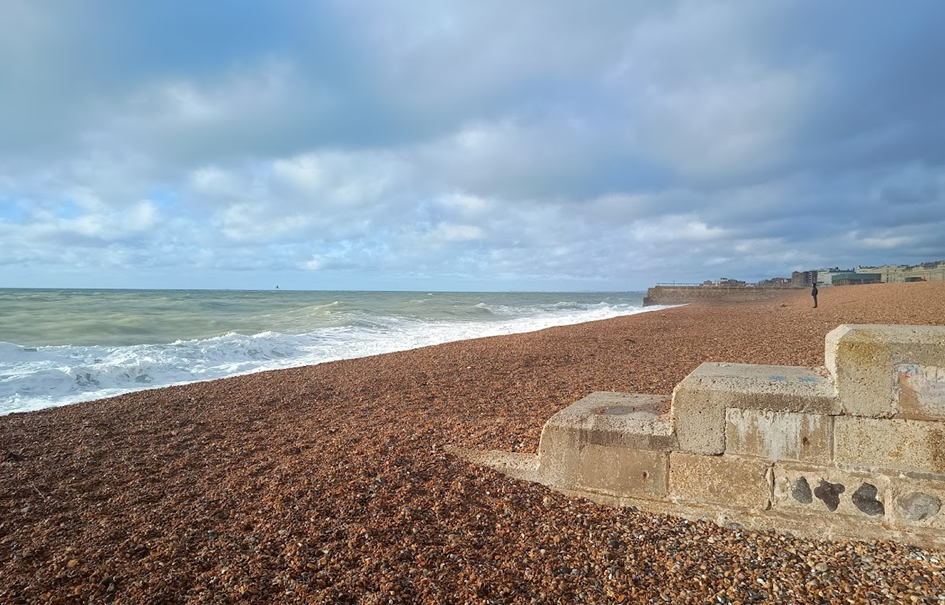
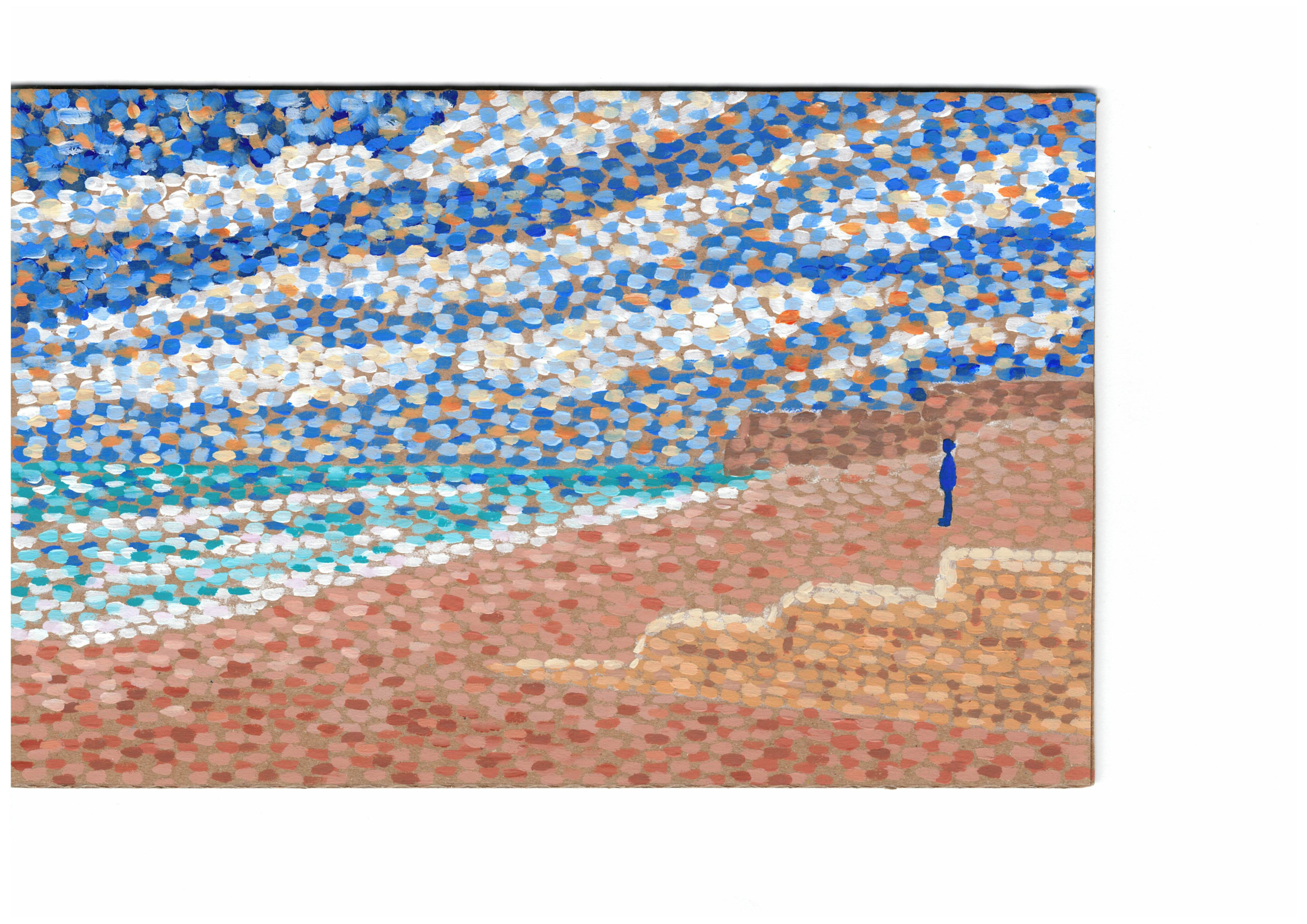
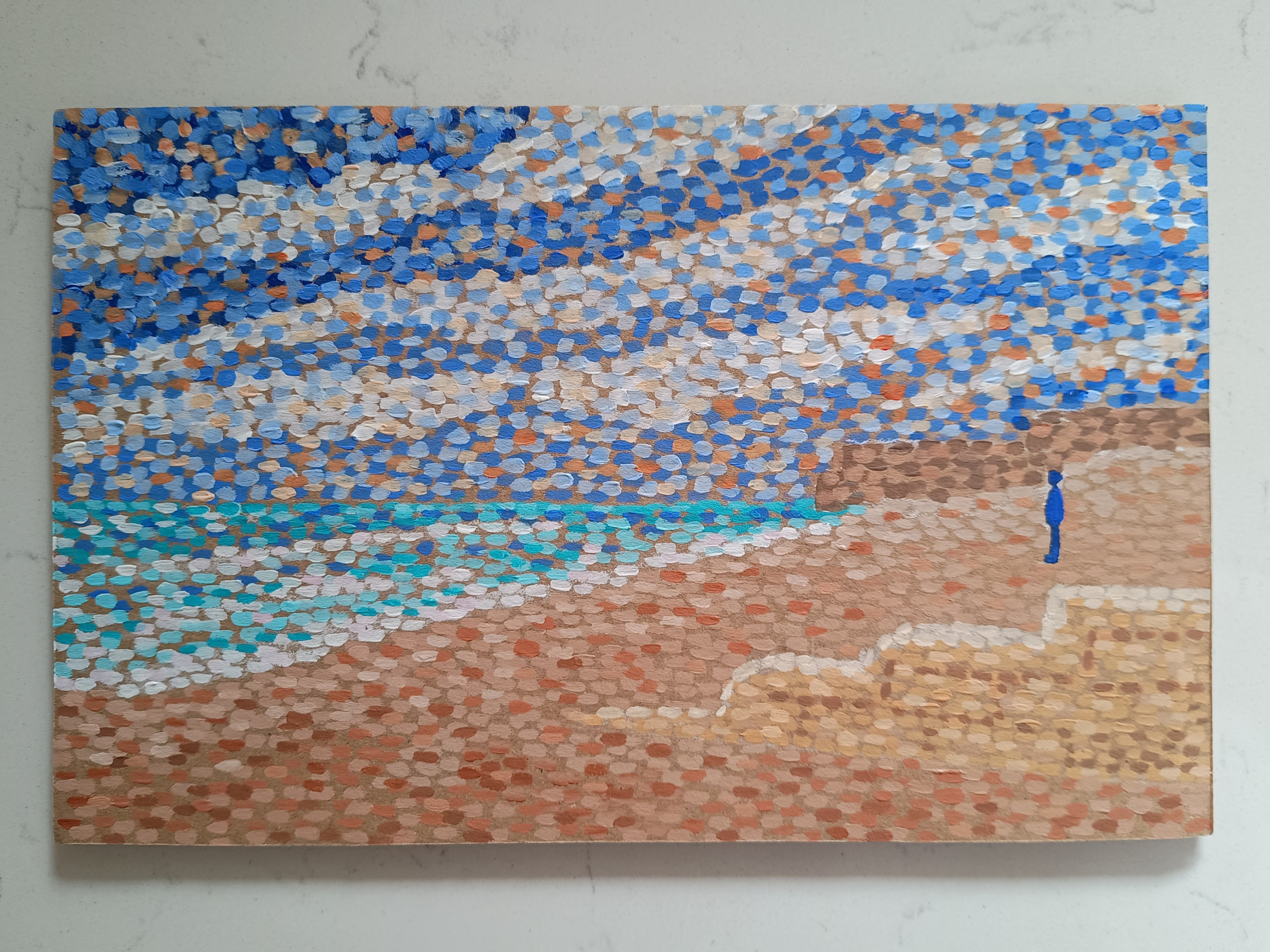
The croquetons reveal Seurat settling into a happy routine of spending winters in Paris and summers on France’s northern coast (he took five such trips from 1885 to 1890). The Beach at Gravelines was made as an independent artwork, purely for pleasure. We know it was painted from direct experience because technical investigation carried out by the Courtauld’s Conservation and Technology department has revealed grains of sand are embedded in the paint.
Talking points: Seurat’s subjects
- What activities do you think took place on the River Seine or the beach at Gravelines?
- What do you think Seurat found interesting about these subjects?
- What might be challenging about painting outdoors?
- Do you prefer a view of nature with or without people? Why?
- Boat by the Riverbank is a quick sketch, while The Beach at Gravelines is more precise. Which style makes the scene feel more “real” to you? Which do you prefer and why?
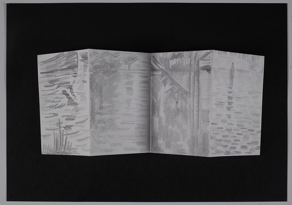
Mark making activity
- Fold an A4 sheet of paper in half horizontally and fold this to make a four-panel concertina.
- For each rectangle, find a painting of water made by Seurat or an artist who was working around the same time (Eugène Boudin, Paul Cezanne, Édouard Manet or Claude Monet / Monet option 2 ). Choose a small area, and carefully capture the shape and direction of the brush marks rather than the whole scene.
- Observe the water and marks: Is the water still or flowing? Are the marks straight or curved? Are they dots or dashes? Are reflections precise or blurred?
- Note the artist’s name for each study.
Seurat and Neo-Impressionism
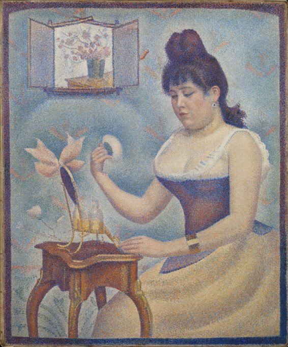
Seurat developed a technique known as Neo-Impressionism or Pointillism. Instead of mixing paints on a palette, pure colours were painted on the canvas or panel in distinct dots, leaving the viewer’s eye to blend them. Seurat preferred ‘chromoluminarism’ or ‘divisionism’ to describe his method since it was about the careful separation and placement of tones rather than the dots or ‘points’ themselves. These were simply the means towards achieving shimmering effects.
The term ‘Neo-Impressionism’ was coined by the critic Félix Fénéon after he observed a new type of art present in the eighth and final Impressionist exhibition in Paris 1886. Seurat and his friend the artist Paul Signac (1863–1935) were invited to participate by Camille Pissarro (1830–1903), who shared their interest in creating optical colour mixtures. People had come to expect modern subject matter, visible brush marks and bright colours from the Impressionists, but the artworks composed of tightly packed dots felt like a new direction. Whereas Impressionism was associated with intuition, Neo-Impressionism was viewed as scientific. Both movements involved personal colour choices.
Talking points: technique and perception
- Boat by the Riverbank shows the influence of Impressionism with its loose dashes of paint. Does the artwork feel entirely spontaneous? Can you see any patterns or repeated types of marks?
- The Beach at Gravelines is made up of tiny distinct dots of colour. What do you think would happen if you looked at this painting from far away?
- Looking closely at both artworks – which marks are best for creating the illusion of shimmering movement? Which marks produce a calm glow?
- In each case, what season and what time of day do the colours suggest? Is the overall effect warm or cool?
- What is the mood of each painting? How would it feel to stand on the riverbank or the shoreline?
- What might it sound, smell or feel like?
Seurat and colour theory
As a young man, Seurat studied at the prestigious École des Beaux-Arts in 1878. However, the work of the Impressionists, combined with military service on the coast of Brittany in 1879, exposed him to a new world of colour and subject matter. He supplemented his traditional training by reading modern colour theories. Key influences on his thinking were books by chemist Michel-Eugène Chevreul (1786–1889) and art critic Charles Blanc (1813–1882). They proposed systems for organising colour and predicting the visual results.
Placing colours on the canvas in tiny dashes or dots created opportunities for greater contrast of colour temperature and juxtaposition of complementary (opposite) colours. Seurat believed that this technique would make the painted surfaces feel more vibrant. Whereas Impressionist artists like Claude Monet and Pierre Auguste Renoir used large areas of complementary colours to produce strong contrasts and intensify hues, Seurat used his dots to bring a sense of harmony between the entire composition. His painter’s palette shows that he kept his colours separate, but relied heavily on white to make them appear luminous.
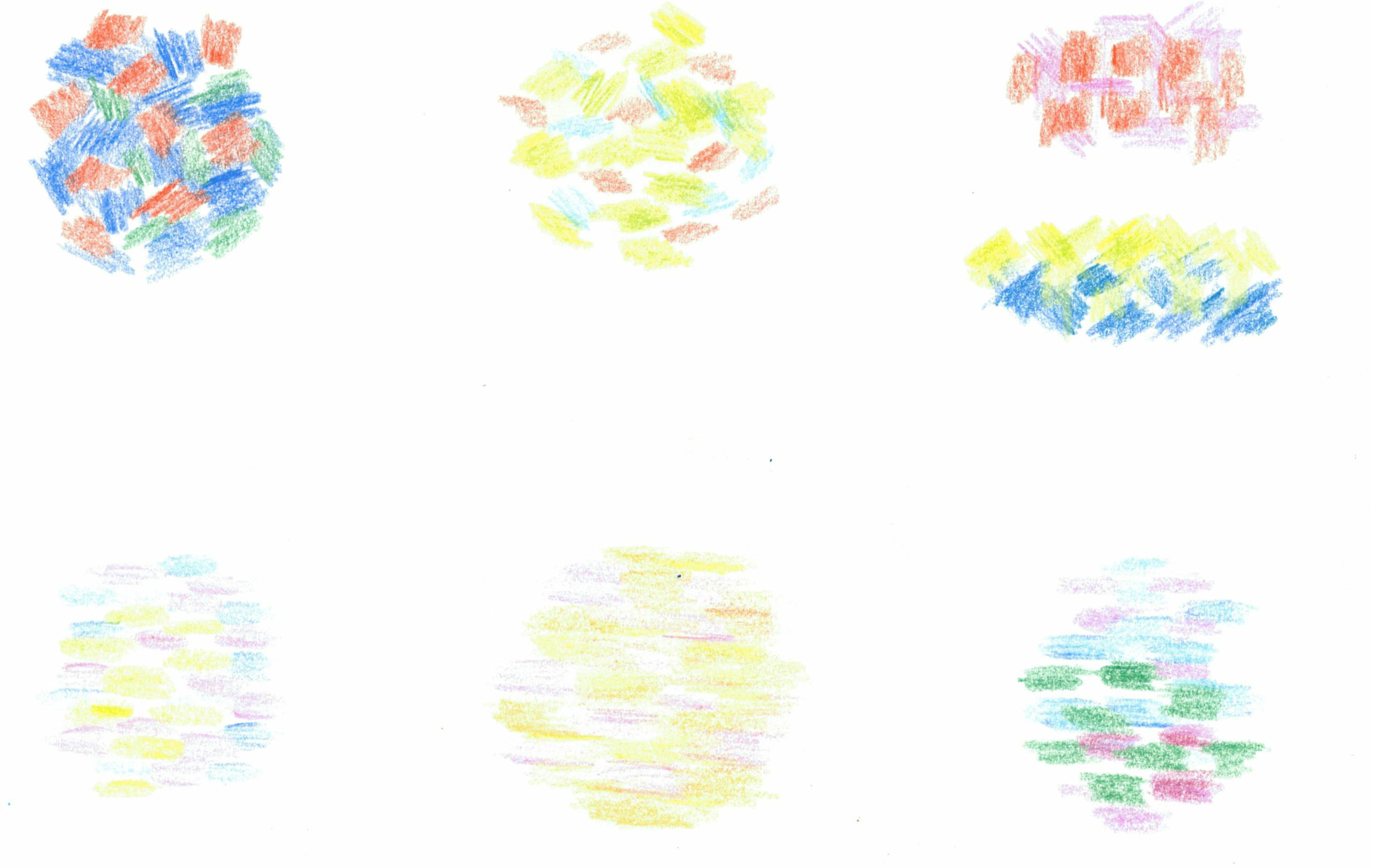
Colour activity: 5 minute mixtures
Look closely at Boat by the Riverbank and record as many interesting colour combinations as you can in 5 mins. Place marks of two or three colours together to see if you can create similar effects.
Once everyone has collected a variety of mixtures, use colour theory to analyse them:
- Who can see complementary colours in any of the combinations? Seurat thought that placing opposite colours side-by-side made them appear more vibrant. Do you agree?
- Who has a warm and a cold colour together?
- Who has a dark and a light colour together?
- Do you think Seurat might have enhanced or exaggerated some of the real-life colours – why or why not?
Colour and Tone activities
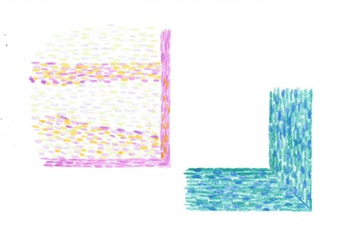
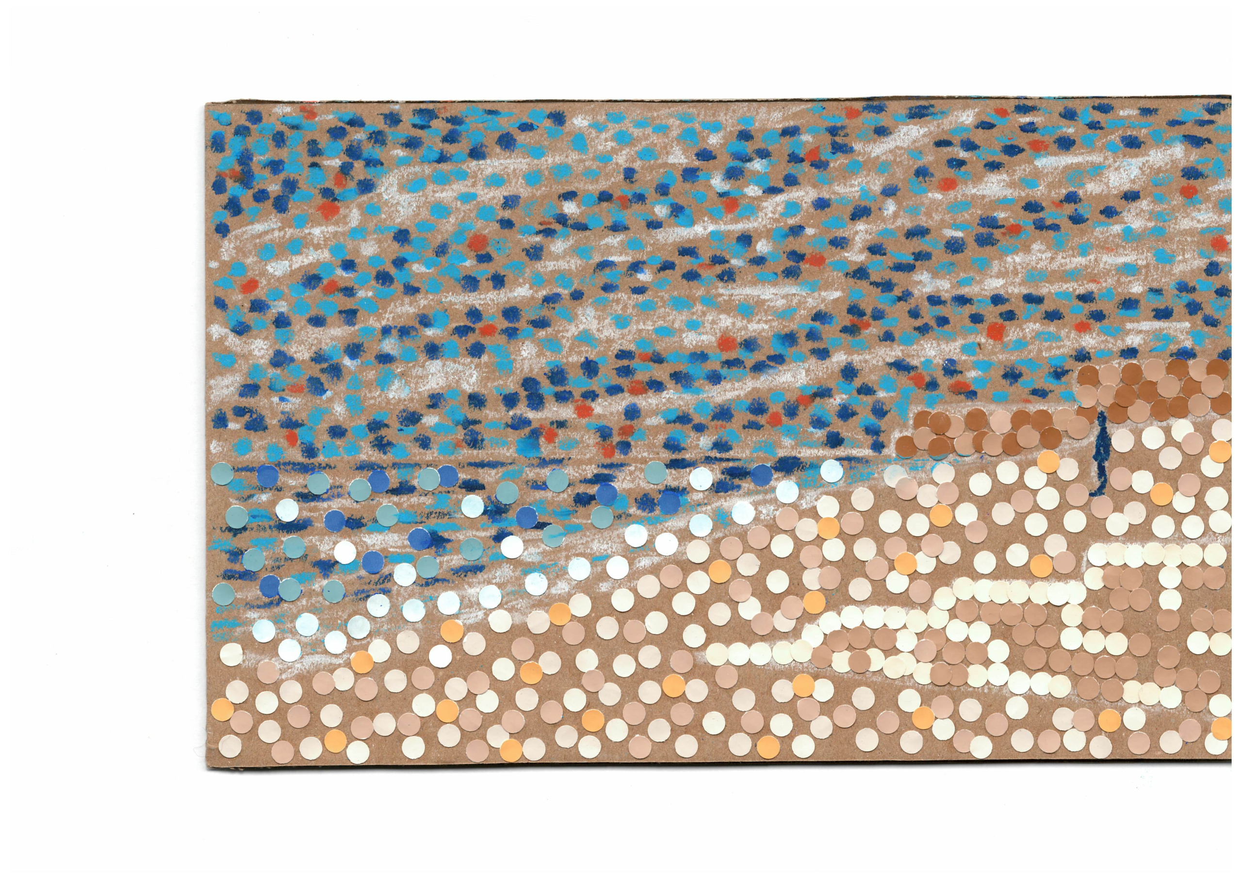
The Beach at Gravelines is remarkable for being composed of mostly two colours: blue and its complementary orange. White has been added to lighten these colours for the sea and sky, which produces a strong tonal contrast with the darker areas of land and the blue border.
- Complementary tones: Select a small area of the painting where the water meets the pebbles. Try to generate the same tonal effects with a different pair of complementary colours. Take your time to apply precise dots.
- The lost frame: Seurat often painted colourful wooden frames to harmonize with his pictures, though the original for this work is now lost. Design a frame that would enhance your colour combination.
Classroom ‘Croquetons’
Use paint or mixed media to make a small panel artwork that is packed with colour.
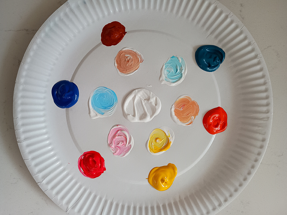
Materials
- Brown cardboard cut to 16 x 25 cm
(e.g. cereal boxes from school breakfast club) - Paint (poster or acrylic)
- Small brushes or eco cotton buds
- Palettes
- White chalk or white pencils
- Waterpots and paper towel
(for cleaning brushes only)
Inspiration
As a class, discuss the nearest place where you can see light on water (a pond, river, canal or seafront). Older students might like to make their own direct sketches from a safe distance. Teachers can provide younger students with photographs or a video. Note down the weather conditions and the main colours you can see.
Step 1
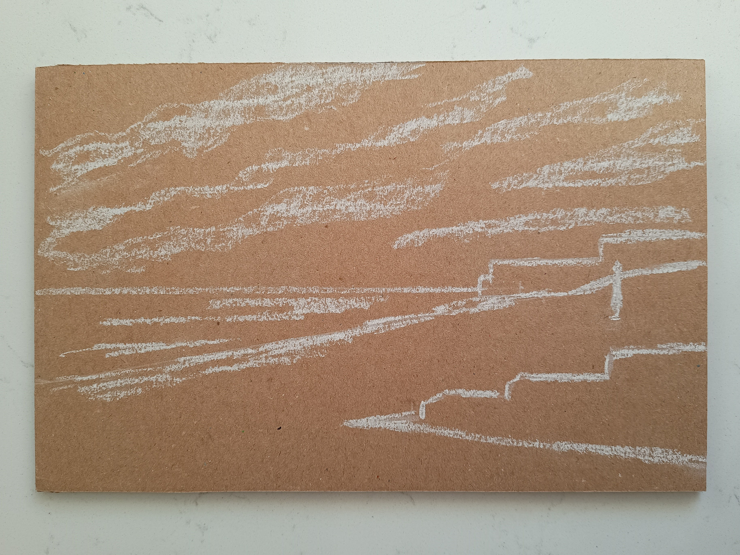
Mark out the structure of your
composition with white chalk or a white pencil. Seurat started his paintings by plotting out key shapes and sections. Keep it simple.
Step 2
Pick a palette of 3-4 main colours, 1-2
complementary colours, plus white. Do not mix!
Do make a lighter version (tint) of each colour using the white.
Step 3
Apply your colours as small dots on the
carboard with brushes or cotton buds.
You might like to start with your mid tone/s (sky blue in this case). Add lighter and darker dots, while keeping a careful balance – you want it to feel light and bright overall.
Finally scatter some dots in the complementary colour (orange in this instance) to make your artwork stand out.
Top tips
Leave gaps between your dots – this will save time and make sure colours stay separate. Seurat did not worry about covering the whole surface and sometimes let the panel show through.
Break the scene down into areas – sky, water, land – so that you can easily take a break between sections. Neo-Impressionism takes concentration!
Mix up your media – experiment with different processes to create colourful dots. Oil pastels look vivid on brown card. Hole-punch paint colour cards for a readymade palette with graduated tones.
Artwork, photograph and text by Francesca Herrick