For John Ruskin, the first surface of Venice—his amphibious ‘sea-dog of towns’—was naturally not that of architecture itself, but the protean ‘salt-smelling skin’ of the sandy earth whereupon it arose. And Ruskin opens his fifth volume of Modern Painters (1860) with this preeminent surface, ‘The Earth-Veil’: ‘The earth in its depths must remain dead and cold, incapable except of slow crystalline change; but at its surface, which human beings look upon and deal with, it ministers to them through a veil of strange intermediate being’.[1] Following his acknowledged ‘master’ Ruskin, William Morris writes in News from Nowhere (1892) of ‘the spirit of the new days, of our days’ as a ‘delight in the life of the world; intense and overweening love of the very skin and surface of the earth, on which man dwells, such as a lover has in the fair flesh of the woman he loves’.[2] Expanding on the ecology of the earth veil Ruskin depicts it variously as ‘a carpet’, as ‘a fantasy of embroidery’ of ‘tall spreading of foliage’ with the ‘unerring uprightness as of temple pillars’ all cleaving to the underlying strength of rock or transient sand. In the first volume of The Stones of Venice (1851), Ruskin had demonstrated how humanity takes these material gifts of nature to form the wall, membrane-like, as ‘an even and united fence, whether of wood, earth, stone or metal’; thus the ‘earth-veil’ translates to what he calls the ‘wall-veil’ as the main enclosing surface in architecture.[3]
This chapter examines the emergence of Ruskin’s wall veil in his readings of the Gothic surfaces of Venice, and its translation to the wall planes of the Arts and Crafts dwellings of Morris, and Philip Webb. The medieval spirit of Red House—the home Webb designed for Morris in 1858–9—emulated the hortus ludi of the Garden of Pleasure; a vision that would have been fully captured in the ‘Palace of Art’ Webb planned for the Morris and Burne-Jones families as a U-plan enlargement of Red House, which was never realised. Here that ‘love of the very skin and surface of the earth’ is expressed as a layered composition akin to the images of a medieval missal. Moving to the interior, the ecologies of nature are likewise engendered in generously layered hierarchies of surface, scaled to simplicity or splendour.
Reading the wall surface
Ruskin called his St Mark’s Rest (published in parts from 1877) the ‘fourth volume’ of his celebrated The Stones of Venice; here the surfaces of the city are both the leaves of a book and a salt-smelling skin, not such opposing metaphors given the vellum leaves of the medieval manuscripts beloved by Ruskin and, as will be seen, equally revered by Morris. His preface describes the autobiographies of nations as written ‘in three manuscripts;—the book of their deeds, their words, and the book of their art’. The most ‘trustworthy one is the last’, and ‘the history of Venice is chiefly written in such manuscript. It once lay open on the waves, miraculous, like St Cuthbert’s book,—a golden legend on countless leaves’, but now it has been brutishly cut and singed into fragments of ‘blackened scroll’ which Ruskin’s redeeming work—as in his earlier volumes of Stones—enables us to recover and read.[4] Ruskin claims to let Venice speak for herself, telling ‘her own story, in her own handwriting … . Not a word shall I have to say in the matter … except to deepen the letters for you when [these cut and blackened fragments] are indistinct’.[5] And, in compelling imagery, Venice’s scrolls are skin, it is ‘this amphibious city—this Phocaea, or sea-dog of towns,—looking with soft human eyes at you from the sand, Proteus himself latent in the salt-smelling skin of her’.[6] Like the Proteus of Greek legend its surfaces are aspect-changing, it can be both male and female, it ‘can add colours to the chameleon / Change shapes with Proteus for advantages’.[7]
And ‘Mr Ruskin was heard’, as his contemporary Charles Eastlake confirms in his A History of The Gothic Revival of 1872, for whereas ‘previous apologists for the [Gothic] Revival had relied more or less on ecclesiastical sentiment, on historical interest, or on a vague sense of the picturesque for their plea in its favour’, Ruskin’s vigorous prose poetry struck ‘a chord of human sympathy that vibrated through all hearts’.[8] His forcible readings of the pages and skins of Venice and northern Italy in The Seven Lamps of Architecture (1849) and The Stones of Venice would re-signify the surfaces of British architecture—whether high Victorian, Arts and Crafts, or proto-modernist—through the second half of the nineteenth century and deep into the twentieth, transforming how they were conceived, made, and symbolised.
Ruskin closes his pivotal ‘The Nature of Gothic’ chapter in the second volume of The Stones of Venice with the injunction: ‘Lastly, Read the sculpture. … Thenceforward the criticism of the building is to be conducted precisely on the same principles as that of a book; and it must depend on the knowledge, feeling, and not a little on the industry and perseverance of the reader, whether, even in the case of the best works, he either perceive them to be great, or feel them to be entertaining’.[9] Ruskin’s own industry and perseverance in reading the scattered pages of the city that ‘once lay open on the waves’ is attested by the vast system of diaries, worksheets, and pocket books crammed with notes and sketches, that laid the foundations of The Stones of Venice.[10] Elizabeth Helsinger claims these three volumes as ‘Ruskin’s first and his most sustained effort to combine religious and artistic reading in a single critical activity’.[11] In Ruskin’s command to ‘Read’ she identifies four symbolic languages. First, there is the manifest language of sculpture and pictorial iconography.[12] Then there is the language of the picturesque, that ‘golden stain of time’; for Ruskin the ‘glory of a building … is in its Age, and in that deep sense of voicefulness, of stern watching, of mysterious sympathy … which we feel in walls that have long been washed by the passing waves of humanity’.[13] Finally, there are two symbolic languages architecture develops from nature: the inherent geological record of the stones themselves, and their theological message[14] Opening the final third volume of The Stones of Venice, Ruskin affirms that the preceding two books have ‘dwelt … on the historical language of stones; let us not forget this, which is their theological language’. As the same passage explains, such stones set ‘forth [the] eternity and … TRUTH’ of the Deity, just as the ‘elements of the universe—its air, its water, and its flame’.[15] Such exegesis is rooted in Ruskin’s evangelical upbringing and his childhood daily Bible-reading at his mother’s side. In practical terms all these languages will be laid out and contested on the surfaces of the architecture of his own and later times.
Ruskin was not the first to establish analogies between texts and the surfaces of architecture but, to reiterate Eastlake’s point, he made once vague historical or literary sentiments ‘vibrate in human hearts’ by synthesising these iconographical, aesthetic, material, and metaphysical languages. Morris, for example, testified to the conversion experience of reading Ruskin’s writings, especially his ‘The Nature of Gothic’ chapter of Stones. Marc-Antoine Laugier, Étienne-Louis Boullée and others had theorised the face of building as ‘architecture parlante’ in the second half of the eighteenth century. More galvanising to nineteenth-century debates was Victor Hugo’s Notre-Dame de Paris (The Hunchback of Notre-Dame, 1831–2), wherein he appealed to architecture as ‘the great book of mankind, man’s chief form of expression in the various stages of his development, either as force or intelligence’.[16] Ruskin had read Hugo’s Notre-Dame in the 1830s, and claimed to have hated it, but the novelist’s vision of architecture as writing the story of a nation was clearly an influence.[17]
Emergence of the Gothic wall veil
In his John Ruskin and Victorian Architecture (1989), Michael Brooks calls Ruskin’s wall veil his ‘most dramatic contribution to architectural terminology’, observing how ‘wall veil’ was soon on the lips of pupils in architectural offices in the 1850s as ‘an early sign of the approaching Ruskinian wave’.[18] As Eastlake writing in 1872 recalls, these pupils also ‘astonished their masters by talking of the Savageness of Northern Gothic, of the Intemperance of Curves, and the Laws of Foliation’.[19]
What, then, is this defining surface of the wall veil? The wall is the first of Ruskin’s three divisions of architecture into walls, roofs, and apertures. He defines the wall, as noted above, as ‘an even and united fence, whether of wood, earth, stone, or metal’. Statically, the wall has to contend with vertical or lateral forces; its strength can be increased ‘by some general addition to its thickness; but if the pressure becomes very great, it is gathered up into piers to resist vertical pressure, and supported by buttresses to resist lateral pressure’.[20] A true wall veil must retain its breadth of surface between the piers (where these are necessary), neither becoming a line of piers altogether, nor a continuous rampart-like buttress. On the one hand, this membrane-like sheer surface of the wall appears to owe something to the fabric analogies of Gottfried Semper, on the other it seems to anticipate the modern ‘curtain wall’ of frame and cladding.[21] These corollaries are certainly worth pursuing, but Ruskin’s wall veil never aims at the atectonic dematerialisation Semper sought when he argued that ‘the annihilation of reality, of the material, is necessary if form is to emerge as a meaningful symbol’.[22] Nor, as is well known, was Ruskin enamoured of the potential of the Crystal Palace’s iron frame and cladding. In truth, Ruskin’s wall veil is always embodied in material substance even if that may be no more than an ‘incrustation’ of thin sheets of marble, as cortex to a masonry core. In contrast to Semper’s desire to annihilate material, read Ruskin on the ornament of the wall veil:
But this is to be noted of all good wall ornament, that it retains the expression of firm and massive substance, and of broad surface, and that architecture instantly declined when linear design was substituted for massive, and the sense of weight of wall was lost in a wilderness of upright or undulating rods.[23]
In the chapter of The Stones of Venice on ‘Gothic Palaces’, Ruskin describes the domestic Gothic arising out of the Byzantine-Romanesque in terms of the broadening wall surfaces of the palazzi . Byzantine palaces, such as the thirteenth-century Ca’ Loredan and Ca’ Farsetti at the Rialto, have no wall veils to speak of, characterised as they are by tier on tier of continuous stilted arches on slender columns, making for maximum transparency and ‘rapid vertical accents’ stayed only by occasional narrow piers.[24] Ruskin notes that ‘the first story of a Byzantine palace consists of, perhaps, eighteen or twenty arches, reaching from one side of the house to the other’. Then ‘a great change takes place in the Gothic period. These long arcades break, as it were, into pieces, and coagulate into central and lateral windows, and small arched doors, pierced in great surfaces of brick wall’.[25] As one Byzantine family of forms of repeated arcades dies out, another Gothic one is born, made of surface and aperture. In Ruskin’s active prose, architectural styles are urgently animate: the Gothic ‘breaks’ and ‘coagulates’ the Byzantine arcades, marking its surfaces with the natural energy of geological forces, with that ‘Changefulness’ of the preceding ‘The Nature of Gothic’ chapter, that can ‘expand into a hall, coil into a staircase, or spring into a spire, with undegraded grace and unexhausted energy’.[26] So, the typical tripartite Venetian palace emerges, with its more solid facade of visible wall surfaces; the arcade is now restricted to the centre of the piano nobile (lighting the deep portego hall behind), while the sea storey now just has its water gate and a few related openings.
Ruskin’s unpublished drafts of this ‘Gothic Palaces’ chapter detail these changes through the ‘Angel House’ or Casa dell’Angelo, a complete late example of the pre-Gothic building type on the Calle di Rimedio near Campo Santa Maria Formosa. All these pre-Gothic palaces comprise a long, narrow rectangular block of two or more storeys, which contains a large, first-floor hall accessed by an external stair. There are two main layouts: in the Casa dell’Angelo type the long side of the block has the main inward-looking facade which overlooks a walled court, not the immediate street or canal; the other layout is that of the above-mentioned Loredan and Farsetti palaces, where the facade is placed outward facing to canal or street, on the short side of the rectangular block, transforming thereby the palace’s relationship to the urban fabric.[27] The austere windows of the upper two storeys of the Casa dell’Angelo are ‘one of the most extensive and perfect examples’ of Ruskin’s transitional ‘second order’ of Venetian arches in their fully established form.[28] Here the inner part of the arch is still of the stilted Byzantine form of Ruskin’s ‘first order’, but in the ogee contour of the outer arch the Gothic spirit begins to show itself (Fig. 5.1).

These Ruskin draft notes on the Casa dell’Angelo require extended quotation, as they show the moment when the Gothic wall surface emerges. Often, in Stones, Ruskin closes ‘an argument by offering an experience’, most obviously in celebrated passages such as the approach to St Mark’s of this second volume.[29] But even the following everyday notes draw readers into a close ‘watching’ of a building as active participants, making a possibly dry accumulation of detail alive, and the building as animate as the observer:
Fronting the bridge which crosses the Rio de Palazzo and leads into the Calle di Rimedio, is a square door, surrounded by an architrave of red marble. … The wall in which this occurs has been restored; but passing beneath it, we enter a courtyard fenced from the Calle di Rimedio by a wall with parapets, and, on the other side by a most picturesque mass of buildings. The ground floor has been much altered, but three shafts are still left … which instead of carrying arches, as hitherto we have been accustomed to find them, sustain a massy horizontal wooden beam, on which rests the first floor of the house above … In the first storey above these shafts is a group of four windows sustained by three shafts and two pilasters. Both shafts and pilasters stand without any base, on a low continuous plinth. … [Previously] the whole width of the house is considered as one arcade with intervals more or less wide. But [now] … the idea of the continuous arcade is lost. The groups of its arches contract themselves only [as] windows; the cornice, as if unable to bear the contraction, snaps and remains only in fragments at the top of the narrow pilasters. The windows as they shrink in width, shrink in height also, draw up their feet, as it were, and instead of falling to the general foundation of the building, receive … a narrow plinth … for a foundation of their own. At the same time the great arch of the entrance sinks into a mere door, and the building, instead of the appearance of a great court or public space surrounded by arcades, assumes that of a very closely veiled private house, with doors and windows of ordinary size.[30]
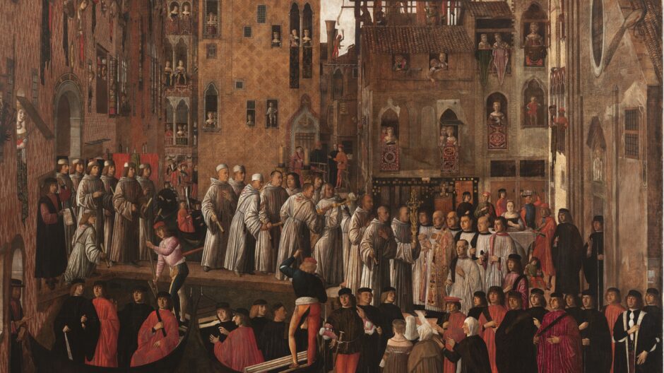
As the openings shrink and sink, a last echo of Byzantine arcaded feeling—in the now ‘closely-veiled’ Gothic palace—survives in the typically ‘connected group of central windows’ of their upper storeys. In the third volume of The Stones of Venice, Ruskin sums up these great changes: ‘the principal difference in general form and treatment between the Byzantine and Gothic palaces was the contraction of the marble facing into the narrow spaces between the windows, leaving large fields of brick wall perfectly bare’.[31] Now, in these newly available wall planes, the ‘whole wall of the palace was considered as the page of a book to be illuminated’.[32] How the Venetians illuminated the pages offered by these large new surface fields can be seen in such late-fifteenth-century pictures of the city as Vittore Carpaccio’s Healing of the Possessed Man (1494) or Giovanni Mansueti’s Miracle of the Relic of the Holy Cross in Campo San Lio (1494), both in the Accademia Gallery, Venice (Fig. 5.2). Ruskin believed such paintings to be ‘the perfectly true representation of what the Architecture of Venice was in her glorious time; trim, dainty,—red and white like the blossom of a carnation,—touched with gold like a peacock’s plume, and frescoed, even to its chimney pots, with fairest arabesque’.[33] On the left of Mansueti’s Miracle, the illuminated urban wall veil recedes steeply, heads pop out to watch the events taking place below, and oriental textiles, hanging down from the windows, layer further arabesques. Here, says Ruskin, is ‘one harmony of work and life,—all of a piece, you see them, in the wonderful palace-perspective on the left … with everybody looking out of their windows’.[34] Enough traces of these polychromatic facades survive to prove that these Quattrocento artists were not painting fantasies, but the real city in front of them.[35]
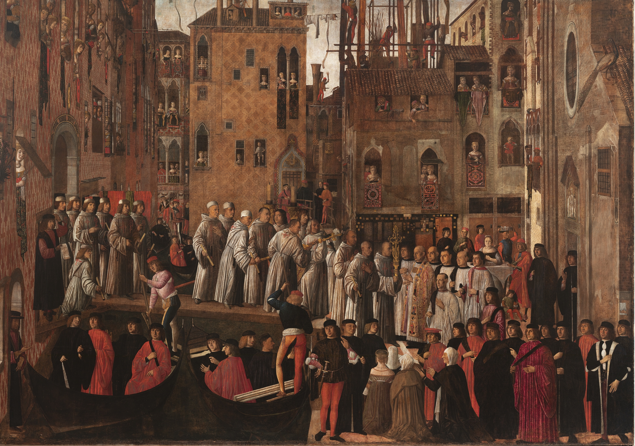
In his studies of Italian Renaissance architecture of 1867, Jacob Burckhardt famously also called Venice the ‘city of incrustation’ for its commitment to ‘uncompromising splendour’, as compared to Florence, ‘the city of rustication’, reprising Ruskin’s characterisation of the city as a substance of brick overlaid with a wealth of colour and marble. The planar appearance of these architectural surfaces is reinforced by these platings of marble or the skins of colour overlaid on plaster.[36] Certainly, Venice realises much of this wealth of colour, not in marble, but in humble paint on plaster, and Ruskin reads in the common chequer patterns (such as those visible in pink and white in Mansueti’s Miracle) the symbolic message of the ‘true chivalric and Gothic spirit’ of Christian service, where the diapers possibly echo the ‘quarterings of the knights’ shields’.[37] Again, it will be seen in Mansueti’s picture that the chequers are the ‘grounds of design rather than designs themselves’.[38] They make an autonomous field in which windows and doors are cut irrespectively, and Ruskin is consequently critical of ‘modern architects, in such minor imitations [of polychromy] as they are beginning to attempt’, in striving to dispose their patterns symmetrically in relation to the openings. Ruskin mourns ‘that the sea winds are bad librarians’ and virtually all these painted pages of chivalric spirit have perished. Yet the facade of the Ducal Palace still emblazons the chequered principle in its imperishable diaperings of Istrian stone and pink Verona marble, described by Paul Hills as a ‘veil that disregards architectural members but begins and ends seemingly at random, like a cut from a huge roll of textile’.[39] The Ducal Palace also encompasses the preceding narrative, in dramatically juxtaposing the Byzantine ethos of its arcaded sea storeys with the broad Gothic surfaces of its upper stage.

To Ruskin’s vital contribution of the concept of the ‘wall veil’ to architectural language must be added his related concept of ‘Surface Gothic’. That planar quality, so conspicuous in the Gothic and early-Renaissance architecture of Venice, is part of a broader feeling for the wall plane in Italian building. A plate in the second volume of Stones of Venice—comparing Linear and Surface Gothic—puts a filigree Flamboyant canopy from Abbeville in northern France side by side with a sturdy one from a Scala tomb in Verona, northern Italy (Fig. 5.3). The Abbeville canopy ‘is so cut through and through that it is hardly stronger than a piece of lace’, whereas the Verona canopy has ‘its surface of stone … unpierced, and the mass of it is thick and strong’. The latter attracts ‘the eye to broad sculptured surfaces, the other to involution of intricate lines’.[40] Accepting that both have their beauties, Ruskin insists the ‘Italian [Surface] Gothic is the nobler style’. Something very similar to this linear/surface distinction had been expressed, before his detailed Venice research, in Ruskin’s ‘The Lamp of Power’ chapter of The Seven Lamps of Architecture. As Nature has ‘her woods and thickets’ and ‘her plains, and cliffs’, so ‘of the many broad divisions under which architecture may be considered, none [are] more significant that those into buildings, whose interest is in their walls, and those whose interest is in the lines dividing their walls’.[41] Ruskin’s instinct is to the sensual skins of wall architecture, seen frontally as face or figure: ‘Whatever infinity of fair form there may be in the maze of the forest, there is a fairer, as I think, in the surface of the quiet lake; and I hardly know that association of shaft or tracery, for which I would exchange the warm sleep of sunshine on some smooth, broad, human-like front of marble’.[42]
So, the question arises as to how this theory of the wall veil—elaborated within the glowing cityscapes of Venice and Verona—might be valid to the smoggy contexts of industrialising England. Notwithstanding Ruskin’s own broad contrast between a ‘surface’ South, and a ‘linear’ North, there are surface characteristics distinctive to the arts of the British Isles, as Nikolaus Pevsner notably elaborated in The Englishness of English Art, based on his BBC Reith Lectures of 1955. Pevsner identifies an English ‘national mania for beautiful surface quality [as] of course an outcome of the national preference for the flat wall’ pointing to such examples of the ‘enrichment … on the surface’ as the English Medieval affection for diapering, lierne vaults, and reticulated tracery.[43] As postscript to these Medieval examples, Pevsner celebrates the design instincts of William Morris:
William Morris was destined to become the best designer of the nineteenth century in all Europe at least where flat surfaces are concerned … . Because he was English and had grown up with a sensitive and intelligent appreciation of English traditions in design. Morris’s designs are paraphrase of natural growth. His observation of tree and flower was as close and intense as that of any English landscape painter. But his genius lies in the conversion of these observed data into perfectly fitting surface patterns.[44]
Here Pevsner suggests the ecological links Morris naturally makes to wider social and creative patterns; designs in which veil enclosures mediate between the room-as-garden, and the garden-as-outdoor-room. Thus, Morris’s intense observation of the earth veil translates into the enrichment of the wall veil.
‘Think first of the walls’: Morris, Webb, and the Arts and Crafts surface
‘Whatever you have in your rooms think first of the walls, for they are that which makes your … home’, said William Morris. His utopian News from Nowhere (1892) opposes Victorian utilitarianism to present ‘the spirit of the new days’ as a ‘delight in the life of the world; intense and overweening love of the very skin and surface of the earth, on which man dwells’.[45] He envisions architectural walls and surfaces equally expressive of the ‘generosity and abundance of life’. With Ruskin’s surface values and Gothic characteristics of ‘Sacrifice’ and ‘Redundance’ in mind, the Gothic architecture in which Morris sought inspiration is generous, ‘it is not ashamed of redundancy of material, or super-abundance of ornament, any more than nature is’.[46] For Morris this passion for the living surface of the earth—Ruskin’s earth veil—is the first characteristic of Gothic art, the ‘Love of Nature’; joined to this, as the second characteristic, is the epical, storytelling quality; and joined to both of these is the ‘ornamental quality’. Morris sees the aspect that fuses the Gothic love of nature, storytelling, and ornament, as ‘the romantic quality’, a quality that ‘is rather to be felt than defined’.[47] On the impact of this elusive atmosphere on a man of sensibility, but not a professional artist, May Morris (Morris’s daughter) quotes from Percy Lubbock’s Shades of Eton (1929) on the ‘strange new presence’ of a Morris interior, which ‘allows you to work and live as usual, as before, but with romance: the breathable air’.[48]
Yet I agree with Nikolaus Pevsner that the raw red faces of local brickwork of Red House (Bexleyheath, London)—designed by Philip Webb as Morris’s first home as a married man in 1858–9—evince little romance in themselves. Pevsner’s Pioneers of Modern Design (1936) admired Red House for this solidly unpretentious character, for its bare red-brick external surfaces unmasked by plaster, and for its one-room-and-a-corridor plan, bent into an L configuration of Ruskinian Changefulness.[49] However, as will be seen, these hard red-brick planes and the open L plan are literally only half the intended story of Red House. And even in this original L Plan, Morris’s first biographer of 1899, J. W. Mackail, confirms that while the ‘rooms on both limbs of the house faced outward on to the garden’:
The two other sides of this half-quadrangle were masked by rose-trellises, enclosing a square inner court, in the middle of which rose the most striking architectural feature of the building, a well-house of brickwork and oak timber, with a steep conical tiled roof.[50]
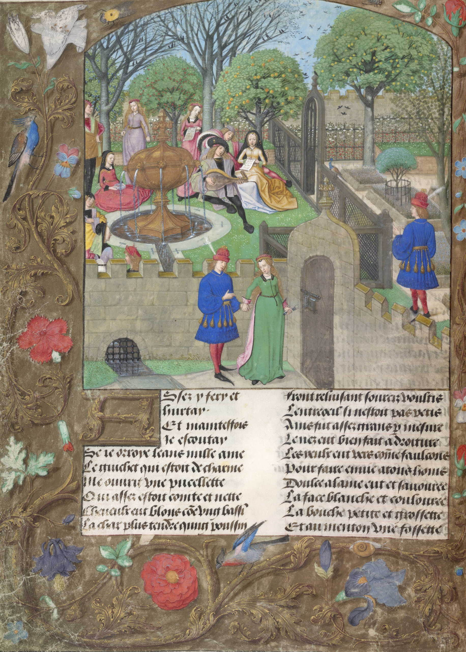
Thus the limbs of the brick L-plan guarded an outdoor room, a hortus conclusus in its specific manifestation of the hortus ludi, a garden full of flowers as a setting for delight and courtly love.[51] Known in the medieval sense as a ‘herber’—from the Latin herba (grass or aromatic plant)—hortus ludi refers to a small garden of delight, or an ornamental enclosed flowery mead set within a larger garden.[52] Look at the Garden of Pleasure in the Flemish fifteenth-century Roman de la Rose manuscript beloved by Morris; a garden wherein courting and philosophising takes place around water fountains—just like Webb’s Red House well—within frames of rose-grown trellises (Fig. 5.4).[53] These trellises can be seen as precursors of Morris’s own trellis enclosures which inspired his first wallpaper design in 1862, and the many pleasure gardens described in Morris’s poem The Earthly Paradise (1868–70) (Fig. 5.5).[54] Owing to Morris, the garden, in its relationship to the house, becomes more architectural, while the domestic interior grows more natural. In his lecture ‘Making the Best of It’ (1879), Morris summed up the garden as a medieval paradise:
Large or small, [the garden] should look both orderly and rich. It should be well fenced from the outside world. It should by no means imitate either the wilfulness or the wildness of Nature, but should look like a thing never to be seen except near a house. It should in fact, look like a part of the house.[55]
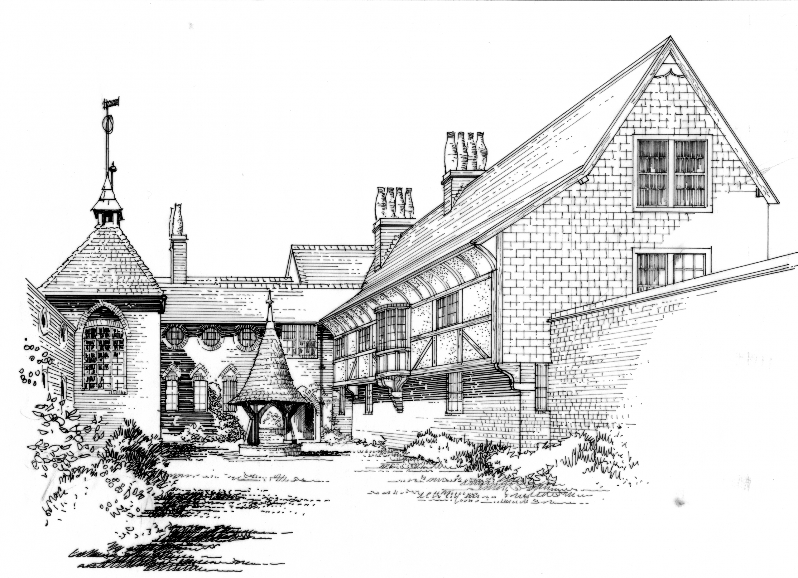
To reiterate, this outdoor ‘pleasure room’—made by the L-plan house and the rose trellis—is but only half of Red House’s narrative. Along with the contract drawings of Red House as built, the Victoria and Albert Museum has Webb’s 1864 drawings for a scheme which would have expanded the L into a U-plan, allowing Edward Burne-Jones and his family to have joined the Morrises to make a complete ‘Palace of Art’. This project was abandoned in sad circumstances following the death of Edward and Georgiana Burne-Jones’s prematurely born second son in the very same year.
Webb’s design would have stitched the new wing into the eastern L of Red House, devising a new hipped roof porch on the north side to give the Burne-Joneses a separate entrance, in balance with the old. The great gable of a first-floor studio for Edward Burne-Jones marks out the east elevation. But the courtyard aspect is the most striking as shown in my perspective reconstruction, based on Webb’s plans and elevations. It skilfully responds to Red House’s original austerity while making richer new surfaces of its own (Fig. 5.6).[56] The existing red brick continues only as a plinth, tying old and new together, and supports a jettied upper storey of half-timber and plaster, punctuated by a semi-circular bay window, which marks a pause to the new wing’s upper passage, on the cross axis of the well house. A bold timber and plaster cove crowns the half-timbering, as found in Kent’s medieval Wealden houses. Add in the tile-hanging to the south and east elevations and it will be seen that Webb’s design draws upon the full material palette of this southeastern region of England in all its potential of pattern and texture.
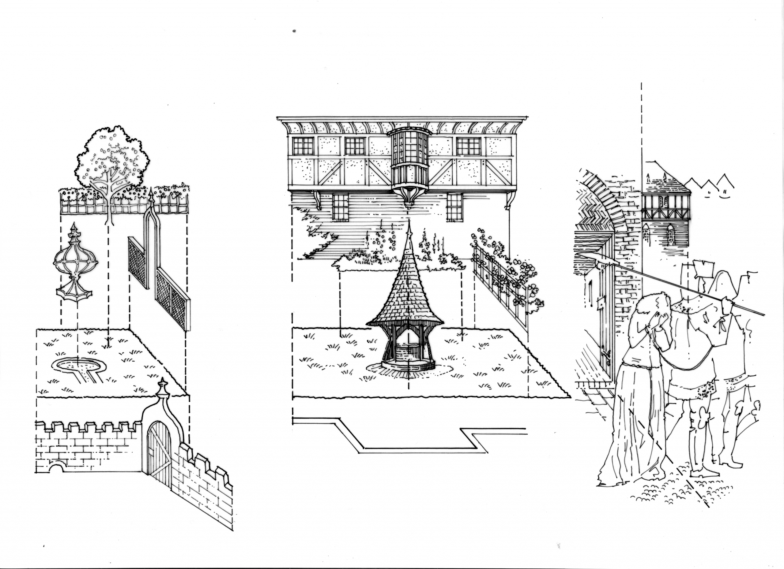
Morris was a master in the layering principles of enriching a surface.[57] As a friend and careful reader of Ruskin, Morris imbibed his principles of the architectonic subordination of ornament as laid out in the chapter on ‘Treatment of Ornament’ in the first volume of The Stones of Venice. Here, Ruskin insists that painting and sculpture on a building should be ‘fitted for its service’ and ‘aid [its] effect of every portion of the building over which it has influence’, that is to say, it should not stand out in its own right as might a framed picture or a freestanding statue.[58] As fine examples of such subordination the reader should consider ‘the effect of the illuminations of an old missal. In their bold rejection of all principles of perspective, light and shade, and drawing, they are infinitely more ornamental to the page, owing to the vivid opposition of their bright colours and quaint lines’.[59] In their historical study of the ingredients and design concepts that made the enclosed garden of the hortus conclusus, Rob Aben and Saskia de Wit deconstruct such illuminations of the hortus ludi as isotropic spaces wherein there is not ‘a sense of alignment or a principal element to be discerned, let alone a link between ground plane, enclosure and built mass’.[60] As compared to the hierarchical spaces of classical perspective, isotropic spaces are equally uniform in all directions. In my drawings analysing the Roman de la Rose manuscript, the spatially layered garden components, shown on the left of the figure, are: wall and gate, flowery mead, fruit trees, fountain, and trellis enclosure (Fig. 5.7).[61] Especially in its complete U-plan vision, Red House, as seen in the centre of Figure 5.7, romantically layers similar elements.
The architectural coherence of Morris’s design stands out as an even greater achievement in the context of the disrupting forces of the time. In her book From Ornament to Object (2012) Alina Payne examines how—from the nineteenth-century foregrounding of the anonymous crafts of the weaver, potter, and so forth—ornament slipped its architectural moorings and tectonic origins to migrate autonomously across the surfaces of walls, ceilings, and objects:
For Ruskin and Morris architectural ornament was the location of artistic expression for the craftsman. With this move they associated ornament with its anonymous artisan-maker and in so doing operated a similar dislocation that we find in Semper: artistic content moved from the monument and its genius artist to the humble object. … Since the architect does not directly handle the materials of his art, this also meant driving a wedge between architecture and ornament. The creative independence that Ruskin attributed to the artisan allowed architectural ornament to float away from architecture and be included in the domain of crafted things.[62]
Ironically, one consequence of Ruskin’s proposition that ‘ornamentation is the principal part of architecture’ was to enable this autonomy to ornament.[63] And, as we have also seen, medievalist romance inspired this new domain of craft. At the same time, it is Morris’s great accomplishment to contain these potentially dislocating forces—this ‘centripetal diffusion of ornament away from its architectural core’ as Payne describes it— within an architectonic unity wherein ornamental patterns both differentiate, and make assonance among the surfaces of wall, textile, paper, furniture, and carpet.[64]
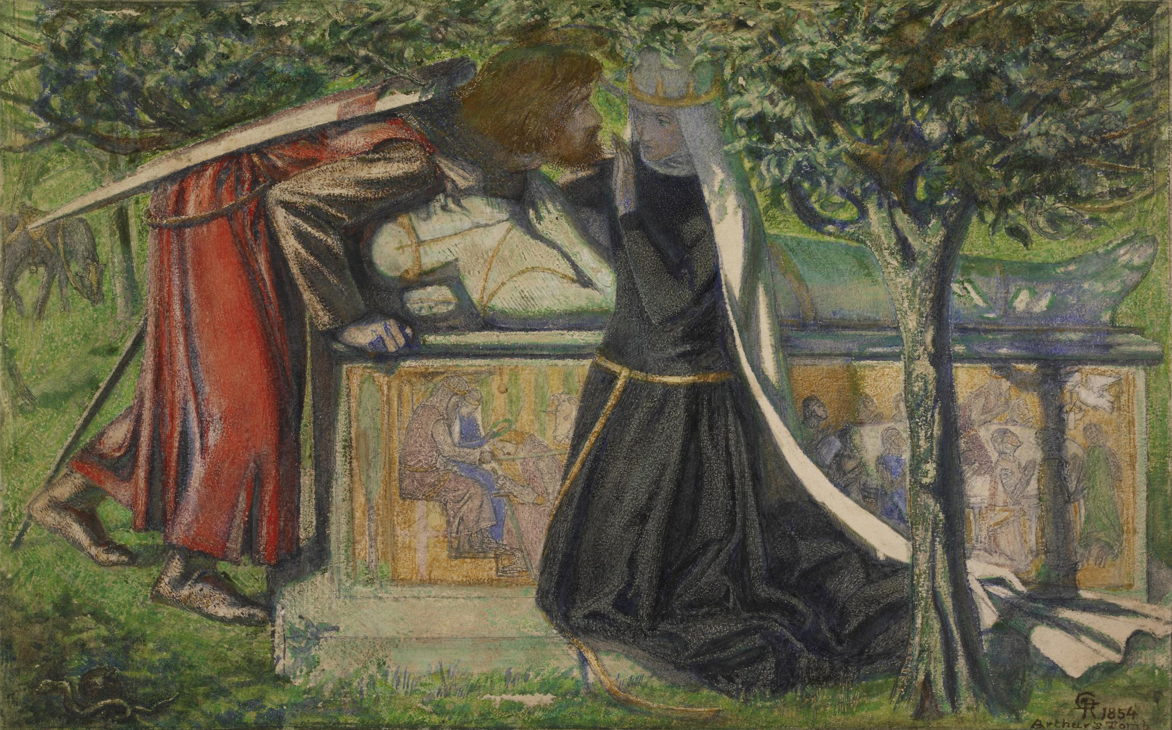
An arresting example of this is how Red House’s architectural language also forms the setting in one of Morris’s pencil and ink studies for the painted doors of the St George Cabinet, designed by Philip Webb, for the 1862 International Exhibition (as indicated in the detail on the right of Figure 5.7).[65] Morris illustrates soldiers leading away the anguished daughter of the king—she is intended to be the dragon’s next victim—from before an arched doorway with a tympanum of herringbone brickwork; within the arch a sturdy planked door with wrought-iron strap hinges opens onto a darkly beamed and tiled passage drawn in shallow perspective; the distant building, locked into the compressed space above the daughter’s tresses, remarkably adumbrates the jettied half-timber and brick plinth of the 1864 extensions. Dante Gabriel Rossetti modelled for some of the figures on this cabinet, and his paintings similarly show the influence of the medieval missal, as Michaela Braesel has pointed out, ‘in their use of a crowded picture plane, the diverse and dense ornamental areas, the slightly unclear spatial treatment within the paintings, the narrow and low spatial boxes’.[66] His 1855 watercolour Arthur’s Tomb, commissioned by Ruskin, is one of a remarkable and influential early series of watercolours; they are small, two-dimensional, and glowingly coloured with medieval romance (Fig. 5.8). The compressed space in this watercolour arranges the figures of Lancelot and Guenevere at their last meeting, the effigy and frieze of Arthur’s tomb itself, and the trunk of a tree whose canopying bower ambiguously elides fore-, middle-, and back-grounds into three, barely distinguishable layers. The tales of romance, and courtly love in Thomas Malory’s Le Morte d’Arthur (completed 1471) had become a cult in the second phase of the Pre-Raphaelite movement. Morris and Burne-Jones had discovered the book in around 1855 and it was the source for the Arthurian murals painted for the Oxford Union Society in 1857 by the group of seven artists gathered by Rossetti, including Morris and Burne-Jones.
Hermann Muthesius made Morris’s rule to ‘think first of the walls’ the epigraph to his chapter on the achievements of the English ‘Contemporary Interior’ in his renowned praise of The English House (1904–5) of the period from 1860 to 1900. Expanding on the ‘concept of the wall’, Muthesius affirms:
The interior is a whole, the essence of which lies, in fact, in its totality, in its quality as space. In conceiving the interior as a work of art, therefore, the artist must first think of it as a space, that is, as the overall form and the interrelationship of the space-enclosing surfaces.[67]
For Muthesius these English interiors are generated from the ‘space-enclosing surfaces’, and he adds ‘when it comes to give the room artistic form the wall is the determining factor among the enclosing surfaces’. Many of these surface experiments were notably initiated in Red House, as we move from the outdoor room of its hortus ludi to the interior proper. Although the interior intentions were never to be fully realised, recent investigations of the drawing room of Red House, for example, have revealed (beneath later repainting) how much of the original polychromatic scheme was completed.[68] Red House’s atmosphere can also be recovered from images of the later interior Morris created for the long drawing room in his home at Kelmscott House, Hammersmith. As biographer Mackail wrote:
The painted settle and cabinet, which were its chief ornaments, belonged to the earliest days of Red House; the rest of the furniture and decoration was all in the same spirit, and had all the effect of making the room a mass of subdued yet glowing colour, into which the eye sank with a sort of active sense of rest.[69]
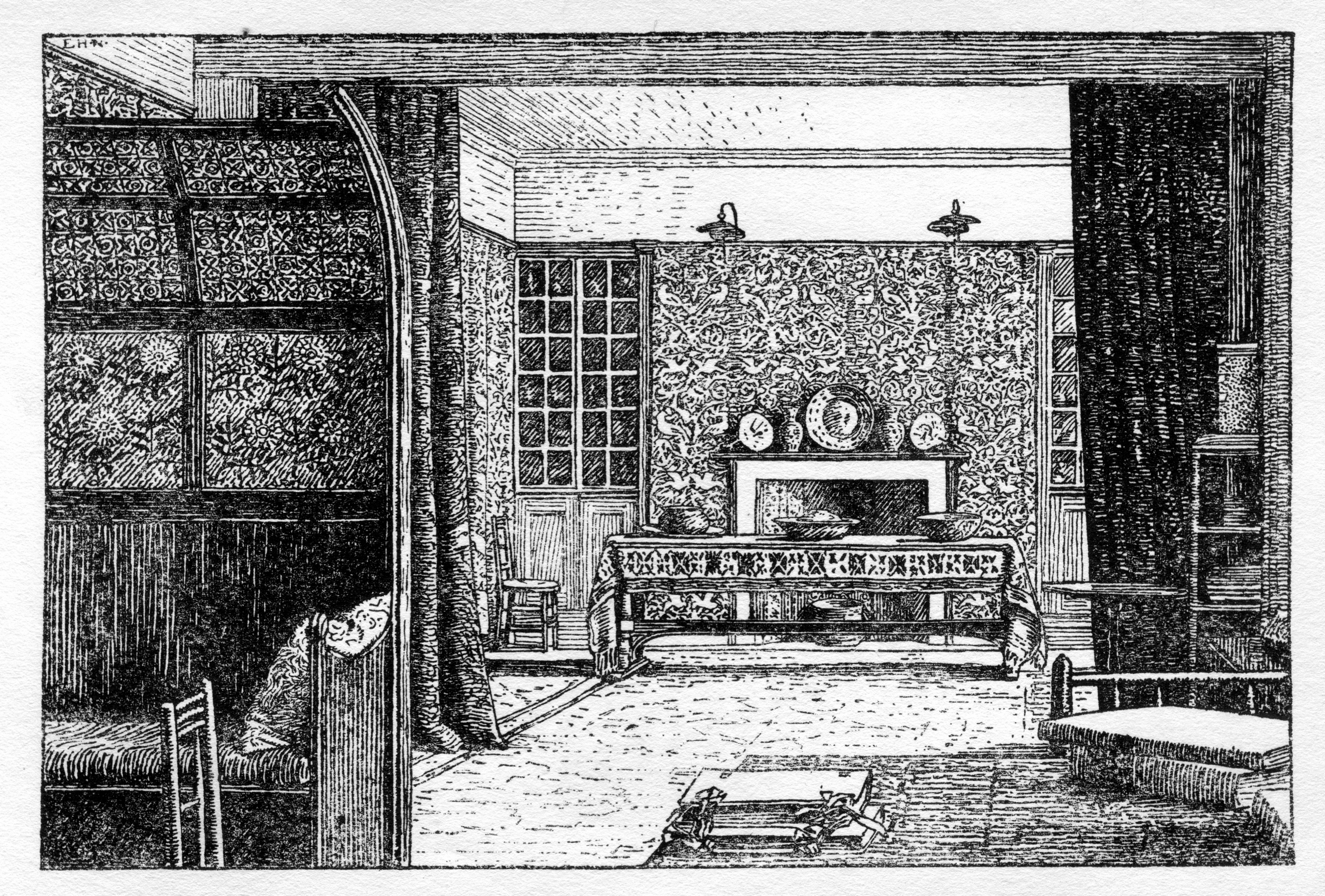
The layering principle of overlapping planes and patterns achieves this ‘active sense of rest’, as shown on Mackail’s accompanying woodcut by F. H. New (Fig. 5.9). In succession there are, first, the floral embossed and painted leather panels of Webb’s settle, then the dividing ‘Peacock and Dragon’ woollen curtains, drawn back to show the furthest plane of blue ‘Bird’ tapestry whose gentle folds background the whole room. At this endpoint a long sturdy table, draped in carpet, holds the space before a fireplace and between a pair of glazed, inbuilt cabinets. The lustre of pots and plates arranged here, and on the mantelpiece beyond, accent the visual field.[70] Such an overlaid assemblage can be seen in the ‘Bal d’Ardents’ of Froissart’s Chronicles, a fifteenth-century illuminated Burgundian manuscript studied by Morris in the British Museum, here of gold vessels arrayed against a fabric of flowers on a red ground.[71] The wall hangings depicted in Froissart also inspired a painted simulation of embroidered ‘wall hangings’ around the drawing room of Red House, where formalised plants bear a scroll on which is written: ‘Qui bien aime tard oublie’ (‘Who loves well forgets slowly’).[72]
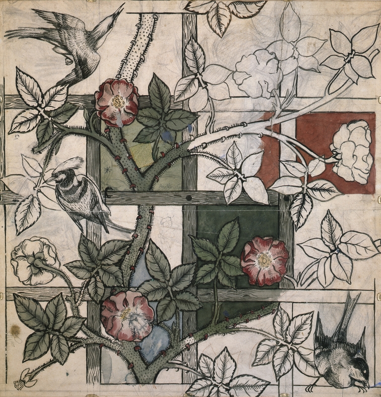
To understand the spatial layering of the Kelmscott drawing room, as applied to the flatness of wallpaper itself, we need look no further than Morris’s very first ‘Trellis’ wallpaper design of 1862. Again the hortus ludi is the wellspring, if the ‘Trellis’ design is compared to the actual Red House garden trellis shown in Burne-Jones’s The Backgammon Players (1862), a study for a painted cabinet panel inspired by Red House’s garden of delights.[73] Georgina Burne-Jones recalled the herber of ‘the well-court, of which two sides were formed by the house and the other two by a tall rose trellis. This little court with its beautiful high-roofed brick well in the centre summed up the feeling of the whole place’.[74]
Morris frankly accepted the ‘mechanical nature’ of wallpaper, recognising that it ‘has to be painted flat on a wall’, but within this flatness he sought ‘to mysteriously … interweave your sprays and stems’.[75] Hence the shallow, three-layer space of ‘Trellis’, entwining foreground blossoms, the architectural trellis grid, and the flitting birds drawn by Webb. ‘Trellis’ is anticipated in the repeating rose-pattern decoration, made probably by Morris in the summer of 1860, to the wall area above the settle in Red House’s drawing room.[76] Already, here in ‘Trellis’ is Morris’s ‘bag of tricks’ as Ray Watkinson puts it: a constructing grid (disclosed or concealed), strong flowing lines on which to build interlocking colour masses of leaf and flower forms, with secondary accents of fauna or flora (Fig. 5.5).[77] The measure of Morris’s achievement here can be seen if the architectural layering of ‘Trellis’ is compared to the eclectic mid-century papers popular with prosperous Victorian consumers ‘containing highly naturalistic cabbage roses and other floral motifs’.[78]
Morris’s brief spell with the great George Edmund Street in 1856 proved pivotal. As Fiona MacCarthy suggests (1994), Morris was particularly influenced by Street’s two fundamental design principles: Street’s ‘sense of architecture as the centre and the ruling force of all design activity’ and ‘his technique in creating grand effects from myriad components’. As she says, ‘a Morris interior is a disciplined amalgam of patterns, colours, textures: wallpapers, friezes, curtain fabrics, wallhangings, painted ceilings, layer upon layer’.[79]
‘Simplicity or Splendour’: 1 Holland Park
So, on the one hand, there is the Morris of surfaces of whitewashed simplicity, the Morris who told his friend Edward Carpenter that although ‘I have spent … a vast amount of time designing furniture and wall-papers, carpets and curtains … after all I am inclined to think that sort of thing is mostly rubbish, and I would prefer for my part to live with the plainest whitewashed walls and wooden chairs and tables’.[80] But as shown, even his own homes of Red House and Kelmscott House were a lot richer than this. For Walter Crane, the leading Aesthetic Movement decorator, ‘the great advantage and charm of the Morrisian method is that it lends itself to either simplicity or splendour. You might be almost as plain as Thoreau, with a rush-bottomed chair; a piece of matting, an oaken trestle table; or you might have gold and lustre … jewelled light in the windows, and the walls hung with arras tapestry’.[81]

Undeniable splendour characterises the spaces that Morris and Webb created for Alexander (Alecco) Ionides (1840–98), the Greek consul, at 1 Holland Park, London, working for almost a decade between 1879 and 1888. The house was badly damaged by bombing in the Second World War and demolished in 1953, but many key artefacts survive from this celebrated interior, which was also well documented in contemporary articles, such as ‘A Kensington Interior’ by Lewis F. Day in The Art Journal of May 1893, finely illustrated with photographs by Harry Bedford Lemere. Take just one moment within its sumptuous sequence of spaces—one illustrated in The Art Journal by the Lemere photograph A corner of the second drawing-room, decorated by William Morris—to absorb the intense cumulative layering of ‘Flower Garden’ woven silk wall covering, curtain fabric, pictures such as Burne-Jones’s Pan and Psyche (1872–4), and Iznik tiles, radiating out into the object surfaces of the piano case and the Hammersmith carpet (Fig. 5.10).[82] In The Art Journal, Lewis F. Day emphasises the prevailing tonal harmony of this abundance:
The walls … are hung with a sober textile material, in which the pattern merges itself into a general tint of greenish or greyish blue, according to the angle at which the light happens to fall upon it; the window curtains are of the same, and the woodwork is painted a quiet green, which is really a lower tone of the prevailing tint.[83]
Writing in The Studio (1898) on ‘An Epoch-Making House’, Gleeson White found the ‘secret’ of 1 Holland Park to lie in the ‘rich mellow “bloom”’ produced by such ‘harmonies of colour’ as those greenish-greyish blues of the drawing room.[84] Writing as a colourist, by ‘bloom’ Gleeson White meant those harmonies of colour that might be enjoyed in a fine old silk rug; comparable tones orchestrated the interior as a whole, and these resonant ‘blooms’ of colour harmony deepened the atmosphere of the dwelling as a natural romance retreat.
Such pleasance gardens—the aforementioned herbers or hortus ludi—often appear as romance settings in Morris’s epic poem The Earthly Paradise, as in ‘The Watching of the Falcon’ where Morris describes a ‘walled pleasance, / With walks and sward fit for the dance / Of Arthur’s court in its best time’ where ‘within the bounds of that sweet close / Was trellised the bewildering rose; / There was the lily over-sweet, / And starry pinks for garlands meet; / And apricots hung on the wall’. The Prologue to The Earthly Paradise is an ecologist’s cri-de-coeur against pollution: ‘Forget six counties overhung with smoke / Forget the snorting steam and piston stroke / Forget the spreading of the hideous town / Think rather of the packhorse on the down / And dream of London, small, and white, and clean’. In truth, just beyond those resonant paradisical wall veils lay the murky, polluted London skies described by Henry James as ‘perpetually instained with a sort of dirty fog-paste, like Thames-mud in solution’.[85] James had to light his candles by eleven o’clock in the morning to read, and artists in the Holland Park circles, patronised by the Ionides clan, complained that it was often too sootily dark on a winter’s day to attempt painting.
I have described what would have been the fullest attainment of the medieval pleasance of the hortus ludi, Red House’s unrealised ‘Palace of Art’ project. In the hortus conclusus of this outdoor room, the primary ‘love of the very skin and surface of the earth’—Ruskin’s earth veil—transmutes to wall veils, designed architectonically as spatially shallow layers, akin to those in the illuminated medieval missals beloved by Ruskin and Morris. Morris’s injunction to ‘think first of the walls’ has been seen to be founded on a ‘revival of Gothic architecture’, which ‘has walls that it is not ashamed of’, underpinned by Ruskin’s readings of the missal and the surface values of the Gothic wall veil. Morris and Webb engendered environments of romance in hierarchies of surface scaled to simplicity or splendour. From the complex harmonies of 1 Holland Park to the relative simplicity of Red House and Kelmscott House, beauty should become—in Morris’s socialist ideal—a taken-for-granted backdrop to life for all. Wall veils are to remind us of the biosphere and the ‘outward face of the earth’, and to evoke romance in what—in a sustainable ecosystem—should be ‘the breathable air’.
Citations
[1] Ruskin, 7.14 (Modern Painters 1, 1843).
[2] William Morris, News from Nowhere [1892] (London: Thames and Hudson, 2017), pp. 189–90.
[3] Ruskin, 9.75 (The Stones of Venice 1, 1851).
[4] Ruskin, 24.203–4 (St Mark’s Rest, 1877).
[5] Ruskin, 24.241.
[6] Ruskin, 24.263.
[7] William Shakespeare, Henry VI, Part 3 [1591], Act 3, Scene 2, in William Shakespeare: Complete Works, Jonathan Bate and Eric Rasmussen (eds.) (The Royal Shakespeare Company: London, 2007), p. 1269.
[8] Charles L. Eastlake, History of the Gothic Revival [1872] (Leicester: Leicester University Press, 1978), p. 278.
[9] Ruskin, 10.269 (The Stones of Venice 2, 1853); See also Stephen Kite, ‘Building Texts and Reading Fabrics’, Library Trends, 61:2 (2012): pp. 418–39.
[10] See Stephen Kite, Building Ruskin’s Italy: Watching Architecture (Farnham, Surrey: Ashgate, 2012).
[11] Elizabeth K. Helsinger, Ruskin and the Art of the Beholder (Cambridge MA: Harvard University Press, 1982), p. 212.
[12] Ruskin, 11.182–3 (The Stones of Venice 3, 1853).
[13] Ruskin, 8.234 (The Seven Lamps of Architecture, 1849).
[14] Ruskin, 11.38, 41.
[15] Ruskin, 11.41. George Landow, The Aesthetic and Critical Theories of John Ruskin (Princeton: Princeton University Press, 1971), chapters 4 and 5.
[16] Quoted in Adrian Forty, Words and Buildings: a vocabulary of modern architecture (London: Thames and Hudson), p. 72.
[17] Ruskin, 36.212 (‘Letter to F. J. Furnivall’, 22 May 1855).
[18] Michael W. Brooks, John Ruskin and Victorian Architecture (London: Thames and Hudson, 1989), p. 88.
[19] Eastlake, History of the Gothic Revival, p. 278.
[20] Ruskin, 9.75 (The Stones of Venice 1, 1851).
[21] Anuradha Chatterjee, John Ruskin and the Fabric of Architecture (Abingdon: Routledge, 2018) richly expands on these fabric and dress themes.
[22] Semper quoted in David Leatherbarrow and Mohsen Mostafavi, Surface Architecture (Cambridge MA: MIT Press, 2002), p. 91.
[23] Ruskin, 9.351, my emphasis.
[24] Deborah Howard, The Architectural History of Venice (New Haven and London: Yale University Press, 2002), p. 34.
[25] Ruskin, 10.276 (The Stones of Venice 2, 1853).
[26] Ruskin, 10.212. On Ruskin’s active prose see Michael Brooks, ‘Describing Buildings: John Ruskin and Nineteenth-Century Architectural Prose’, Prose Studies 3 (1980): pp. 241–53.
[27] Juergen Schulz, The New Palaces of Medieval Venice (University Park PA: The Pennsylvania State University Press, 2004), chapter 1, figs. 20, 21. See also Paolo Maretto, La Casa Veneziana (Venezia: Marsilio Editori, 1986), pp. 66–70, fig. 33; Edoardo Arslan, Gothic Architecture in Venice, (trans.) Anne Engel (London: Phaidon, 1971), pp. 30–1.
[28] Ruskin, 10.295.
[29] Brooks, ‘Describing Buildings’, p. 245.
[30] Ruskin, 10.275–6, note 1, my emphasis to last sentence. There are also field notes and details in Ruskin’s Venice-Notebook ‘House Book 1’: ‘House No 43. very interesting in a courtyard in the Calle del Rimedio’. He notes the ‘old wooden bracketed beam’ (p. 52) and draws its capitals on the opposite page, and the ‘4 at[tached arches] of 2nd. [order] on a long plinth’. On the following page he records: ‘I got up to its second story and marked the section and angle leaf of this capital which are important thus—The shafts stand on this plinth. and I think always have stood without any base’, ‘Ruskin Library and Research Centre / Venetian Notebooks Electronic Edition’, accessed February 2018, http://Lancaster.ac.uk/fass/ruskin/eSoV/.
[31] Ruskin, 11.22–3 (The Stones of Venice 3, 1853). On Ruskin and brickwork, see also Stephen Kite, ‘The Bricks of Venice: material and craft in John Ruskin’s political economy’, in Juliet Odgers, Mhairi McVicar, and Stephen Kite (eds.), Economy and Architecture (Abingdon: Routledge, 2015).
[32] Ruskin, 11.27.
[33] Ruskin, 24.163 (Guide to the Principle Pictures in The Academy of Fine Arts at Venice, 1877).
[34] Ruskin, 24.163.
[35] Manfred Schuller, ‘Le facciate dei palazzo medioevali di Venezia. Ricerche su singoli esempi architettonici’, in Francesco Valcanover and Wolfgang Wolters (eds.), L’Architettura Gotica Veneziana (Venice: Instituto Veneto di Scienze, Letteri ed Arti, 2000), p. 338.
[36] Jacob Burckhardt, The Architecture of the Italian Renaissance [1867], (trans.) James Palmes, (ed.) Peter Murray (Harmondsworth: Penguin Books, 1987), p. 46; Ruskin, 9.323 (The Stones of Venice 1, 1851); See also Paul Hills, Venetian Colour: Marble, Mosaic, Painting and Glass 1250–1550 (New Haven and London: Yale University Press, 1999), p. 12.
[37] Ruskin, 11.23 (The Stones of Venice 3, 1853).
[38] Ruskin, 11.28.
[39] Hills, Venetian Colour, pp. 66–7.
[40] Ruskin, 10.264 (The Stones of Venice 2, 1853).
[41] Ruskin, 8.108 (The Seven Lamps of Architecture, 1849).
[42] Ruskin, 8.109.
[43] Nikolaus Pevsner, The Englishness of English Art [1956] (Harmondsworth, Middlesex: Penguin Books, 1964), p. 105.
[44] Pevsner, The Englishness of English Art, p. 107.
[45] Morris, News from Nowhere, pp. 189–90.
[46] William Morris, ‘Gothic Architecture’, in May Morris, The Art of William Morris: Morris as a Writer [1936], vol. 1 of May Morris, William Morris, Artist, Writer, Socialist, two volumes (Cambridge: Cambridge University Press, 2012), p. 275.
[47] William Morris, ‘Address on the collection of paintings of the English Pre-Raphaelite school in the City of Birmingham Museum and Art Gallery on Friday, October 24, 1891’, in Morris, The Art of William Morris, pp. 302–3.
[48] Percy Lubbock, Shades of Eton [1929] (London: Jonathan Cape, 1932), pp. 93–4. See also May Morris, The Art of William Morris, pp. 38–9.
[49] Nikolaus Pevsner, Pioneers of Modern Design: from William Morris to Walter Gropius [1936] (London: Pelican Books, 1960), pp. 58–9; see for example, Peter Davey, Arts and Crafts Architecture (London: Phaidon, 1995), pp. 39–40. See also Nicholas Cooper, ‘Red House: Some Architectural Histories’, Architectural History 49 (2006): pp. 207–21.
[50] J. W. Mackail, The Life of William Morris [1899], two volumes (London: Longmans, Green, 1901), vol. 1, p. 142.
[51] See Rob Aben and Sakia de Wit, The Enclosed Garden: History and Development of the Hortus Conclusus and its Reintroduction into the Present-day Urban Landscape (Rotterdam: 010 Publishers, 2001), pp. 37–40.
[52] Aben and de Wit, The Enclosed Garden, p. 247; see also Tessa Wild, William Morris and the Palace of Art (London: Philip Wilson, 2018), p. 201.
[53] British Library, Harley MS 4425; acquired by the nation in 1753 under the Act of Parliament that established the British Museum, and one of the foundation collections of the British Library. See also Fiona MacCarthy, The Last Pre-Raphaelite: Edward Burne-Jones and the Victorian Imagination (London: Faber and Faber, 2012), p. 151.
[54] Morris, ‘The Man Born to Be King: The Medieval Tale for March’, in The Earthly Paradise (Boston: Roberts Brothers, 1868), vol. 1, lines 1660–88, 1890–3.
[55] William Morris, ‘Making the Best of It’ (a paper read before the Trades’ Guild of Learning and the Birmingham Society of Artists, 1879), in William Morris, Hopes and Fears for Art: Five lectures delivered in Birmingham, London, and Nottingham, 1878–1881 (London: Ellis and White, 1882), p. 128.
[56] Peter Blundell-Jones, ‘Red House’, Architects’ Journal 183:3 (15 January 1986): p. 47.
[57] See for example, Ray Watkinson, Morris as Designer (London: Studio Vista, 1967), p. 42.
[58] Ruskin, 9.284–5 (The Stones of Venice 1, 1851), Ruskin’s emphasis.
[59] Ruskin, 9.285. See also Michaela Braesel, ‘The Influence of Medieval Illuminated Manuscripts on the Pre-Raphaelites and the Early Poetry of William Morris’, Journal of William Morris Studies 15:4 (2004): p. 41.
[60] Aben and de Wit, Enclosed Garden, p. 44.
[61] See related manuscript analysis diagram in Aben and de Wit, Enclosed Garden, p. 43.
[62] Alina Payne, Ornament to Object: Genealogies of Architectural Modernism (New Haven and London: Yale University Press, 2012), p. 89.
[63] Ruskin, 12.83 (Lectures on Architecture and Painting, 1854), Ruskin’s emphasis.
[64] Payne, Ornament to Object, p. 90.
[65] Linda Parry (ed.), William Morris, exhibition catalogue, Victoria and Albert Museum (London: Philip Wilson, V&A Publishing, 1996), p. 172.
[66] Braesel, ‘Medieval Illuminated Manuscripts’, p. 41.
[67] Hermann Muthesius, The English House, three volumes [Das Englische Haus, 1904–5)], (trans.) Janet Seligman and Stewart Spencer, (ed.) Dennis Sharp (London: Frances Lincoln, 2007), vol. 3, p. 89.
[68] See Wild, Morris and his Palace of Art, pp. 119–25.
[69] Mackail, Life of William Morris, vol. 1, pp. 372–3.
[70] Linda Parry, William Morris Textiles (London: V&A Publishing, 2013), p. 185; and Imogen Hart, ‘An “Enchanted” Interior: William Morris at Kelmscott House’, in Jason Edwards and Imogen Hart (eds.), Rethinking the Interior, c.1867–1896: Aestheticism and Arts and Crafts (Farnham: Ashgate, 2010).
[71] See Caroline Arscott, William Morris and Edward Burne-Jones: Interlacings (New Haven and London: Yale University Press, 2008), pp. 88–9.
[72] Wild, Morris and his Palace of Art, pp. 119–28.
[73] See Charlotte Gere, Artistic Circles: Design and Decoration in the Aesthetic Movement (London: V&A Publishing, 2010), pp. 161–2.
[74] Georgina Burne-Jones, quoted in Wild, Morris and his Palace of Art, p. 205.
[75] William Morris, ‘The Lesser Arts of Life’ [1878], in William Morris, Architecture, Industry and Wealth (London: Longmans, Green, 1902), p. 68.
[76] See Wild, Morris and his Palace of Art, p. 145.
[77] Watkinson, Morris as Designer, p. 52.
[78] Joanna Banham, ‘The English Response: Mechanization and Design Reform’, in Lesley Hoskins (ed.), The Papered Wall: The History, Patterns and Techniques of Wallpaper (London: Thames and Hudson, 2005), pp. 138–9, see for example fig. 186, ‘Floral pattern by William Woollams & Co., block-printed in colours, 1849’.
[79] Fiona MacCarthy, William Morris: A Life for our Time (London: Faber and Faber, 1995), p. 107, my emphasis.
[80] Quoted in Hart, ‘An “Enchanted” Interior’, p. 79.
[81] Quoted in Gere, Artistic Circles, p. 165.
[82] Lewis F. Day, ‘A Kensington Interior’, The Art Journal (May 1893): p. 141.
[83] Day, ‘Kensington Interior’, p. 141.
[84] Gleeson White, ‘An Epoch Making House’, The Studio 14 (1898): p. 111.
[85] Henry James, quoted in Caroline Dakers, The Holland Park Circle: Artists and Victorian Society (New Haven and London: Yale University Press, 1999), p. 238.