At the close of a lengthy account of the three volumes of The Stones of Venice, published in successive editions of the Illustrated London News in 1853, the reviewer made a belated acknowledgement: ‘We must add, in conclusion, that the work abounds in engraved illustrations of decorative features in Venetian architecture, which in themselves are highly interesting’. This anonymous writer conceded that ‘some of the critical remarks upon these objects, and upon the smaller points of formative beauty, are ingenious and discriminative, and such as we can often concur with’. But the conclusion was not positive: ‘even these lose much of their value in our estimation from the impossibility of going hand in hand with the author in the broader fields of criticism, in which they are but the stray flowers’.[1]
It appears that this view of the relative unimportance of John Ruskin’s illustrations may have been widely shared at the time. Among the extracts from many reviews of the work cited by his publisher, only the Spectator signalled any special interest, noting in respect of volume two of the work: ‘The plates in this volume are all in line engraving, most minutely designed, and delicately executed’.[2] In fact, the illustrations to this volume of Stones, which appeared in 1853, are a good deal richer in their variety: far from being simply ‘all in line engraving’, they comprise two prints of stonework at the Cathedral of Murano which featured a novel colour process, and two engravings taken directly from daguerreotypes, all of the former being signed by the engraver James Charles Armytage, not to mention a large number of Ruskin’s woodcuts after his own designs.[3] The premise of this chapter is that, despite the myopia of Ruskin’s contemporaries, it is well worth taking a fresh look at the illustrations that Ruskin initiated and commissioned over the period when he was disseminating his studies of Venetian architecture.[4] Though these publications were bracketed within the long-term project of Modern Painters, this was surely the period when he proved most ambitious in pressing into service an unprecedentedly wide range of printmaking techniques.
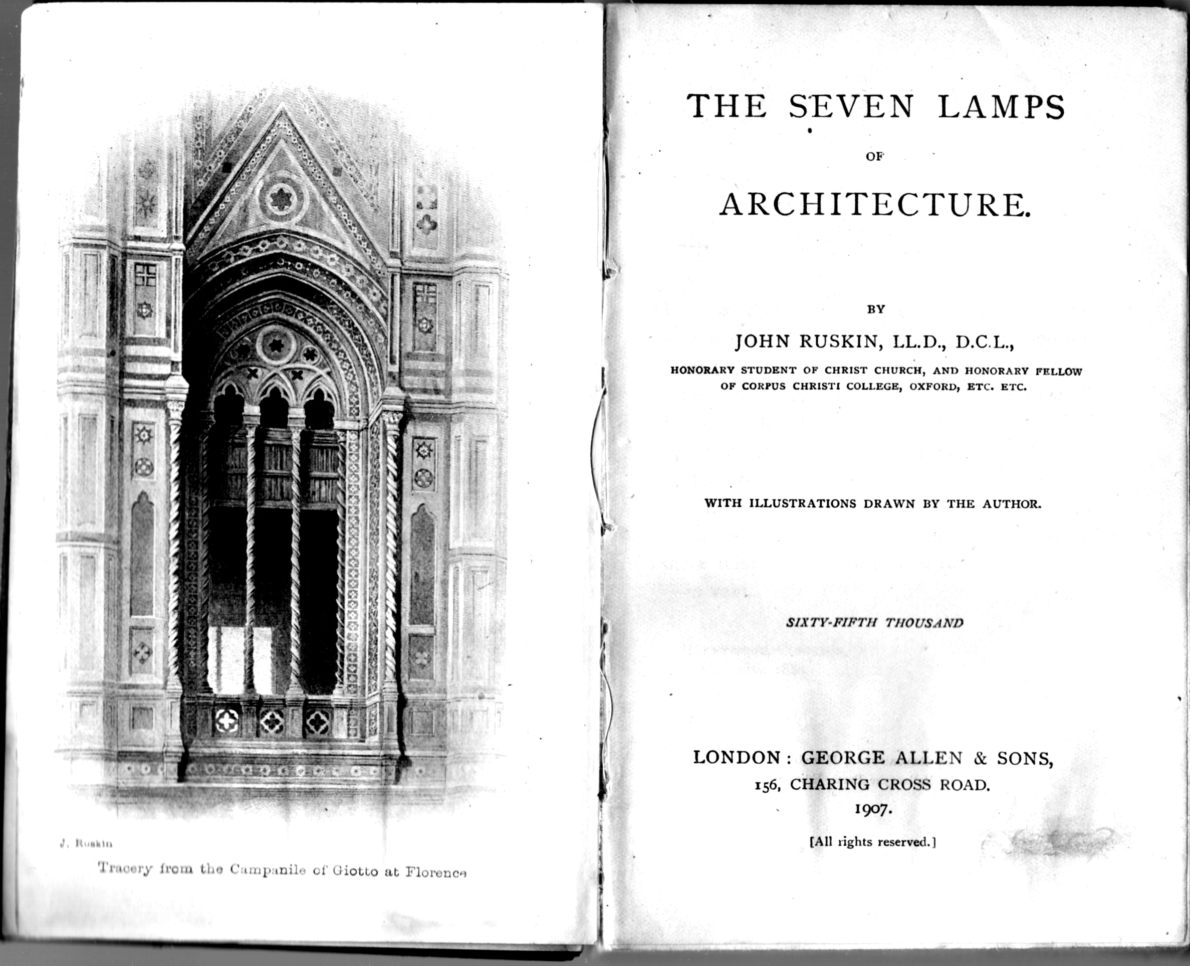
The first two volumes of Modern Painters contained no illustrations. But in the preface to the first edition of volume one, published in 1843, Ruskin had already made a declaration that pointed clearly in this new direction. He asserted that his text consisted in ‘demonstrations which must stand or fall by their own strength’. But still being anonymous at this point in time, he also considered it appropriate to remind his readers of the artistic qualifications that he possessed: ‘Yet it is proper for the public to know that the writer is no mere theorist, but has been devoted from his youth to the laborious study of practical art’.[5] It is evident that much of the discussion in this opening volume of Modern Painters focused on the achievements of contemporary British artists with whose works the reading public would have been familiar. Nonetheless, there is a point in his text when Ruskin displays a certain irritation at being confined to verbal description. While discussing the ‘effects of light and colour’ in a general way, he adds a brief note: ‘I have not given any examples in this place, because it is difficult to explain such circumstances of effect without diagrams: I propose entering into fuller discussion of the subject with the aid of illustration’.[6]
No such intention was fulfilled in volume two of Modern Painters, a work which was viewed very critically by the author in later life, when he republished the text in a revised and copiously annotated version. An autobiographical note was then inserted to explain the limitations of his early judgements on Italian Renaissance art. He claimed that his ‘total ignorance of the antecedent religious schools’ had only been rectified in 1845, when he read ‘the writings of Lord Lindsay’ and ‘worked for the first time in Santa Maria Novella’.[7] ‘Working’, in this context, meant that Ruskin had begun an arduous round of sketching the ancient buildings of Florence, while he was also starting to accumulate a collection of daguerreotypes of ancient Italian buildings, partly through purchase and partly on his own initiative in collaboration with his servant, Thomas Hobbs. The third volume of Modern Painters, however, was placed on hold for a decade, and only received its preface in January 1856. Throughout the intervening period, Ruskin devoted himself to exploring the potentiality of the different modes of current printmaking with an energy and resourcefulness that was surely unparalleled for the period. But this was not an easy course to follow, and successes were achieved at the price of setbacks. This was certainly the case with the lengthy ‘essay’, in Ruskin’s own words ‘thrown together during the preparation of one of the sections of the third volume of “Modern Painters”’, and published in 1849 under the title of The Seven Lamps of Architecture.[8]
First trials: etchings for Seven Lamps
The rushed circumstances under which Ruskin completed the plates for his illustrations to Seven Lamps are graphically described in his diaries. The entry contained in his ‘Diary of journey with my father and mother alone in 1849’ reads: ‘23 April, when I stayed to finish the last chapters of 7 Lamps, and bit in the plate of Giotto’s tower in a wash-hand basin’.[9] As he recalled in later life, this incident had taken place at the Hotel de la Cloche in Dijon. He had been obliged to comb the whole city in order to find the necessary ingredients for processing his own soft-ground etching: ‘I had some difficulty in getting wax and nitric acid; had to flatter a poor engraver and persuade a queer chemist, who could hardly put the fraction 1/5 into ounces’.[10]
It is interesting to observe that, for his first illustrated book, Ruskin relied on a process that was as close as possible to a transcription of his own architectural drawings. Soft-ground etching does not require the desired image to be incised directly on the copper plate with an etching needle. Instead, the plate is coated with wax, and the drawing made in the normal way on a sheet of paper laid over it, with the effect that the lines are impressed on the coated surface of the plate, and the design is then ready to be ‘bitten’ by the acid. This process achieves a final printed image in which the line is not sharp, as with ordinary etchings, but remains somewhat granular. Such is the common feature of almost all the fourteen plates that Ruskin prepared to illustrate Seven Lamps.[11]
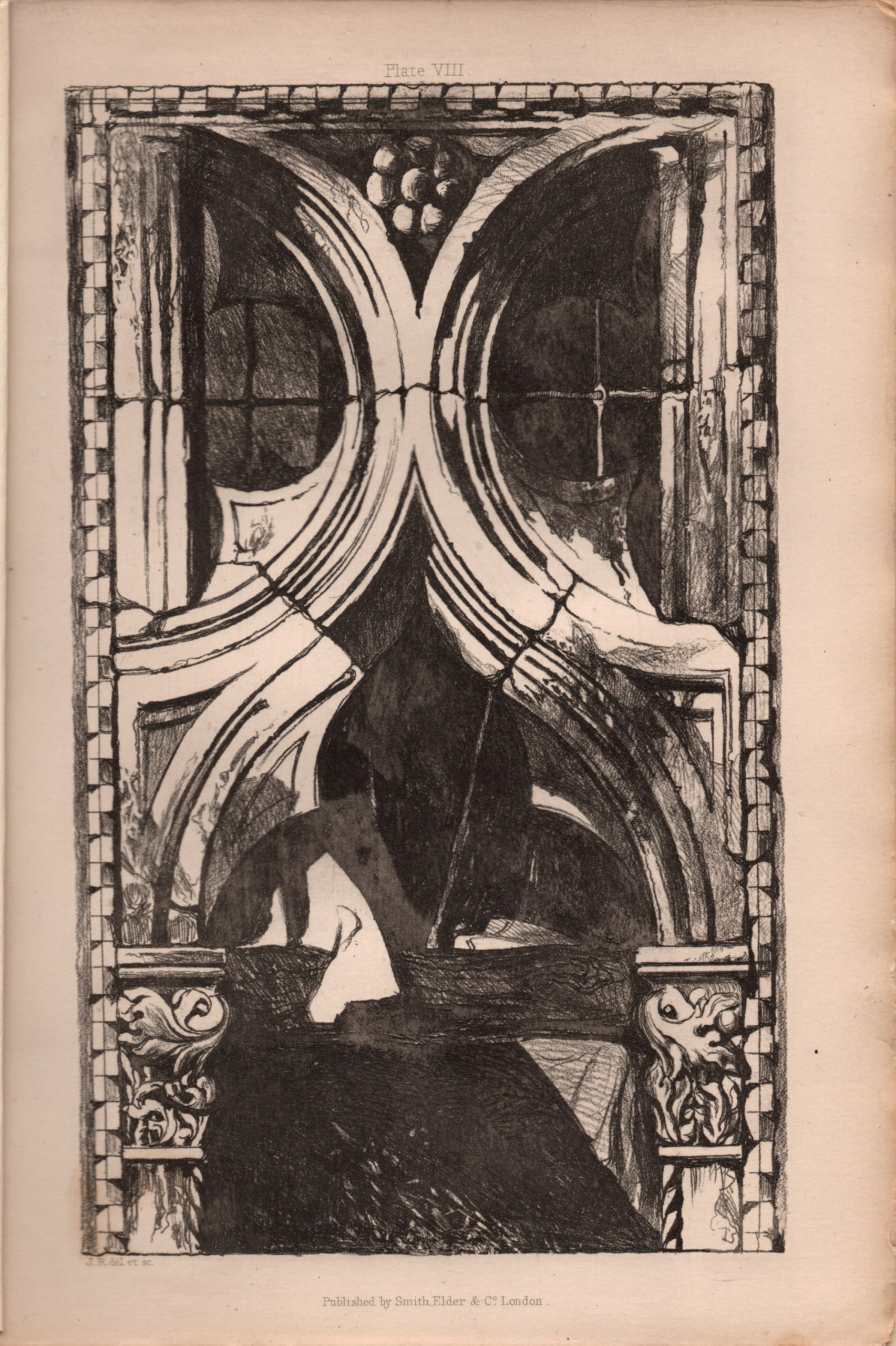
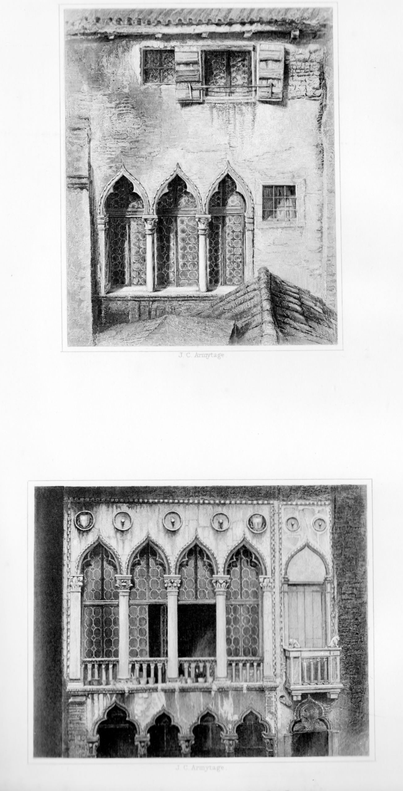
In two of these plates, it is possible to correlate the printed images with two of Ruskin’s known sketches. Both Plate VI (Arch from the Façade of San Michele at Lucca) (Fig. 12.1) and Plate VIII (Window from the Ca’ Foscari, Venice) (Fig. 12.2) closely resemble watercolours in public collections, which would have served in Ruskin’s terms as ‘memoranda made upon the spot’.[12] But, in a further two examples which are mentioned in the preface, Ruskin informs his readers that the prints were ‘enlarged and adapted from Daguerreotypes, taken under my own superintendence’.[13] One of these, Plate XI (Balcony in the Campo St Benedetto, Venice), can surely be regarded as a very successful transcription of the photographic image, which combines fine detail with a faithful record of the effects of light on stone (Fig. 12.3).[14] The other illustration, Plate IX (Tracery from the Campanile of Giotto, at Florence), derives from the ‘plate of Giotto’s tower’ that was bitten in the hand basin of Ruskin’s hotel bedroom, and in his preface he does not conceal his dissatisfaction with the result (Fig. 12.4).


A daguerreotype that survives from Ruskin’s collection may well indicate what went wrong in this case. He was obviously committed to illustrating what he would describe in his text as the ‘noble third’ storey of the Campanile, to which two lower storeys were subordinated.[15] But, as he conceded in his preface, this raised a problem: ‘the great distance from the ground of the window … renders even the Daguerreotype indistinct’. He had to admit: ‘I cannot answer for the accuracy of any of the mosaic details, more especially of those which surround the window, and which I rather imagine, in the original, to be sculptured in relief’. On the positive side, he had only this to say in defence of his print: ‘The general proportions are, however, studiously preserved’.[16] In fact, there is an unpublished letter to his publisher, dated 23 April 1849, which shows that only lack of time prevented him from jettisoning this plate, and seeking a replacement:
I have received this afternoon the proof of the Giotto subject for Lamps of Beauty. I intended it to be far different, and I hoped it would have been creditable to the book, and to you. I am sadly disappointed in it, but I fear it must go as it is, for even if I were to stay here to do another I feel wearied & discouraged and could hardly be sure of doing a better. But I wish you would not throw off more than a thousand of it, and give me a chance of replacing it by a better for the conclusion of the edition.[17]
This glimpse into Ruskin’s relationship with his publisher, George Murray Smith, is a timely reminder of the stakes involved when Ruskin took to publishing his first illustrated book. Plate IX, of the Giotto Campanile, had been placed strategically at the beginning of the chapter headed ‘The Lamp of Beauty’. Towards the end of this chapter, Ruskin acclaimed it as ‘the one building in the world’ which had brought together all of the ‘conditions of power and beauty’. Not surprisingly, he also expressed in the text the wish that his own print might go some way in conveying the qualities of this supreme architectural achievement: ‘The drawing of the tracery of its upper story, which heads this chapter, rude as it is, will nevertheless give the reader some better conception of that tower’s magnificence than the thin outlines in which it is usually pourtrayed [sic]’.[18] Yet the exculpatory passage placed in the preface, which is supported by the evidence of his letter to Smith, is an acknowledgement that he had failed. Part of the problem was the fact that the daguerreotype gave a view of the lofty building from the ground upwards. He had to invent a prospect of the interior of the top storey that could not possibly be seen from such an angle.
Ruskin’s suggestion, that he might replace the offending plate ‘by a better’, eventually came to a happy conclusion. The first edition of Seven Lamps was still being sold by Smith, Elder, and Co. in 1851, at a time when the newly published first volume of Stones was also advertised. Plate IX still remained in place. But by 1855 a second edition of Seven Lamps was needed. By that stage, the run of Ruskin’s original soft-ground etchings was exhausted, and the professional line engraver R. P. Cuff had been commissioned to transpose the original designs on copper onto more durable steel plates. Writing from Brantwood in a new preface to the 1880 edition of Seven Lamps, Ruskin confessed to a lingering affection for his original etchings, done ‘with savage carelessness’, and predicted (quite rightly!) that the first edition would always fetch ‘a high price in the market’. But he endorsed Cuff’s re-strikes as being ‘quite as good for practical illustration, and much more admirable as pieces of careful and singular engraver’s skill’.[19]
Only one significant change was made in the second edition of 1855, and this was the replacement of the offending print of Giotto’s Campanile by a new steel engraving, commissioned from James Charles Armytage.[20] Ruskin would have been well aware of Armytage’s contribution to the prints in J. M. W. Turner’s series Rivers of France, which had appeared in the 1830s. But this may have been his first professional contact with the outstanding steel engraver who would leave his mark on the pages of Stones of Venice and Modern Painters. Ruskin was sufficiently pleased with Armytage’s new engraving of the Campanile to advance it to the position of frontispiece for the second edition, and it retained this place in all the editions that followed (Fig. 12.5). Armytage had the benefit of Ruskin’s ‘new drawing’, presumably based on the original daguerreotype, and his rendering has none of the awkwardness of Ruskin’s soft-ground etching.[21] The square patch of light that shines through from the other side of the tower, which clearly derives from the daguerreotype, gives the whole prospect a spatial coherence that was lacking in its predecessor.
This new illustration by Armytage testifies to the brilliant effect, and the unprecedented durability, of the medium of steel engraving.[22] Ruskin himself acknowledged in 1880 that ‘some of [Armytage’s] plates … show scarcely any loss of brightness for any use hitherto made of them’.[23] Such a successful judgement on the connection with Armytage prompts a further reflection on the varieties of printmaking that were available to him when he undertook the illustration of his writings. In the first volume of Modern Painters, dating from 1843, he had noted the point that his hero Turner, who initially worked with the practitioners of mezzotint, later consigned many prints after his work to the medium of steel engraving. He wrote in 1843: ‘an engraving from Turner is always beautiful and forcible in proportion as the colour of the original has been intense, and never in a single instance has failed to express the picture as a perfect composition’.[24] Yet by 1851, when he was adding a lengthy annotation to the second edition of Modern Painters 1, he revised this enthusiastic endorsement:
This is saying too much; for it not unfrequently [sic] happens that the light and shade of the original is lost in the engraving, the effect of which is afterwards partially recovered, with the aid of the artist himself, by introduction of new features. … In the plate of the Old Téméraire, lately published in Finden’s Gallery, I do not know whether it was Turner or the engraver who broke up the water into sparkling ripple, but it was a grievous mistake, and has destroyed the whole dignity and value of the conception.[25]
It is noteworthy that Ruskin was having second thoughts about the medium of steel engraving in 1851, when he had become heavily involved in the process of commissioning prints for his own illustrated publications. To restate the main proposition of this chapter, the ‘stray flowers’ (so described by the reviewer in 1851) were in fact the product of an intensive process of judgement, as a result of which he harnessed specific techniques, and particular printmakers, to the broader objective of ‘demonstration’ by verbal argument. In this context, the first edition of Seven Lamps (however cherished it might have appeared to him in retrospect) must have given Ruskin a cautionary message at the time. He would have seen that he could not fulfil his intentions by relying only on his own efforts.
In fact, the repeated editions of Ruskin’s first illustrated book testify to the growing popularity of his writings, but they also betray a rather cavalier attitude to detail. When George Allen & Sons published the pocket version of the new edition in 1907, it was proclaimed to be the ‘sixty-fifth thousand’. Armytage’s engraving, by that stage reduced photographically, still sat opposite the title page, though the only credit given was to the original drawing of ‘J. Ruskin’ (Fig. 12.5). In the new preface of 1880, repeated in subsequent editions, Ruskin did indeed credit Armytage for his ‘excellent piece of work’, as well as recounting the story of his own attempts at etching, which had been salvaged by ‘Mr Cuff’s skill’ in converting them to steel engraving.[26] But it may be noted that the copies of the first edition that were still being sold in 1851 incorporated an ‘errata’ slip. Ruskin acknowledged a confusion in the text between Plate IX and Plate X in the first edition, which could have been caused by his dissatisfaction with the original Plate IX (of the Giotto Campanile), and his proposal for a replacement. The misprint did not survive into the second edition. But the errata note referring to p. 92, line 23—‘for “east”, read “west”’—was not acted upon. As late as 1907, readers might have been puzzled by the notion that Salisbury Cathedral possessed an ‘east front’, as no English medieval cathedral has ever exhibited such a feature!
The fact that Salisbury Cathedral finds a way into the argument of Seven Lamps is a testimony to Ruskin’s eclectic range of comparisons. But it is also a pointer to the market which he was entering when he published his architectural studies. In the preface to the first edition of Seven Lamps, he cited a visit to Salisbury in the previous summer, when ‘a few days work’ in the cold cathedral had resulted in a ‘state of weakened health’.[27] Ruskin was not reluctant to admit his bias towards churches that were in warmer climates, on the principle that ‘the daily services, lamps, and fumigation … render them perfectly safe’.[28] But it is also pertinent to add that Ruskin was launching himself upon a series of illustrated books on architecture and aesthetics at a time when book production in London had achieved an unprecedentedly high level of quality, which was largely due to the availability of new printmaking techniques. Before opening the discussion of Ruskin’s own choice of illustrations, it is helpful to set his early publications beside the works of a comparable scope with which he and his publisher were effectively in competition.[29]
Contemporaries and competitors: Benjamin Winkles and Henry Twining
1851 was also the year of the appearance of the ‘New edition’ of Winkles’s Architectural and Picturesque Illustrations of the Cathedral Churches of England and Wales (Fig. 12.6). This popular publication, which had appeared first of all in the 1830s, contained ‘Historical and Descriptive Accounts’ of all the churches in question, and its first volume opened with an informative text on Salisbury Cathedral. But its main selling point was clearly the provision of a large number of steel engravings, done by Benjamin Winkles after sketches by a number of artists, and representing the exterior and interior views of every cathedral in turn. Those of the exterior of Salisbury Cathedral, for example, featured the ‘west front’, the ‘north side’ and the ‘south-east view’, all shown in a style which could be described as ‘picturesque’, with attention being given to the striking mass of the great building, and care being taken to record the local trees and occasional visitors in the close, not excluding the fine cloud effects to which steel engraving was especially suited (Fig. 12.7). Nothing could be more unlike the focus on architectural detail, the ‘veracity’, that Ruskin required in his illustrations for Seven Lamps and subsequently in those for Stones. Yet he must have been aware that his potential readers would have been more familiar with the approach of Winkles. In the prospectus for Examples of the Architecture of Venice, which announced its forthcoming publication in 1851, he sounded a note of warning: ‘In order to prevent future disappointment, Mr Ruskin wishes it especially to be observed that very few of the drawings will be of entire buildings’.[30]

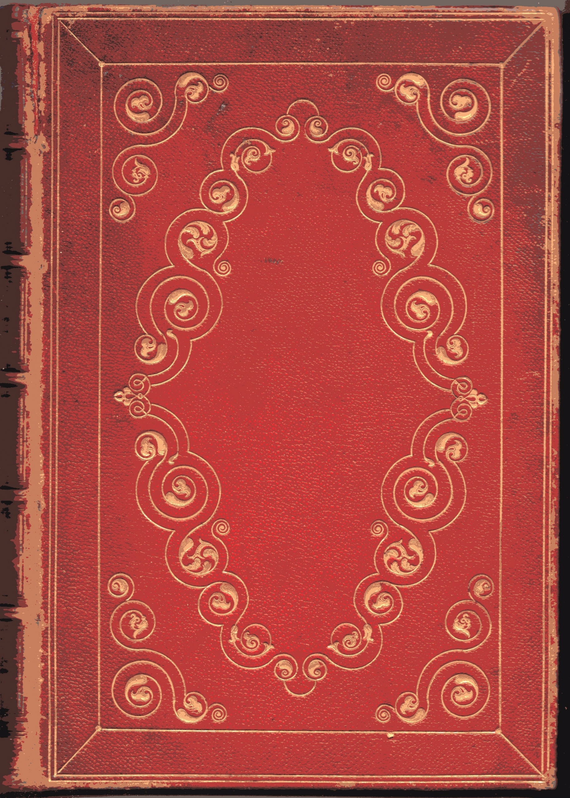
Ruskin had no truck with Winkles’s picturesque mode of illustration. But it is worth noting that, in one particular respect, he had deferred to the custom of his times. Embossed cloth bindings had come into fashion in Britain in the 1830s. Winkles had adopted this convenient style for his volumes, signalling their ecclesiastical connections through the imprinted motif of a golden mitre and crozier. Ruskin himself chose to embellish the binding of Seven Lamps by commissioning an embossed motif that was derived from the inlaid flooring of the Florentine church of San Miniato al Monte, where he happened to have passed a ‘happy evening’ in the summer of 1846 (Fig. 12.8).[31] The intricate design of black and white marble representing the signs of the Zodiac has been creatively adapted to contain seven medallions inscribed with watchwords selected by Ruskin: RELIGIO, OBSERVATIO, AUCTORITAS, FIDES, OBEDIENTIA, MEMORIA and SPIRITUS (Fig. 12.9).
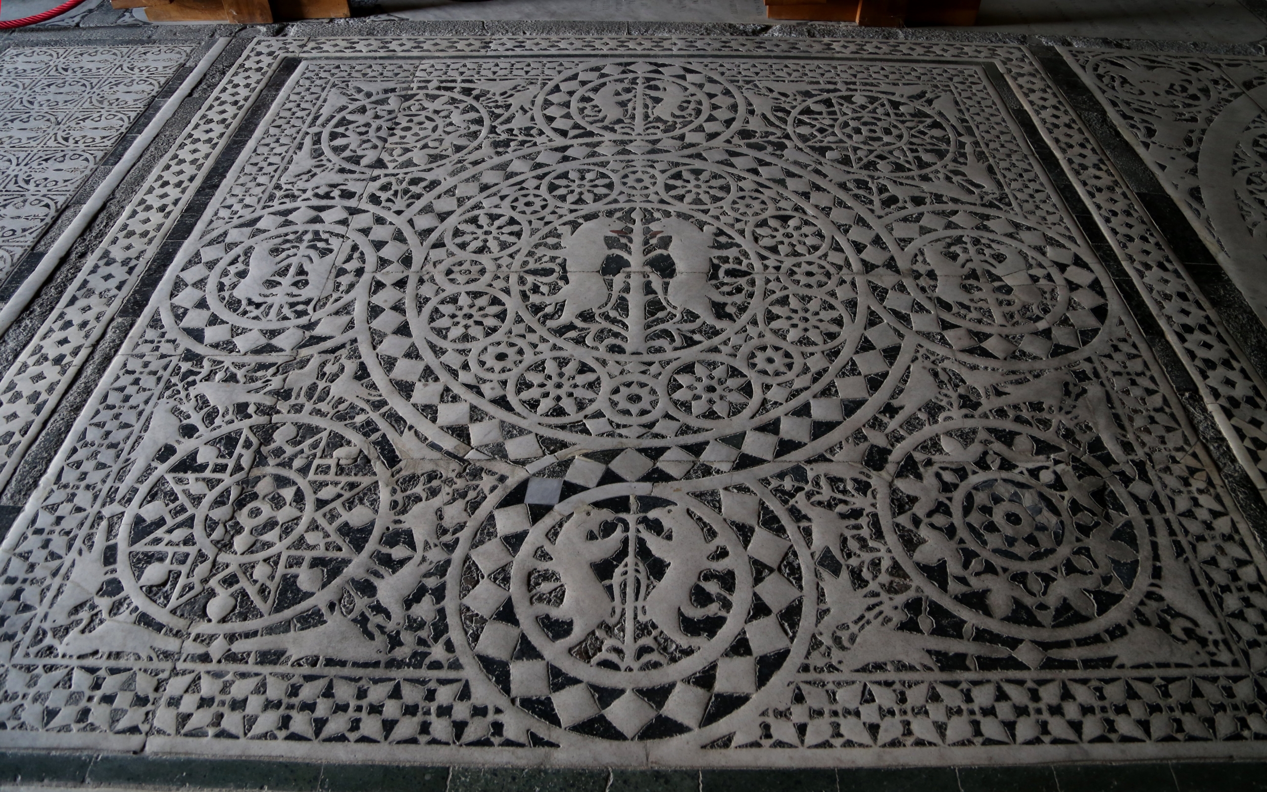
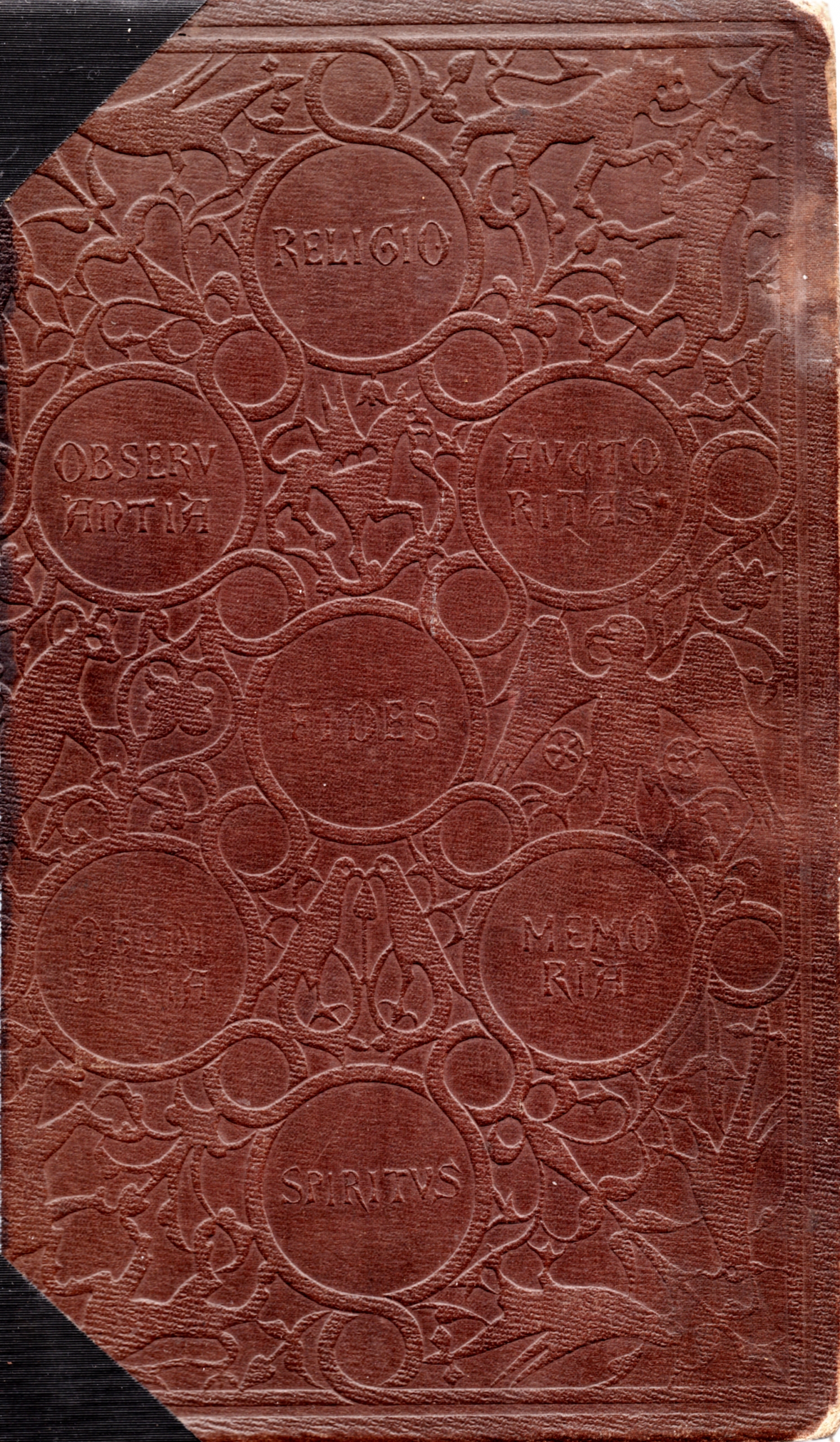
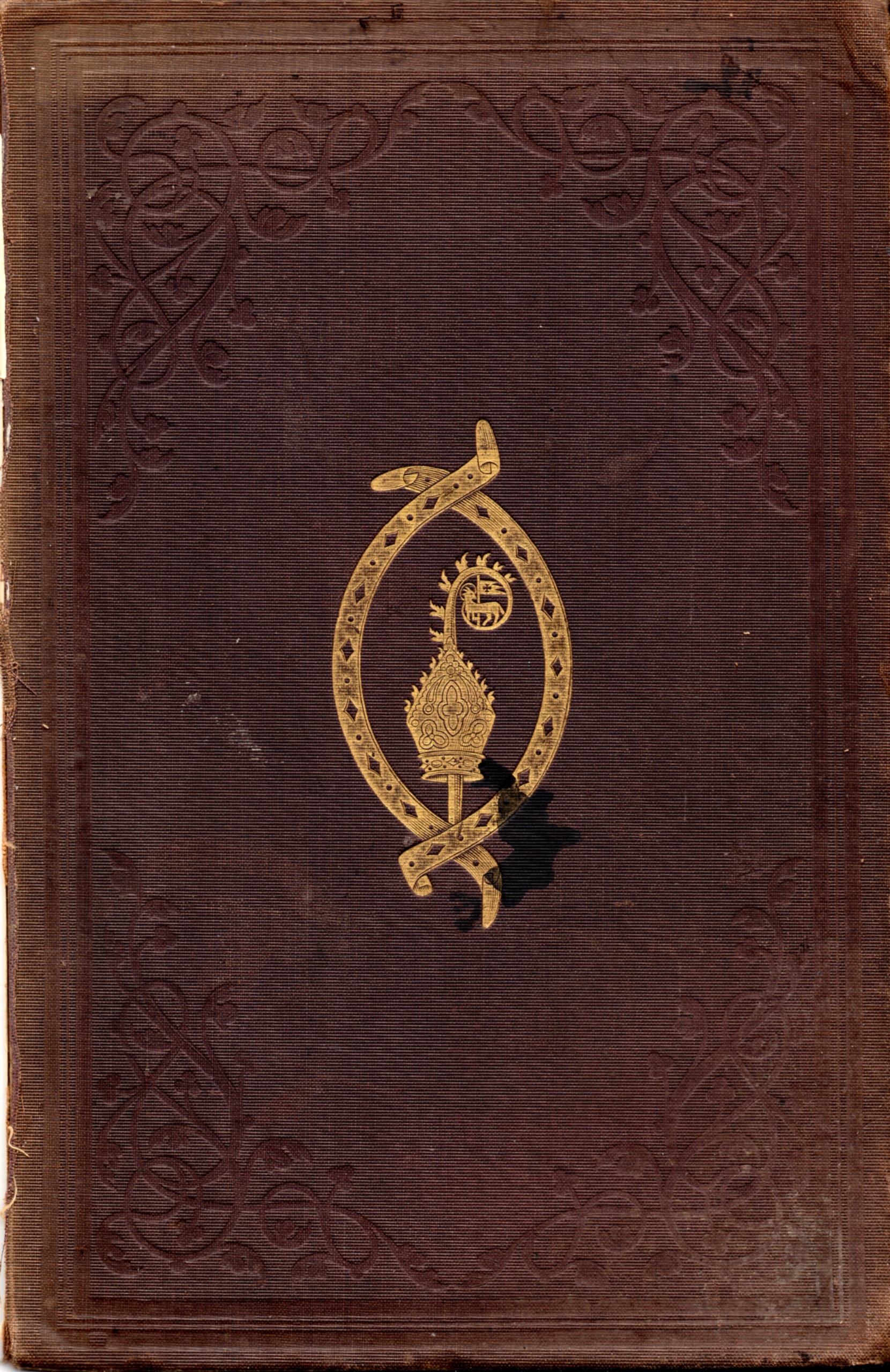
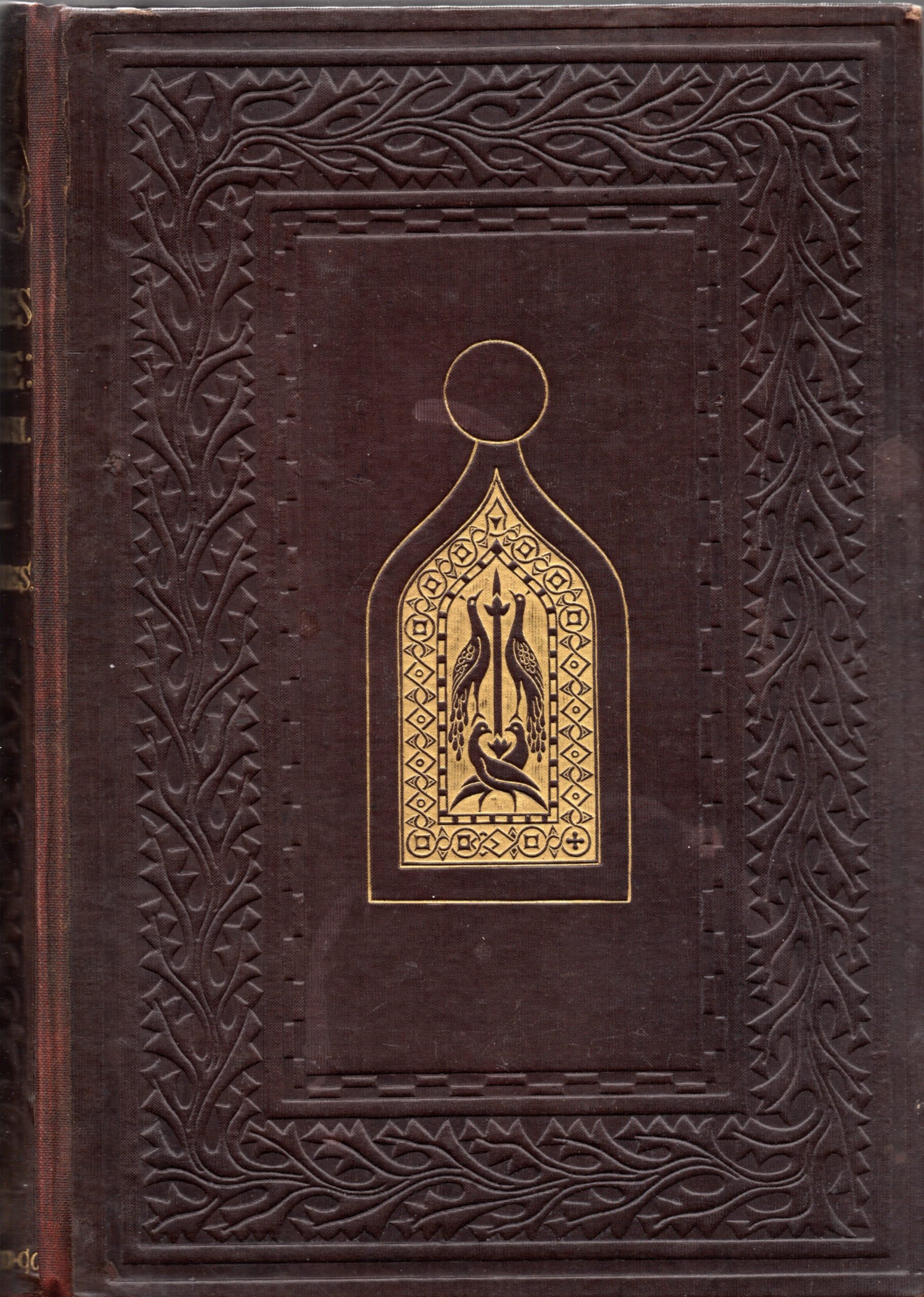
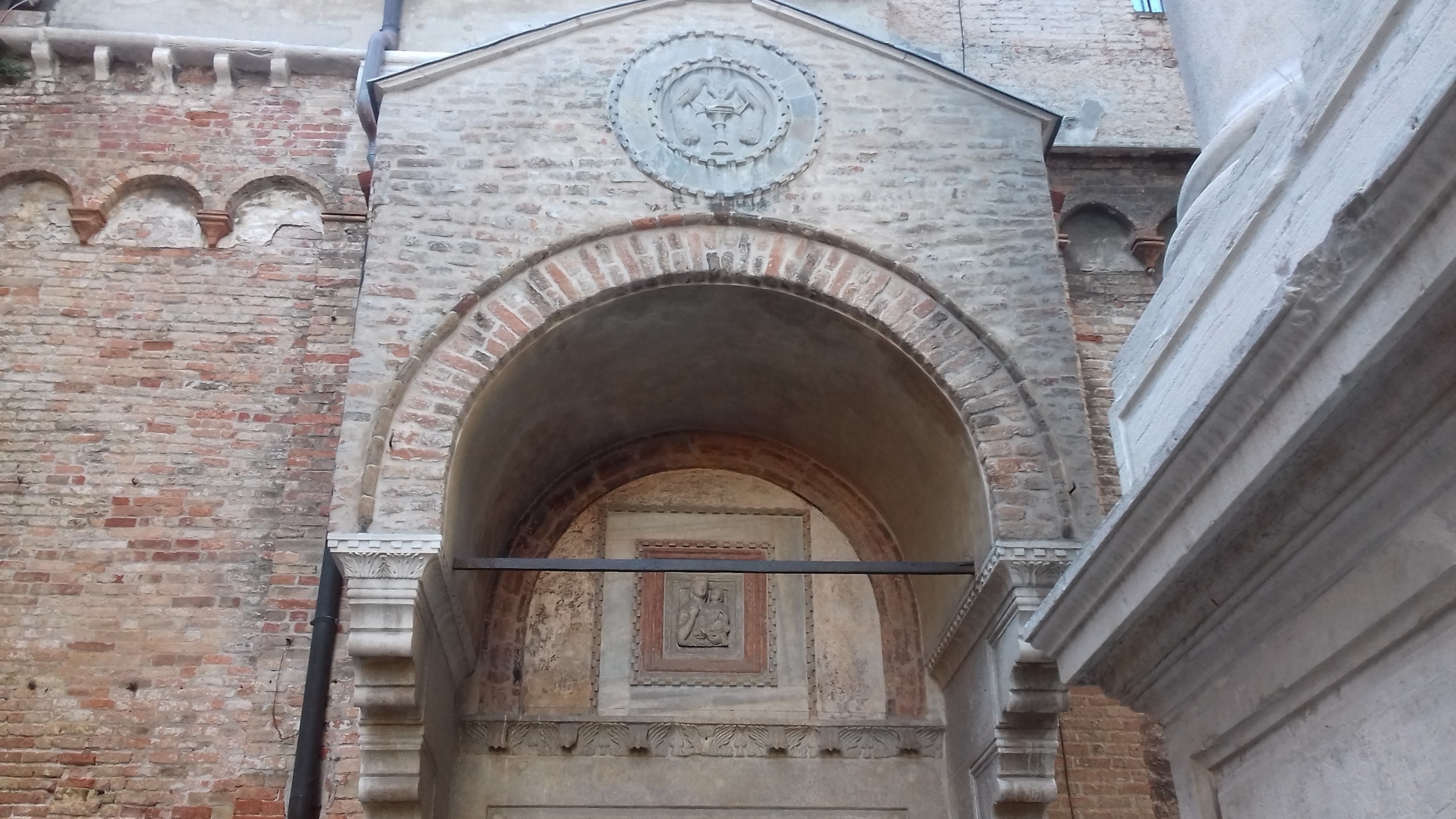
The task of realising this distinctive cover had been allotted to the young ornamental designer William Harry Rogers (1825–73). In the letter to his publisher quoted previously, Ruskin referred to his ‘intelligent arrangement’ of the medallions, and his ‘graceful adaptation of their connecting arabesque’.[32] He also inserted a similar acknowledgement in his ‘Notes to the First Edition of Seven Lamps’.[33] Though the question has not (to my knowledge) been investigated, it appears quite likely that Rogers was also responsible for the very distinctive embossed cloth binding of the first edition of The Stones of Venice, whose gilded motif, derived from the west facade of St Mark’s, features paired peacocks in an allegory of the Resurrection (Fig. 12.10). The gilded central motif derives from St Mark’s, and is illustrated and identified by Ruskin in Stones 2 (Plate XI, fig. 1). Variants of the motif, however, can be found throughout Venice, as on the North Porch of the Carmini church by the Campo Santa Margarita (Fig. 12.11).
Though Ruskin shunned the precedent of Winkles, his decision to integrate specially commissioned plates into an ongoing ‘demonstration’ had a clear parallel in another immediately contemporary study. 1849 saw the publication of Seven Lamps, and it was also the date of Henry Twining’s impressively titled study, On the Philosophy of Painting(Fig. 12.12). In fact, the two new works were reviewed together in the September issue of the Bulletin of the American Art Union, though Seven Lamps merited by far the most attention.[34] Twining was a rather older man than Ruskin, but his likely connection with the extensive family of London tea merchants might well have allowed him to finance his publications with the profits of trade, as did Ruskin. On the Philosophy of Painting was, in the first instance, a comparative discussion of aesthetics which took into account the theories of earlier authors like Edmund Burke and Richard Payne Knight. Its red leather embossed binding could have been more expensive than the cloth binding of Seven Lamps. But the imprinted design held no special meaning. Twining could not have had time to take Ruskin’s newly published Seven Lamps into account when writing his study. But he certainly knew the early volumes of Modern Painters, which had appeared anonymously. He even wrote presciently in his preface: ‘What may yet come forth from this able and eloquent writer, is yet unknown; and it is not impossible that the similarity of our respective aims may produce some slight clashing either of facts or of impressions’.[35]
In fact, Twining’s work on aesthetics had very little in common with the new approach developed by Ruskin. But what permits a useful comparison with Ruskin is his explicit statement of the importance of illustrations, and the practical approach that he adopts with regard to this issue. In his preface, Twining judiciously balances the arguments for and against the inclusion of illustrations:
It may perhaps in general be found preferable to exclude illustrative plates from books on art, unless the author, by executing them himself, is able fully to carry out the principles and effects which it is his object to explain. The impossibility for any individual to enter fully into feelings and impressions which are not his own, and to represent certain characteristic appearances of nature which he has not witnessed, necessarily renders very uncertain the success of any illustrations which are not planned and carried out by the same mind. On the other hand, a work on art, without illustrations, appears incomplete. The rejection of the very means and resources which art supplies, seems an injustice done to her, and tends to engender feelings of doubt as to whether the principles advanced are susceptible of realization by the means which she places at our command.[36]
Twining concludes in favour of ‘intermingling a few plates with the letterpress’.[37] He freely acknowledges the limitations of an argument about art which contains no illustrations. But not all of the illustrative material that he includes in his book seemed to satisfy his stated criterion of being ‘planned and carried out by the same mind’. In the first and second parts, which are concerned primarily with aesthetics and composition, he relies on full-page line engravings after paintings by Correggio and Guido Reni which he presumably commissioned from the wood engraver, George Childs. The same artist was also responsible for the numerous small woodcut designs and diagrams inserted directly into the letterpress. But what appears more consistent with Twining’s expressed criterion is the insertion in the third part of the book of a series of three tinted lithographs. Two of these illustrations indeed signal the role of a kindred ‘mind’—his wife—as their initiator: ‘Mrs H. Twining del’. The third is more modestly labelled ‘Effect by H. Twining.– Geo Bernard. lith./ Day & Son. Lithrs to the Queen’ (Fig. 12.13).
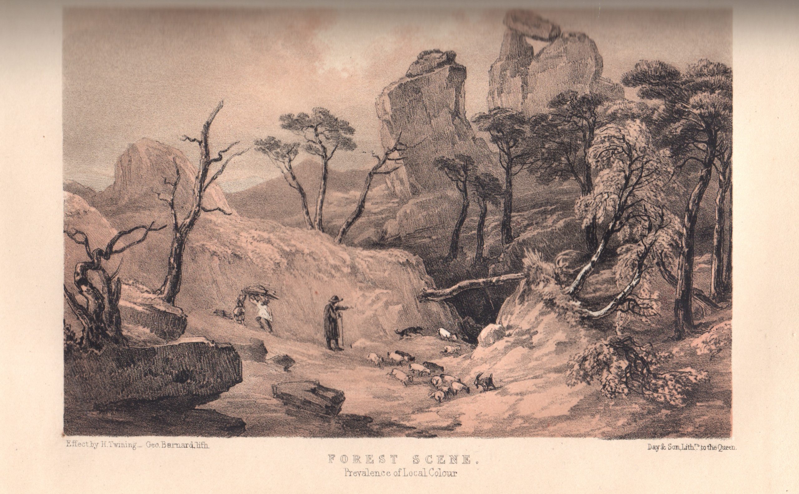
The appearance of these proper names follows the normal practice of crediting all the parties involved in the realisation of the image: both the author of the original drawing and the printmaker and press responsible for its production. But it is pertinent that the citation of an ‘Effect’ by Twining serves as a means of relating the image to the author’s critical point of view. The lithograph in question bears a traditional title, Forest Scene. But it is accompanied by a subtitle: ‘Prevalence of local colour’. Both in this example, and in the case of the two lithographs after original drawings by his wife, such subtitles are designed to refer the reader to the artistic issues that are debated in the adjacent text.
Though unquestionably of minor importance compared to Ruskin, Henry Twining offers a useful comparison. His Philosophy of Painting, published in the same year as Seven Lamps and two years before the first volume of Stones, advances the author’s intention that it should be illustrations reflecting his own ‘mind’ that will guide the argument. In a much more ambitious and original way, Ruskin took the steps to apply this criterion in the sequence of works that followed the daring, though imperfect, achievement of Seven Lamps. But this formulation begs the question of what we conceive to have been the tenor of Ruskin’s ‘argument’, or (to use the term from Modern Painters 1) his ‘demonstration’. For the critic writing in the Illustrated London News, at any rate, there was no doubt on this topic:
The object of Mr Ruskin … in producing these three very portly tomes is—1st, to assert the superiority of Byzantine over Classic architecture; 2ndly, the superiority of Gothic architecture over both; and, 3rdly, to denounce the Classic, or as he calls it, the Renaissance school, as an abomination in itself, to be outlawed by all sane and honest men; and, with singular perverseness, he selects Venice as a field for examples of these three positions.[38]
After making this assessment in the first instalment of his criticism, the reviewer reverted to the issue in his final article with a more concise and cutting judgement which was probably precipitated by Ruskin’s attack on ‘Romanist Modern Art’ in the first volume: ‘we do not fail to discover the intention to set up Protestantism in antagonism to Romanism; and the compatibility between Protestantism and Art distinctly asserted’.[39]
These two summaries of Ruskin’s ‘argument’ do not appear very wide of the mark, in view of his unconcealed ideological bias. But they do not take us much further in identifying the role that illustrations play in Ruskin’s overall ‘demonstration’. The aim of this chapter is therefore to pinpoint the exact articulation of an argument that depends on ready reference throughout the text to every one of the specially devised and commissioned images, and at the same time to take stock of the versatile performance of Ruskin’s chosen collaborators.
Commissions and collaborators: illustrating Venice
The first two volumes of Modern Painters had appeared in 1843 and 1845 without illustrations. Ruskin’s preface to the third volume, which is illustrated, dates from January 1856, and contains a general statement about the use of illustrations to which I will eventually return. Throughout the intervening decade, Ruskin was wrestling with the issue of how best to illustrate his writings. His publications did not, however, follow a simple linear progression. They related to one another like a collection of Chinese boxes, each subsequent initiative being fitted within the overarching project. Seven Lamps, illustrated by Ruskin himself, reappeared in the new edition of 1855 with Armytage’s frontispiece and the other plates re-engraved by Cuff. Stones, the first volume of which was published in 1851, reached its conclusion only in 1853 with the second and third volumes. All these volumes dealing with the architecture of Venice were extensively illustrated by specialist printmakers using a diversity of techniques. But nested within the sequence of Stones was the folio production of large-scale imperial prints which ran to three issues in 1851. Though it failed to fulfil its ambitious programme, Examples of the Architecture of Venice elevated Ruskin’s Venetian project to a new level of artistic achievement.
There can be little doubt that a constant factor throughout this period was Ruskin’s desire to come to terms with the challenge to traditional modes of visual representation that had been posed by the invention of photography. But far from deterring him, the challenge made him all the more determined to diversify, and experiment with, the various modes of printmaking that were available to him. Photography, in the form of the daguerreotype, posed a special challenge in so far as its automatic seizure of fine detail competed with his own role as a draughtsman, which was the necessary prelude to the printmaking process. But photography could never at this point supersede, for the purposes of illustration, the exciting possibilities of media like tinted lithography and even steel engraving. Photography was the grit in the oyster, but Ruskin’s task was to produce pearls.
In the first volume of Stones, the honours were shared between three notable practitioners who were already well into their own successful careers, and represented three different varieties of printmaking. Thomas Goff Lupton (1791–1873) practised the traditional English medium of mezzotint, but had been a pioneer in the use of steel rather than copper plates in his production. James Charles Armytage (1802–97), who retrieved the image of Giotto’s Tower for the second edition of Seven Lamps, was a line engraver, who adopted and considerably refined the recently developed craft of steel engraving. Like Lupton, he had worked with Turner, providing plates for Rivers of France in the 1830s. Thomas Shotter Boys (1803–74) was also a printmaker skilled in exploring a recently enhanced technique. As a lithographer, he employed the new medium that involved drawing with a tool on specially prepared stones, which had developed exponentially in Europe following the end of the Napoleonic wars. But his speciality was the costly medium of tinted lithography, which required the preparation of separate stones for each colour. Ruskin announced in the preface to the first volume of The Stones of Venice that he had planned to use tinted lithography for ‘a considerable number of … larger plates’, but ‘the result was unsatisfactory’, and he had recourse instead to mezzotints.[40] In the event, he still reserved the medium of tinted lithography for a few subjects where accents of colour were indispensable, and of course not susceptible to reproduction by any other print medium, including photography.
There is little risk of mistaking the medium of mezzotint as used in Plate VI of Stones, volume one. Thomas Lupton’s work would have been known to Ruskin from his collaboration with Turner on the series of River Scenery, dating back to the mid-1820s. But there is no requirement in this plate to emulate the dramatic effects of light and shade in a natural landscape that Lupton had conjured up in the case of Turner’s compositions. Ruskin’s juxtaposition of two Types of Towers is an imaginary scene, which places the vast tower of the Campanile of St Mark’s in Venice beside the lowly profile of ‘the lately built college at Edinburgh’, and situates them both beneath an ominous sky (Fig. 12.14). In contrast to his reverence for Giotto’s Campanile, Ruskin had little regard for the tower in St Mark’s square which he evaluated as ‘Renaissance, but as good Renaissance as there is in Venice’.[41] The point of the print was simply to show that ‘noble towers’ were not being built at present. Ruskin’s original drawing is identified on the plate, as is the record of etching (Aq. fort.) carried out by ‘T. Boys’, who would have incised Ruskin’s drawing before the mezzotint process was used to achieve an overall soft brown tonality.[42]
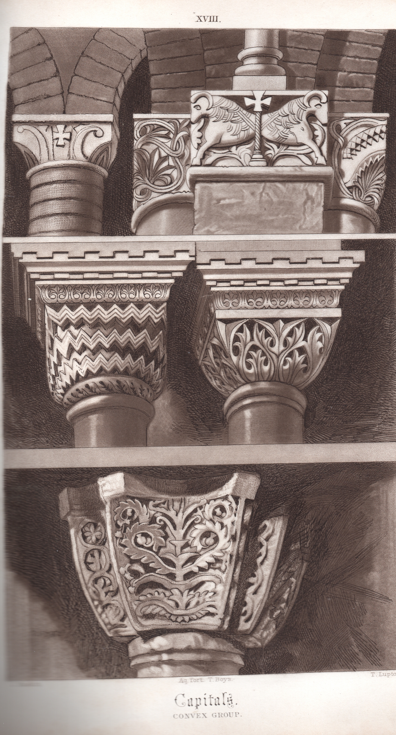
The remaining mezzotints by Lupton in Stones, volume one, are close-up studies of architectural features that are discussed in detail in the course of Ruskin’s argument. It is difficult to see how he could have conducted his analysis with such a degree of precision if these figures were not to the reader’s hand as points of reference, and signalled on adjacent pages of text. Yet Ruskin is keen to point out that the octavo format of Stones will prove adequate only for the comparison of relatively small architectural details, such as the ‘Capitals’ in Plate XVIII (Fig. 12.15). He explains, doubtless with the folio collection of Examples already in mind: ‘I shall not attempt to give any illustrations here of the most elaborate developments of either order; they will be better given on a larger scale’.[43] This does not detract from the fact that the warm tonality of Lupton’s mezzotints, and the way in which they convey mass without sacrificing detail, assist Ruskin in furthering an argument which is linked to a polemic against ‘the so-called Five orders of the Renaissance architects’.[44] The polemic may not prove convincing, and Ruskin’s ‘law’ is not exemplified in all the details that he illustrates. But the reader’s attention is certainly captured by the reference in the text to the features highlighted in the plate: ‘The zigzagged capital is highly curious, and in its place very effective and beautiful; although one of the exceptions which it was above noticed that we should sometimes find to the law stated … above’.[45]
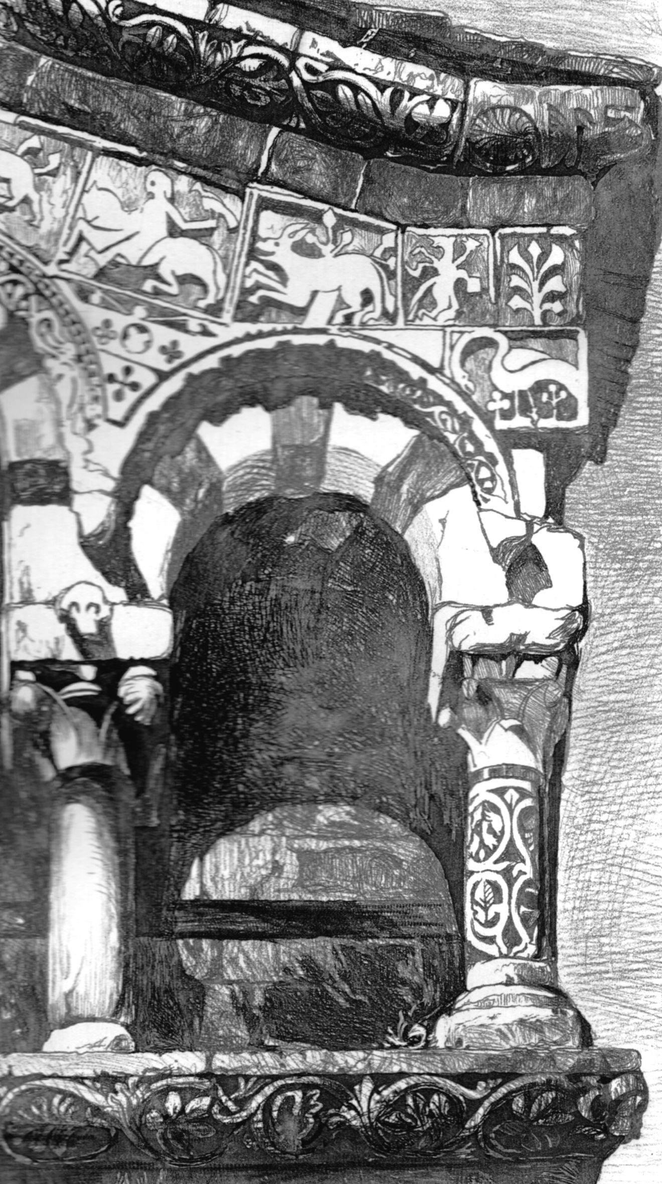
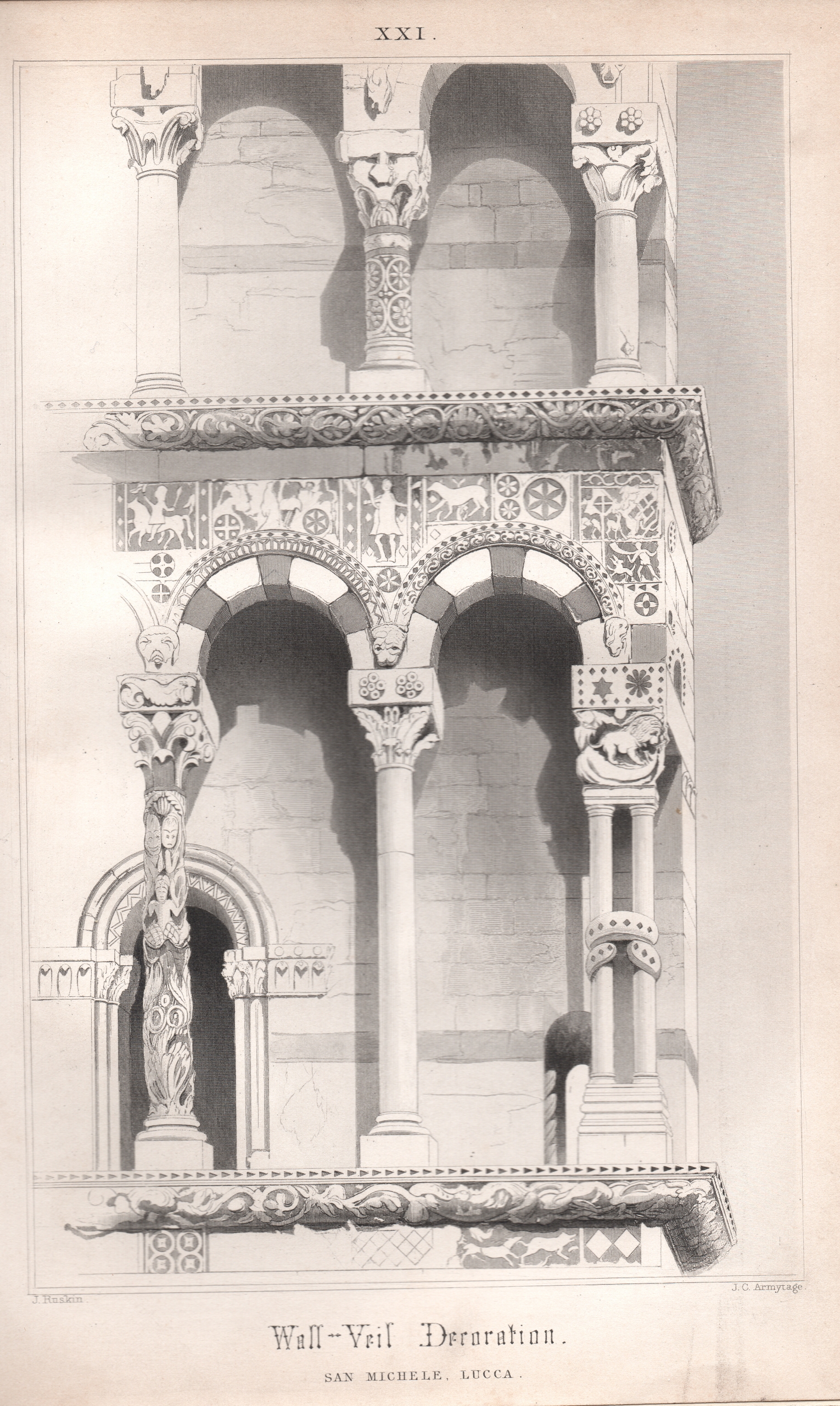
Lupton’s mezzotints render through light and shade the robust detailing of the carved stone. But the plates supplied by Armytage were designed to trace more delicate and intricate surface effects. The fact that two of Armytage’s most effective steel engravings are included in the Appendices to volume one may imply that Ruskin was first in contact with him while he commissioned the new print of the Giotto Campanile in Seven Lamps to replace his own unsatisfactory etching. In Plate XX, which illustrates appendix six, Armytage records in subtle variations of grey what Ruskin describes as ‘a most curious and delicate piece of inlaid design’, to be seen in the Ca’ Trevisan in Venice.[46] But the most striking proof of his artistry is in Plate XXI, where he supplies a full-page image of wall-veil decoration at San Michele, Lucca, to illustrate appendix eight, subtitled ‘The Northern Energy’ (Fig. 12.16). Ruskin admits that he was chided by his ‘good friend Mr Cockerell’ for giving ‘so much praise to this “crazy front of Lucca”’.[47] But he is unrepentant, and refers the reader back to Seven Lamps where he had employed one of his own watercolours of the top two ranges of columns in the production of his soft-ground etching of Plate VI. As mentioned previously, in the case of Ruskin’s print there was no correction for the reversed orientation of the image, which showed the northward edge of the facade as if it were on the southward edge. Armytage must have relied on another of Ruskin’s Lucca drawings which extended to the lowest range of columns, and he has reversed the design on the plate so that the finished print becomes true to appearance. This illustration is a fine tribute to the building Ruskin viewed as ‘perhaps the noblest instance in Italy of the Lombard spirit in its later refinement’ (Fig. 12.17).[48]
Up to this point, the relationship of Ruskin’s ‘stray flowers’ to his argument is not difficult to appreciate. The ‘curious’ character of a ‘zigzagged capital’ can be attested only by displaying it in the company of others. The puny size of a British tower, which would not be registered simply through citing measurements, becomes evident when it is placed beside the looming Campanile of St Mark’s. Once again, the jibe about the ‘crazy front of Lucca’ can only be refuted convincingly if another of Ruskin’s careful drawings is mobilised to demonstrate its fine quality. But in the case of another plate for the volume, the connection between text and image becomes rather more complicated. The tinted lithography of Thomas Shotter Boys, a medium which Ruskin originally intended to be used throughout the volume, first makes its mark when Ruskin decides to gloss the comment of the French traveller Philippe de Commynes, who noted of Renaissance palaces in Venice that they featured ‘many a large piece of porphyry and serpentine upon their fronts’.[49] Plate I manifests the circles of deep purple and blue shot with green which enrich the greyish stone facades of Ca’ Trevisan and Ca’ Dario.
The complication arises, however, in Boys’s subsequent Plate VIII, Decoration by Disks, which employs the same range of colour tints in a vivid representation of relief decoration on the facade of the Palazzo dei Badoari Partecipazzi (Figs. 12.18 and 12.19).[50] It is known that Ruskin possessed a daguerreotype of this palace, as it would have appeared from the entry to the Campo.[51] It is obvious from the same daguerreotype that the building had fallen into disrepute, being festooned with laundry. Indeed, Ruskin added a note in the third volume of Stones attesting that it was ‘now a ruin, inhabited by the lowest orders’.[52] But the passage in Ruskin’s text adjoining Boys’s lithograph makes no mention of this degradation. It focuses on the perceptual (and conceptual) issue of how such a representation can interpret features that would never be observed in such fine detail through the eyes of a spectator located on the ground. In the process, Ruskin needs to demonstrate the astute decision of the ‘Byzantine’ sculptor who has displaced onto a circle of stone rings what are metaphorically termed the ‘eyes’ of the peacock, that is to say, the distinctive circular patches of colour displayed on its plumage.
Here, then, enters the stratagem of sculpture; you must cut the eyes in relief, somehow or another; see how it is done in the peacock on the opposite page; it is done so by nearly all the Byzantine sculptors: this particular peacock is meant to be seen at some distance (how far off I know not, for it is an interpolation in the building where it occurs, of which more hereafter), but at all events at a distance of thirty or forty feet; I have put it close to you that you may see plainly the rude rings and rods which stand for the eyes and quills, but at the just distance their effect is perfect.[53]
Ruskin here addresses the issue of how (and when) to represent actual physical distance, in relation to the conditions of illustrating (and reading) a text. But his interest in this problem was not to be taken further in the remaining volumes of Stones. The list of ‘Books published by Smith, Elder and Co.’ that was distributed in 1851 announced hopefully: ‘The Second Volume of The Stones of Venice is in preparation’. But Ruskin did not bring his great project to a timely conclusion. When volume two was eventually published in 1853, the text opened with the author’s ‘Advertisement’ that ‘the subject has extended to three’. But it reassured his readers that volume three was ‘already in the press’.[54]
Teaching through examples: the large prints of 1851
Ruskin had not been idle in the interval that followed the publication of volume one. He was occupied at first in planning Examples of the Architecture of Venice which was, on one level, no more than a ‘spin off’ from the project of Stones. But this was also, by far, his most ambitious venture to date in the commissioning of new prints. The rationale for this venture was provided succinctly in the prospectus circulated in 1851:
Mr Ruskin has found it impossible to reduce to the size of an octavo volume all the sketches made to illustrate his intended Essay on Venetian Architecture; at least without loss of accuracy in detail: he has thought it better to separate some of the plates from the text, than either to throw the latter into a folio form, or diminish the fidelity of the drawings. The subjects which are absolutely necessary to the understanding of the essay will alone therefore be reduced, and published with the text; the rest will be engraved in the size of the drawings, and will form a separate work, which, though referred to in the text, will not be essential to the reading of it. The Essay will thus be made accessible in a form involving the least possible expense to the general reader, and those who may be more deeply interested in the subject may possess the book of illustrations executed on a scale large enough for the expression of all details.[55]
It is not difficult to account for the failure of Ruskin’s strategy of appealing to an elite among his readers, who still awaited the further volumes of the interminable ‘Essay’, and were being invited to subscribe to twelve Folio Imperial editions, priced at one guinea each. Examples of the Architecture of Venice was forecasted to include at least twelve new mezzotints (to name only the most costly medium). But Ruskin succeeded in publishing no more than two mezzotints in the three issues of plates. If he had clearly over-reached himself, and perhaps tested the limits of his father’s generosity, the set of plates in different media that were obtained from his chosen printmakers marks the most ambitious stage in his pursuit of the potentialities of ‘illustration’.
As the prospectus shows, a prime motive was to be faithful to the character of Ruskin’s own drawings, which were frequently of a size that demanded imperial rather than octavo dimensions. But in the same measure as these new prints rendered more exactly through their proportions the outcome of the physical process of drawing, they also invited further textual testimony as to the phenomenological status of the subjects under review. Returning again to Plate VIII of the first volume of Stones, Ruskin had paid attention to the relationship between his rendering of the Byzantine sculptor’s work, and the issue of how the relief in question might appear to the viewer, when observed from a distance. As will be shown here, he accentuates this relation when prompted by the larger format. In the brief commentaries that accompany the plates of Examples, Ruskin’s bond with the imagined reader is further developed as he invests his commentary with details of his experience in the process of initiating them.
There is however an important difference, in this regard, between the status of the two mezzotints and that of the remaining plates. Both the mezzotints are derived from daguerreotypes. Ruskin was fairly sensitive, at this stage in his career, to the accusation that the aid of photography had dispensed him from undertaking the laborious drawings on which he ostensibly set such store. The long extract from the preface to Examples that follows here is worth giving in full, since it addresses such criticisms (mostly applying to Seven Lamps) by countering that his drawings have, in fact, been following a specific artistic tradition, which he terms ‘Rembrandtism’. In the light of this hallowed precedent (i.e., the chiaroscuro style of the Dutch master) he asserts that he is fully authorised to make use of his daguerreotypes ‘without scruple’, despite the fact that the photographic registration of the effects of light and shade is purely automatic. But he undertakes to inform his readers when doing so:
I never draw architecture in outline, nor unless I can make perfect notes of the forms of its shadows, and foci of its lights. In completing studies of this kind, it has always seemed to me, that the most expressive and truthful effects were to be obtained (at least when the subject presented little variation of distances) by bold Rembrandtism; that is to say, by the sacrifice of details in the shadowed parts, in order that greater depths of tone might be afforded by the lights. Studies made on such a system, if successful, resemble daguerreotypes; and those which I have hitherto published, both in the “Seven Lamps”, and in the text of the present work, have been mistaken by several persons for copies of them. Had they been so, I should certainly not have stated them to be copies of my own drawings; but I have used the help of the daguerreotype without scruple in completing many of the mezzotinted subjects for the present series; and I much regret that artists in general do not think it worth their while to perpetuate some of the beautiful effects which the daguerreotype alone can seize.[56]
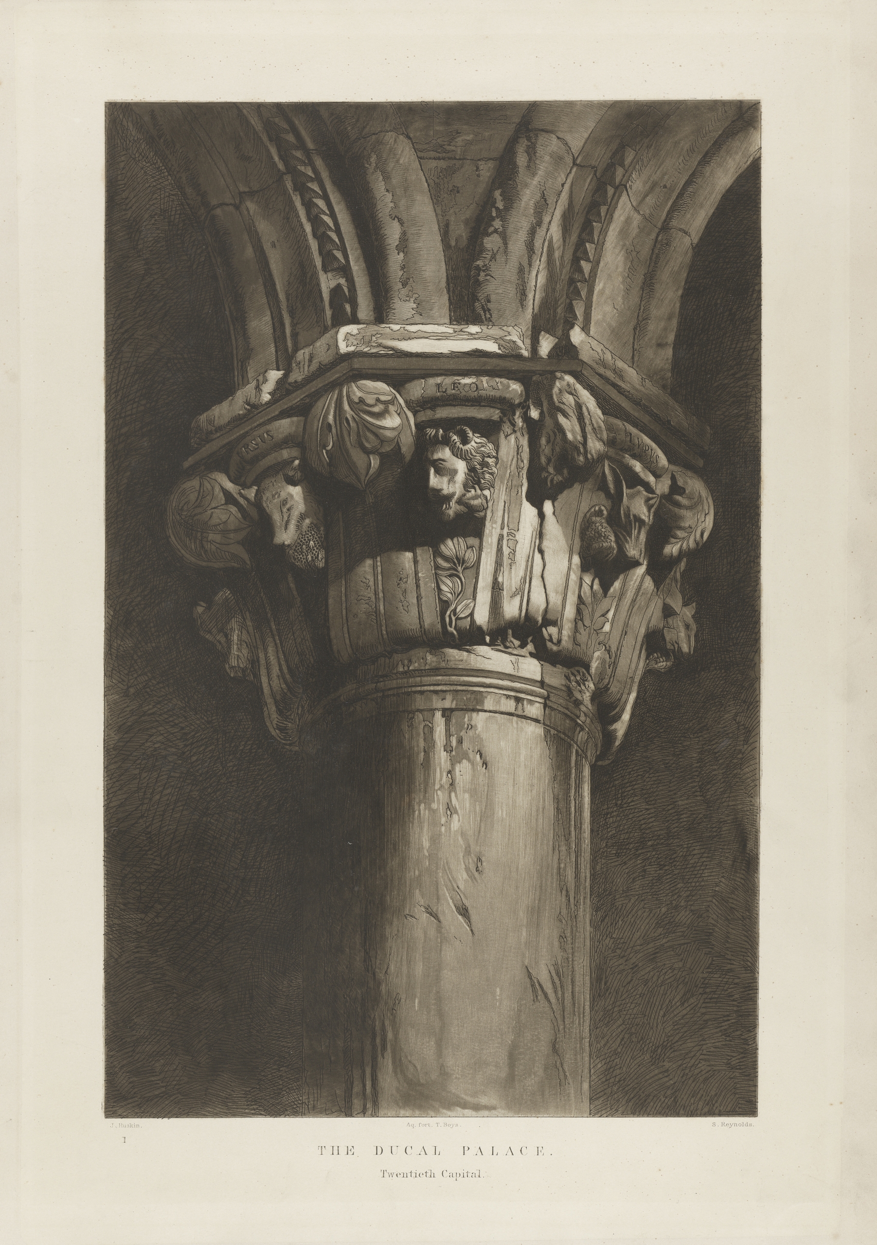
In the event, there were not to be ‘many’ mezzotints published in Examples. But the two that were included stand out as spectacular achievements. Ruskin and his collaborators had produced prints that were well worthy of the accolade of ‘Rembrandtism’. The first in order, Plate 1, entitled The Ducal Palace: 20th capital, relates to a daguerreotype of this architectural feature which Ruskin had taken with his servant, Hobbs (Fig 12.20). The etching of the print had been undertaken by ‘T. Boys’ (again, possibly a relative of Thomas Shotter Boys, the lithographer). Yet the accomplished mezzotinting was the work of Samuel William Reynolds, the son of probably the most famous English printmaker of the first part of the century, who had born the same name. Ruskin seized the opportunity to express his pride in the preliminary drawing for the print which he had made after the daguerreotype. Tiny features which he recorded became plain when scrutinising the mezzotint: ‘It is drawn on a large scale that its details may be fully visible; even down to the bees which cluster on the honeycomb in the bear’s mouth’ (Fig. 12.21).[57]

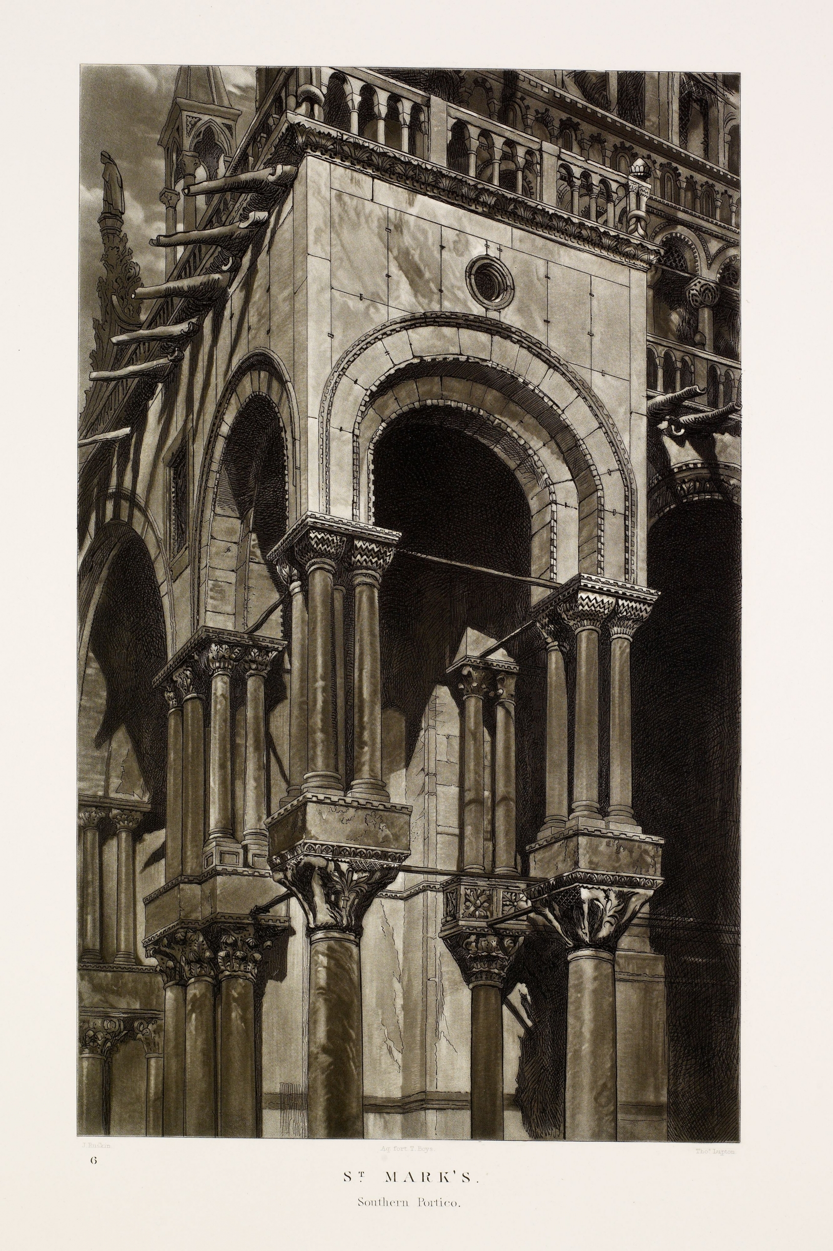
A similar sequence of stages preceded the fabrication of the second mezzotint: Plate 6, representing St Mark’s, Southern Portico (Fig. 12.22). In this case, T. Boys was once again responsible for the etching, but Ruskin enlisted Thomas Lupton (his collaborator in the first volume of Stones) for the mezzotint work. There is a surviving daguerreotype taken by Ruskin which comes very close to this subject, though it does not show exactly the same projecting feature of the facade of St Mark’s as the one selected for the drawing. His commentary, however, applies equally to the daguerreotype in question, and to Lupton’s fine mezzotint, as each succeeds in rendering in striking perspective the respective architectural feature. The plate is advertised as being the outcome of Ruskin’s long-standing deliberations on how a facade of this type should be rendered: ‘I have long felt the difficulty of conveying a true impression of richly decorated buildings … but I believe the best way is to venture a steep perspective, and calculate the arrangement of the forms of the building, on the supposition of the horizontal line being considerably below the bottom of the picture. I have done so in this plate’.[58]
Close attention to the prints included in Examples, with their revealing commentaries, underlines how far Ruskin was from distributing ‘stray flowers’ along the way. Virtually every plate offers some evidence of his endeavour to involve the reader in an imagined relationship that is analogous to the experience of the actual building. This concern runs the risk of self-parody. Plate 9, Byzantine Ruins: In Rio di Ca’ Foscari, is a tinted lithograph executed by Thomas Shotter Boys which employs pink colouring to bring out the vestiges of earlier construction in a range of buildings bordering on a canal (Fig. 12.23). Ruskin explains, or indeed complains: ‘There was no way of drawing this arch but out of a gondola immediately underneath, in a position from which it was quite impossible to see the upper portal’.[59]

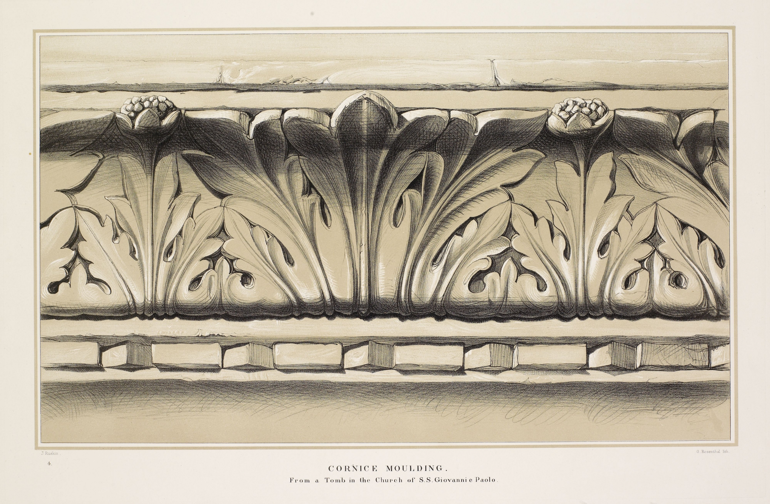
Yet his strategy remains consistent throughout. He does not see the role of illustration as being a matter of creating ‘pictorial arrangements’, that is, presuming an aesthetic distance that divides the image from the reader.[60] It is essential that the reader should be prompted to engage in the critical process, rather than taking the fidelity of the printed image for granted. So Ruskin is keen to point out, in the case of a detail in the engraving of Plate 5 by R. P. Cuff: ‘This curve I traced on the stonework itself, in order to make sure of its accuracy’ (Fig. 12.24).[61] Plate 4, a lithograph reproducing Cornice Mouldings from a Tomb in the Church of SS Giovanni e Paolo, gives rise to an instruction on how it might be viewed by the reader, not from close to, but at a specified distance: ‘given its actual size … if placed at a distance of fifteen feet, it will give very nearly the true effect of the sculpture, which was intended to be seen at that distance’ (Fig. 12.25).[62]

These instances from the plates of Ruskin’s most luxurious set of illustrations would probably not have allayed the doubts expressed in the Illustrated London News. Are they indeed too literal in the manner in which they inveigle the reader into ‘going hand-in-hand with the author in the broader field of criticism’? The countervailing point that Ruskin is encouraging his readers to be self-critical, or at least self-aware, in their response to such visual representations should not be lightly brushed aside. But there is one particular instance in Examples where he employs an illustration to enshrine a more substantive element of his ‘demonstration’. The reviewer had identified Ruskin’s ‘object’ as being ‘to assert the superiority of Byzantine over Classic architecture’ and ‘the superiority of Gothic architecture over both’. In his judgement, Ruskin also sought ‘to denounce the Classic, or as he calls it, the Renaissance school, as an abomination in itself, to be execrated and outlawed by all sane and honest men’. Plate 12, a tinted lithograph by G. Rosenthal, is a subtle rendering of ‘door heads’ in Ramo Dirimpetto Mocenigo, which Ruskin has selected for a commentary (Fig. 12.26). Describing two of its decorative features, he initially notes ‘an example of the simple shield—pendant by its rude thong (as a mere heraldic device, how far more manly than our beast-borne escutcheons)’. He then proceeds to comment that ‘the piece of sculpture, with the two small rosettes above the gable, is the easily recognisable fragment of a Greek Cross … which has been cut away to insert a shield of the Renaissance period’ (Fig. 12.27).[63] Within the scope of this brief commentary, Ruskin has struck a glancing blow at the manners of the English aristocracy, and then proceeded to highlight an act of iconoclasm perpetrated by the ‘Renaissance school’ on its Byzantine precursor. He hastens to defend his method through asserting the absolute primacy of the unique observation. As he puts it: ‘Every little fact of this kind becomes of importance when it is regarded in its proper connection with others; and all such facts may be rendered meaningless by a sufficient degree of what is called “general information” in the examiner’.[64]
Ruskin’s defence of ‘fact’ is explicitly directed at the content of one of the reviews of Stones volume one. The reviewer in question (‘I forget which, and it is not worth research’) had taken exception to the lengthy passage which involved ‘one of the most important facts stated in the opening chapter’.[65] The episode to which Ruskin refers does indeed rank as a salient example of his idiosyncratic mode of argument. It was a question of describing his ascent, by ladder, to inspect the tomb of Doge Vendramin, and his consequent discovery that the sculptor had failed to complete the far side of the venerable effigy that is invisible to the viewer on the level of the ground. Ruskin’s abhorrence of the sculptor’s lack of scruple was vindicated further in the text by the revelation that he was, at a later date, transported from Venice for forgery.[66]
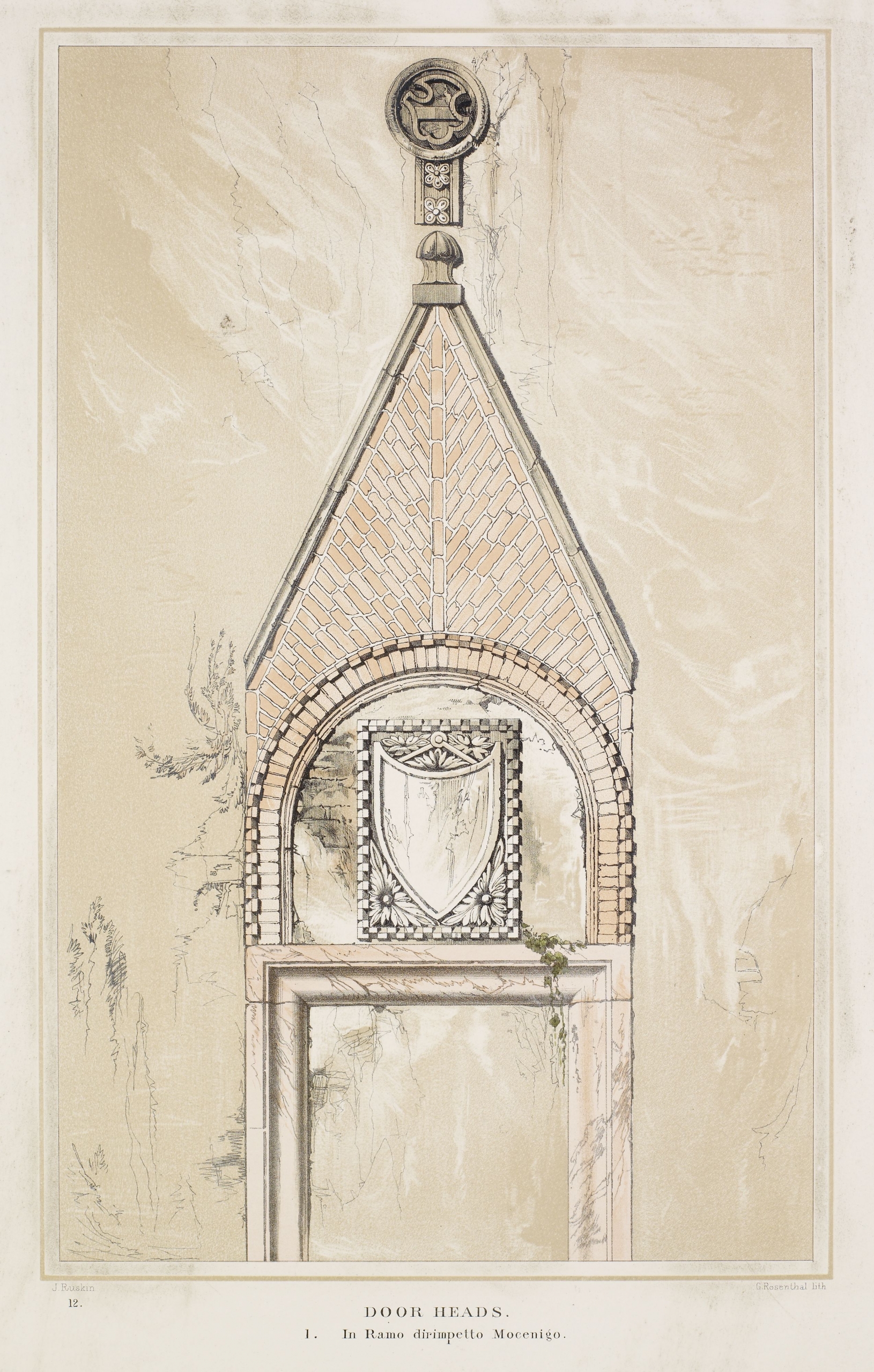
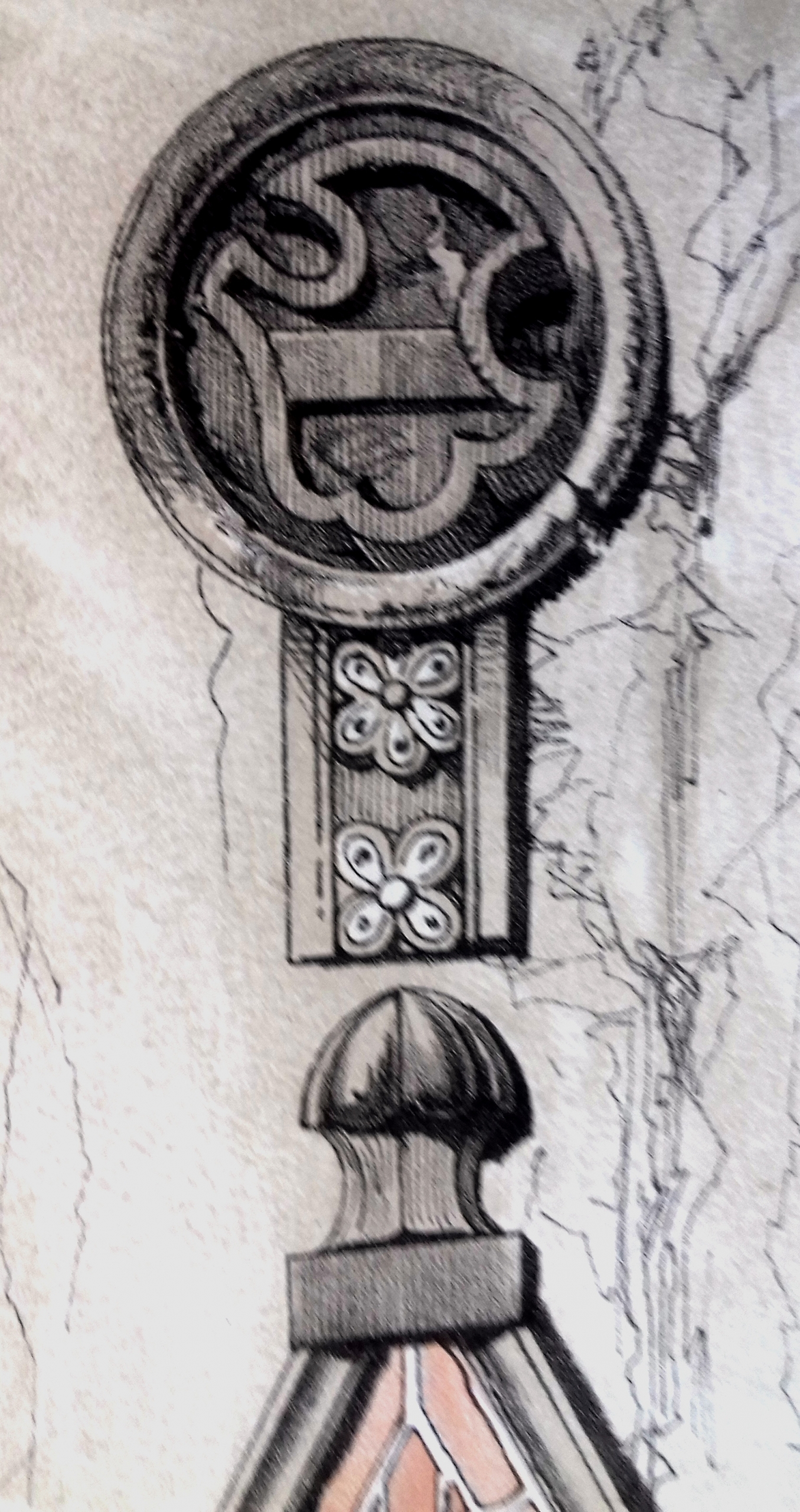
Illustration and experience: beyond the test of the daguerreotype
This is no reason to delve further into this celebrated example of Ruskin’s passionate advocacy, except to note the point that he chooses to recall it here, in one of the last plates for Examples. On one level at least, this repeated insistence on ‘fact’, as opposed to ‘general information’, can be regarded as having drawn him inevitably in the direction of illustration, since only the production of precise visual evidence could be robust enough to replicate the certainty attained through close observation. Yet no such indirect evidence, not even that which was obtained by means of the daguerreotype, could pass the ultimate test of conformity to experience. Hence it became the task of Examples to school the reader in the sort of mental adjustments that were needed before the printed image would correspond to Ruskin’s own perceptions in the material world.
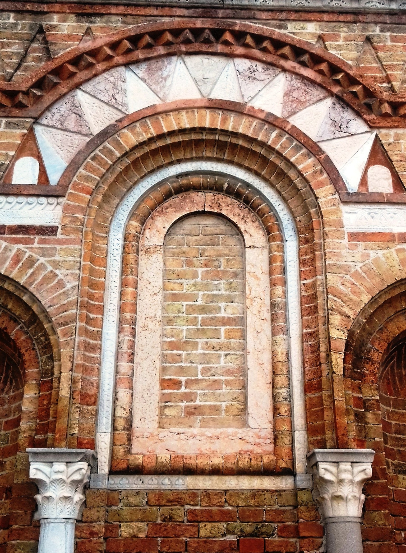
At the opposite end of the scale from the mass of ‘general information’, one might say, stands the ‘little fact’ which is capable of signalling a truth. But such ‘facts’ are communicated only by the truthful representation of identified particulars. What emerges from the study of Ruskin’s illustrations over this range is the point that he was always pressing his select collaborators to advance their technical capacities in a period when Louis Daguerre’s invention had galvanised the world of print media. When volume two of Stones was finally published in 1853, the impressive talent of Armytage was once again brought to the fore. For the first time, steel engravings that were directly derived from daguerreotypes without further mediation were included. Ruskin noted the innovation with reference to his Plate XVIII, Windows of the Fifth Order: ‘This plate is not from a drawing of mine. It has been engraved by Mr Armytage, with great skill, from two daguerreotypes’ (Fig. 12.28).[67]
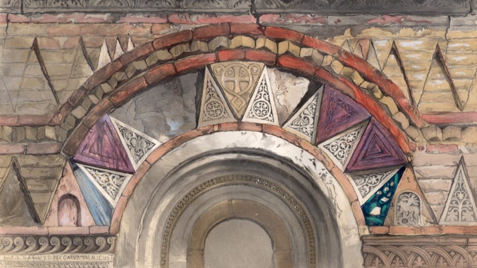
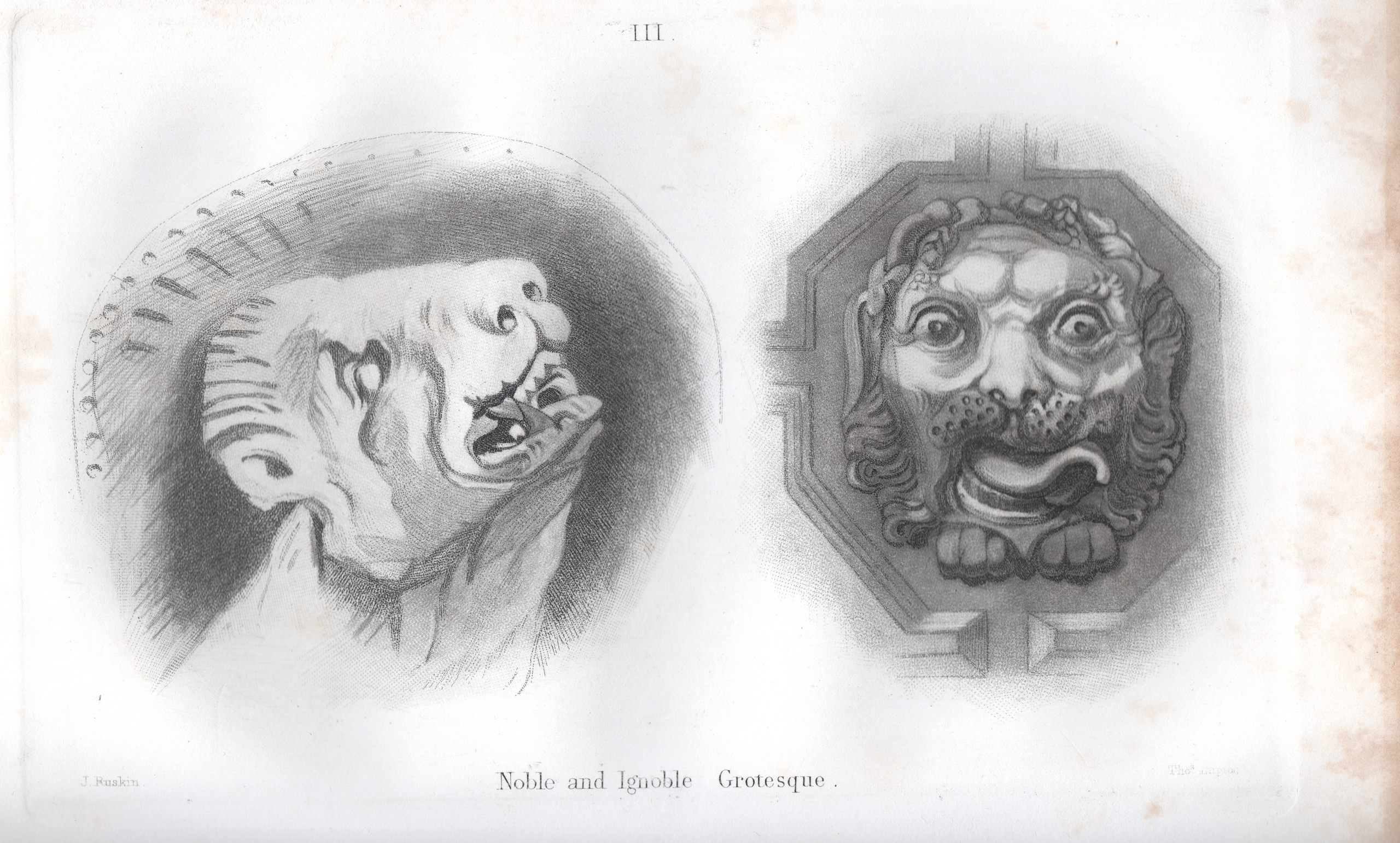
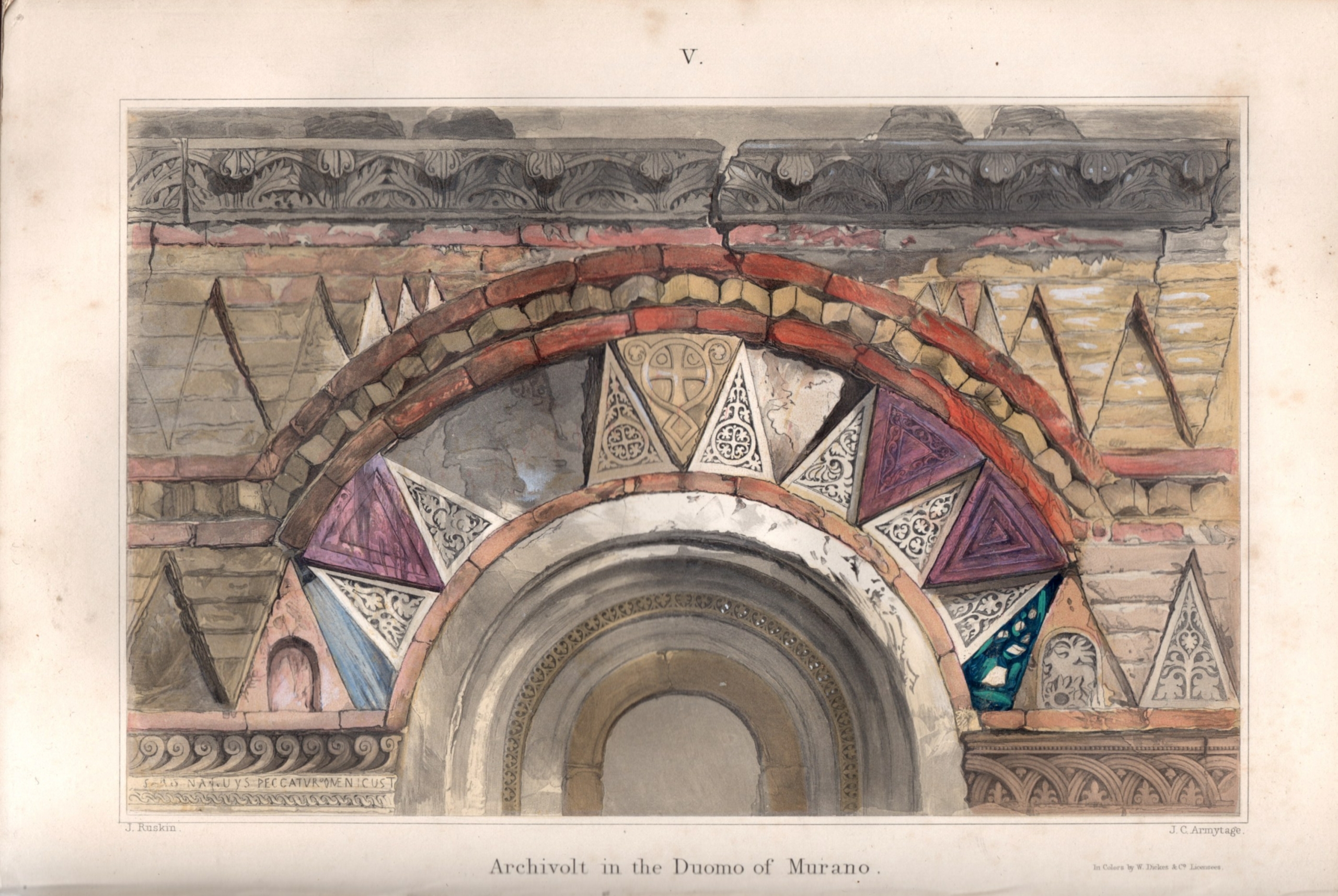
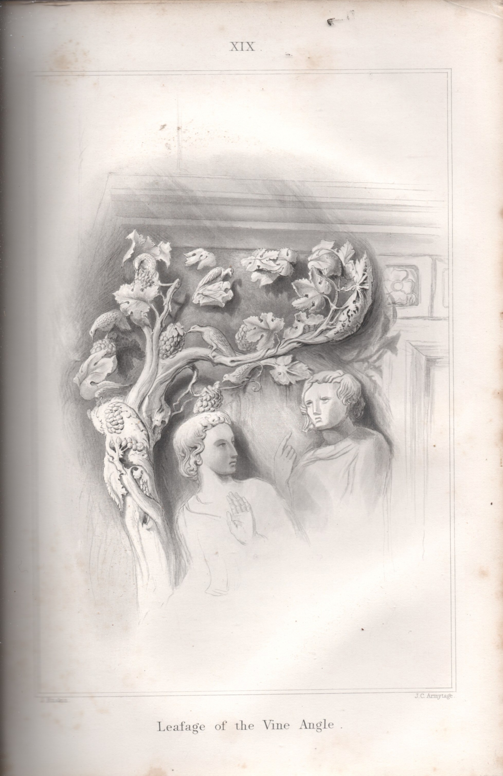
After the publication of the first volume of Stones, and the three instalments of Examples, Ruskin continued in effect to commission a wide range of prints for the remaining two volumes, and also for the forthcoming new volumes of Modern Painters, which resumed publication in 1856. By this stage, he was well aware of the different talents in which he could place his trust. R. P. Cuff, who was revivifying Ruskin’s etchings for the future editions of Seven Lamps, also engraved several plates of architectural details for volumes two and three of Stones. Lupton contributed a stunning mezzotint of Noble and Ignoble Grotesque to volume three (Fig. 12.29).[68] But it was perhaps J. C. Armytage, the steel engraver who had solved the problem of the Giotto Campanile, who continued to provide the most varied and effective adjuncts to Ruskin’s text. For Stones, volume two, he collaborated with the colour processing facility of William Dickes to create the brilliant multi-coloured image of the Archivolt in the Duomo of Murano (Figs. 12.30 and 12.31).[69] He also continued to provide fine steel engravings, such as Plate XIX, Leafage of the Vine Angle (Fig. 12.32).[70] In praising this sculptural feature of ‘extreme refinement’, Ruskin was keen to point out that (as in the case of the Vendramin tomb) the sculpture needed to be viewed also from behind, since ‘only half the finish of the work can be seen in the Plate’.[71] He made a further meta-critical point when he needed to account for the strong colouring of Armytage’s exquisite Plate IV of Mosaics of Olive-tree and Flowers in volume three (Fig. 12.33): ‘I have printed the whole plate in blue, because that colour approaches more nearly than black to the distant effect of the mosaics’.[72]

Within the context of the present volume, it is evident that Ruskin’s involvement in the collaborative practice of illustration can be taken as a pointer to the wider ‘ecological’ import of his mission. In the process of effecting a dialogue between word and image, the illustrations also enable Ruskin to codify an ongoing process of bodily response to the built environment. Himself an assiduous draughtsman and a one-time etcher, he invests himself as an author in the materiality of the illustrated page, not simply to record but to reimagine the phenomenal presence of the visible world. Ruskin’s ‘flowers’ are not ‘stray’. They create a habitat.
Acknowledgements
I extend my thanks to Antonella Pelizzari and Scott Wilcox of the Yale Center for British art, who impelled me to think again about Ruskin’s use of daguerreotypes for illustration; to Susanna Avery-Quash for inviting me to speak on the subject at Ruskin conference at the National Gallery in 2019; and to Paul Tucker for encouraging me to broaden the enquiry in the memorable setting of the former monastery of San Francesco at Lucca.
Citations
[1] Illustrated London News, 31 December 1853, p. 604.
[2] See A Catalogue of New and Standard Books published by Smith, Elder, & Co. (62 Cornhill, London, October 1853), p. 2.
[3] The different techniques employed in these illustrations will be discussed further in relation to specific examples cited in the text. It should be noted, however, that all of them were printed separately, on paper of a different weight, and accompanied by a protective tissue. The small woodcuts were an exception to this rule, being inserted directly in the letterpress. That Ruskin was directly responsible for the many woodcuts, which he not only designed but cut himself, is attested by an amusing comment in his note referring to one of them: ‘I am sometimes obliged, unfortunately, to read my woodcuts backwards, owing to my having forgotten to reverse them on the wood’. See The Stones of Venice, volume two (London: Smith, Elder, and Co., 1853), p. 128.
[4] It appears that the last noteworthy occasion when attention was devoted to the study of Ruskin’s use of illustrations in his early editions was in 2003, when Alan Davis curated the exhibition, ‘“A Pen of Iron”: Ruskin and Printmaking’, at The Ruskin, Lancaster, and wrote a catalogue essay on the subject. He followed this up with an article, ‘“What I intended the plates to be”: Ruskin’s Etchings for The Seven Lamps of Architecture’, in The Ruskin Review and Bulletin 1:2 (2005): pp. 3–15. Davis has acknowledged his debt to an earlier study: Roy Haslam, ‘“For the sake of the subject”: Ruskin and the Tradition of Architectural Engraving’, in Michael Wheeler and Nigel Whiteley (eds.), The Lamp of Memory: Ruskin, Tradition and Architecture (Manchester: Manchester University Press, 1992), pp. 138–66.
[5] John Ruskin, Modern Painters [1843], fourth edition in small form (Orpington and London: George Allen, 1903), vol. 1, p. ix.
[6] Ruskin, Modern Painters, fourth edition (1903), vol. 1, p. 113.
[7] John Ruskin, Modern Painters, fifth edition (Orpington and London: George Allen, 1894), vol. 2, p. 175.
[8] John Ruskin, The Seven Lamps of Architecture (London: Smith, Elder, and Co., 1849), p. v.
[9] Joan Evans (ed.), The Diaries of John Ruskin (Oxford: Clarendon Press, 1958), vol. 2, p. 372.
[10] Evans (ed.), The Diaries of John Ruskin, vol. 2, p. 373.
[11] The somewhat haphazard publication history of Seven Lamps may account for the fact that copies in circulation not infrequently have individual leather bindings. All my references given here to this publication are to my personal copy of the first edition of 1849, in the embossed cloth binding by Harry Rogers. This copy includes an ‘errata’ insert, and it also contains as a supplement: Smith and Elder’s Catalogue of New and Standard Books, dated October 1853.
[12] Ruskin, Seven Lamps, p. vi. Of the two plates in question, Plate VI is probably based on the watercolour in the Ashmolean Museum, Part of the Facade of the destroyed Church of San Michele in Foro, Lucca, sketched in Colour (Accession no. WA. RS. Ed. 084). Since Ruskin has not allowed for the left/right reversal of the image through the printing process, the plate therefore shows the northward end of the facade as if it were on the southward side. (J. C. Armytage corrects for this reversal in his engraving of Plate XXI for Stones of Venice, volume one, which shows a larger section of the same facade.) Plate VIII, of the window from Ca’ Foscari, relates to a watercolour in the collection of Ruskin’s works held in the Library of King’s College, Cambridge.
[13] Ruskin, Seven Lamps, p. vi.
[14] This plate, captioned as Balcony in the Campo San Benedetto, Venice, represents a feature of the much-restored building now known as the Palazzo Fortuny, after the nineteenth-century painter who made it his home, and ultimately his museum. Ruskin picks up the delicate incised design on the stonework of the balcony, and illustrates it again as his fig. 8 in the composite arrangement of Plate XII, Fragments from Abbeville, Lucca, Venice, and Pisa. He writes: ‘This arabesque, relieved as it is in darkness from the white stone by the stain of time, is surely both beautiful and pure; and as long as the renaissance ornament remained in such forms it may be beheld with unreserved admiration’ (Seven Lamps, p. 125).
[15] Ruskin, Seven Lamps, p. 118.
[16] Ruskin, Seven Lamps, p. vi.
[17] This letter to Smith, dated Folkestone, 23 April [1849] is enclosed in a first edition of Seven Lamps which is currently in the possession of Contact Editions (Toronto). I am most grateful for the communication of a transcript.
[18] Ruskin, Seven Lamps, p. 134.
[19] John Ruskin, The Seven Lamps of Architecture [1849] (London: George Allen, New edition, 1880), pp. v–vi. It is worth noting that Ruskin’s biographer, W. G. Collingwood, took a rather different view of the publishing history of Seven Lamps, after Ruskin had shown him the very room in the hotel where the last plate had been ‘bitten’: ‘He was not dissatisfied with his work himself; the public of the day wanted something more finished. So the second edition appeared with the subjects elaborately popularized in fashionable engraving. More recently they have undergone reduction for a cheap issue. But any book lover knows the value of the original “Seven Lamps” with its San Miniato cover and autograph plates’. See W. G. Collingwood, The Life of John Ruskin (London: Methuen, 1911), p. 66. The debate about the quality of Ruskin’s own etchings, by comparison with Cuff’s versions, had already developed when P. G. Hammerton published his Etching and Etchers in 1868, and coincided with the new attention given to the medium in what was known in Britain and France as the ‘Etching Revival’. Hammerton asserted of Ruskin’s etchings: ‘Their imperfection is seen at once and as quickly forgiven’ (quoted in Alan Davis, ‘“I am Not Answerable for the Sky”: Ruskin, P. G. Hamerton, and Printmaking’, The Ruskin Review and Bulletin 11:1 (2015): p. 19).
[20] The forenames and dates of this important engraver have been subject to some confusion, but ‘James Charles’ appears most likely, and his lifespan 1802–97.
[21] John Ruskin, The Seven Lamps of Architecture [1849], second edition (London: Smith, Elder, and Co, 1855), p. xv.
[22] For a discursive account of the history of the new medium, see Basil Hunnisett, Engraved on Steel: The History of Picture Production using Steel Plates (Aldershot: Ashgate, 1998).
[23] Ruskin, Seven Lamps (1880), p. vi.
[24] Ruskin, Modern Painters, vol. 1, pp. 181–2.
[25] Ruskin, Modern Painters, vol. 1, pp.1 81–2.
[26] Ruskin, Seven Lamps (1880), pp. v–vi.
[27] Ruskin, Seven Lamps (1849), p. viii.
[28] Ruskin, Seven Lamps (1849), p. viii.
[29] For the developments in book production during this period, involving the mass-production of ornate bindings, see Gerard Curtis, Visual Words: Art and the Material Book in Victorian England (London: Ashgate, 2002).
[30] John Ruskin, Examples of the Architecture of Venice (London: Smith, Elder, and Co., 1851), Prospectus.
[31] Evans (ed.), The Diaries of John Ruskin, vol. 2, p. 343, entry for 7 June 1846.
[32] See note 19.
[33] See Seven Lamps, p. 204. ‘I have to thank its designer, Mr W. Harry Rogers, for his intelligent arrangement of them, and graceful adaptation of the connecting arabesque’. Rogers’s father was a famous wood carver, who had carved a cradle of Queen Victoria after his son’s design. Rogers himself became well known for his embossed book bindings, and it is odd that the fine design for Seven Lamps is not usually mentioned in this connection.
[34] See Bulletin of the American Art Union 2:6 (1849): pp. 11–21.
[35] Henry Twining, On the Philosophy of Painting: A Theoretical and Practical Treatise (London: Longman, Brown, Green, and Longmans, 1849), p. xxii.
[36] Twining, On the Philosophy of Painting, pp. 22–3.
[37] Twining, On the Philosophy of Painting, pp. 22–3.
[38] Illustrated London News, 3 December 1853, p. 467.
[39] Illustrated London News, 31 December 1853, p. 602. The section that attacks ‘Romanist Modern Art’ occurs in John Ruskin, The Stones of Venice, volume one (London: Smith, Elder and Co., 1851), pp. 370–4.
[40] Ruskin, Stones, vol. 1, p. x.
[41] Ruskin, Stones, vol. 1, p. 201.
[42] Mezzotints were produced through a time-consuming process of roughening the entire surface of the plate with a ‘rocker’, so that the ink was retained and produced a tonal, rather than a linear impression. However graphic designs could also be etched on the same plate. The ‘T. Boys’ who etched this plate is not Thomas Shotter Boys the lithographer, though he may have belonged to the same family. He also contributed to other mezzotints commissioned by Ruskin. See Hunnisett, Engraved on steel, pp. 96, 145–6.
[43] Ruskin, Stones, vol. 1, p. 318.
[44] Ruskin, Stones, vol. 1, p. 317.
[45] Ruskin, Stones, vol. 1, p. 318.
[46] Ruskin, Stones, vol. 1, p. 358.
[47] Ruskin, Stones, vol. 1, p. 364.
[48] Ruskin, Stones, vol. 1, p. 363.
[49] Ruskin, Stones, vol. 1, p. 13.
[50] Ruskin’s preliminary drawing of this feature, which is held in The Ruskin, Lancaster, is illustrated in Sarah Quill, Ruskin’s Venice: The Stones revisited (London: Lund Humphries, 2015), p. 113.
[51] It is illustrated in Ken Jacobson and Jenny Jacobson, Carrying off the Palaces: John Ruskin’s Lost Daguerreotypes (London: Bernard Quaritch, 2015), p. 286.
[52] John Ruskin, The Stones of Venice, volume three [1853] (London: Smith, Elder, and Co., 1867), p. 276.
[53] Ruskin, Stones, vol. 3, p. 235.
[54] Ruskin, Stones, vol. 2, p. iii.
[55] This prospectus was later included in the folio production of Examples of the Architecture of Venice. As this publication consisted of separate sheets, there is no consistent numbering. In the notes that follow, I refer to main headings such as ‘Preface’, and to the designated numbers of individual plates, which are retained in the individual commentaries.
[56] Ruskin, Examples, Preface.
[57] Ruskin, Examples, Plate 1, commentary.
[58] Ruskin, Examples, Plate 6, commentary.
[59] Ruskin, Examples, Plate 9, commentary.
[60] Ruskin, Examples, Prospectus.
[61] Ruskin, Examples, Plate 5, commentary.
[62] Ruskin, Examples, Plate 4, commentary
[63] Ruskin, Examples, Plate 12, commentary.
[64] Ruskin, Examples, Plate 12, commentary.
[65] Ruskin, Examples, Plate 12, commentary.
[66] See Ruskin, Stones, vol. 1, pp. 27–9.
[67] Ruskin, Stones, vol. 2, p. 266.
[68] Hunnisett includes an interesting comment on Lupton, who became a close friend of Ruskin’s assistant, George Allen (1832–1907). It was Allen who published later editions of Ruskin’s illustrated works, and he subsequently vouched for the fact that ‘the original plates of The Stones … were still being used in the third edition, in 1874’, though Lupton’s death in 1873 had compelled him ‘to limit the present edition to 1500 copies’. See Hunnisett, Engraved on Steel, pp. 95–6.
[69] Ruskin, Stones, vol. 2, Plate V (facing p. 45). It should be emphasised that this is not a conventional tinted lithograph. There is a credit at the bottom of the sheet: ‘In Colors by W. Dickes & Co. Licensee’. William Dickes (1815–92) exhibited a new method of oil colour printing at the Great Exhibition of 1851. His colour process involved the use of copper plates, hence the collaboration with Armytage rather than a lithographer.
[70] Ruskin, Stones, vol. 2, Plate XIX (facing p. 308).
[71] Ruskin, Stones, vol. 2, p. 308.
[72] Ruskin, Stones, vol. 3, p. 179.
[73] Ruskin, Modern Painters, vol. 3, p. x.
[74] Ruskin, Modern Painters, vol. 3, p. x.