Part one: a pattern emerging
L’Alhambra! l’Alhambra! palais que les Génies
Ont doré commes un rêve et rempli d’harmonies;
Forteress aux créneaux festonnés et croulans,
Où l’on entend la nuit de magiques syllabes,
Quand la lune, à travers les milles arceaux arabes,
Séme les murs de tréfles blanc!The Alhambra! the Alhambra! palace that the Genii
have gilded like a dream and filled with harmonies,
Fortress with festooned crenellations and crumbling,
Where one hears the night of magical syllables,
When the moon, through the thousand Arab arches,
Sows the walls of clover flanks![1]
In the appendix to his first volume of The Stones of Venice (1851), John Ruskin notes with characteristic chagrin his dislike of the celebrated Andalusian fortress that inspired these lines from Victor Hugo’s 1829 collection of poems, Les Orientales. Having never visited the Alhambra Palace, Ruskin seems to have based his dismissal of it on a celebrated and lavishly-illustrated publication put together by that renowned enthusiast of architectural ornament, Owen Jones. Documenting in painstaking detail through the then-innovative technique of chromolithography a huge variety of prototypical patterns from a wide and diverse selection of arches, tiles, and lattices—encountered during his first visit to Granada in 1832 with Jules Goury—Jones’s Plans, Elevations, Sections and Details of the Alhambra (1842–5) stands as the most thorough formal study of the building to date. It would be republished almost in full in Jones’s giant compendium, The Grammar of Ornament (1856), within the chapter dedicated to ‘Moresque Ornament from the Alhambra’.[2] Given the influential success of Jones’s first book it is perhaps unsurprising that Ruskin took it as just such a direct source when coming to his damning conclusion:
I do not mean what I have here said of the Inventive power of the Arab to be understood as in the least applying to the detestable ornamentation of the Alhambra. The Alhambra is no more characteristic of Arab work, than Milan Cathedral is of Gothic: it is a late building, a work of the Spanish dynasty in its last decline, and its ornamentation is fit for nothing but to be transferred to patterns of carpets or bindings of books, together with their marbling, and mottling, and other mechanical recommendations. The Alhambra ornament has of late been largely used in shop-fronts, to the no small detriment of Regent Street and Oxford Street.[3]
‘I have not seen the building itself’, Ruskin added, referring to the Alhambra, ‘but Mr Owen Jones’s work may, I suppose, be considered as sufficiently representing it for all purposes of criticism’. The many commercial uses and abuses of the ‘arabesque’ alluded to by Ruskin in this statement may have also been, as Deborah Howard has suggested, a not-so-veiled jibe at the Crystal Palace, the interior of which was designed by none other than Jones himself in 1851.[4] In 1854, Jones went on to oversee the construction of the Egyptian, Greek, and Roman Courts that buttressed the original Alhambra Court, all based on his sketches, following the relocation of the building and its contents to Sydenham, south London.[5] Jones was convinced of the pedagogic merits of this enterprise and believed that these pavilion-like displays emphasised what he called ‘the absolute necessity of rejecting that which is local or temporary’ in favour of the ‘eternal’, understood as the lingering facets of a kind of historical cycle that culminated in achievements specifically tailored to the conditions of a given society that survived for the benefit of later ingenuity.[6] In his account of the Alhambra Court’s design, which features the above extract from Hugo’s poem as its preface, Jones denounced the ‘vanity’ and ‘foolishness’ of a point of view that would ‘attempt to make the art which faithfully represented the wants, the faculties and the feelings of one people, represent those of another under totally different conditions’.[7] Yet, far from a localised endeavour, the Alhambra for Jones provided an exemplar of ‘the general principles [of ornament] … which are not [its] alone, but common to all the best periods of art’, including those yet to come.[8]
While a largely implicit rivalry, this clash of approaches to a foreign tradition of ornamentation playing out between Jones and Ruskin provides an entry point into Ruskin’s opposition to a vicious complex of the Orientalist, the industrial, and the geometric, which this chapter explores in order to re-evaluate the contested role of pattern in twentieth-century painting. In what follows, I posit the arabesque, understood in Gothic terms, as a generative, plastic pattern that bypasses the logic of modernity—albeit waywardly—and reactivates perception, sensation, and embodiment in a way that counterintuitively echoes what we might call Ruskin’s ecological view of art as a conduit for forging emotional connections and providing a sense of wholeness. In doing so, I aim to open up the question of what Ruskin (and to a lesser extent, Jones, and their differing approaches) might offer to a contemporary reconsideration of the role of pattern in modern painting and, in turn, what the production and reception of modern pattern painting—or op art, as it has come to be indiscriminately categorised—might enable us to see in Ruskin. What possible relationship might these two seemingly incompatible and historically distant moments share? And what might they bring out in the other? Given that Ruskin’s fear of the disintegration of society and its morality at the hands of industrialised production would be largely, if unknowingly, echoed in the negative critical reception of op during the 1960s, the anxiety surrounding ornamental pattern can itself be traced as a pattern running through art-historical time. In what follows, I touch upon several of these moments before focusing on the work of Bridget Riley, which serves as a lynchpin for many of the various threads that I tease out, not least the peaks and troughs of an ongoing preoccupation with the arabesque as both a formal and psycho-social device.
In light of the consequent success of Plans, Elevations, Sections and Details of the Alhambra, it seems that Ruskin did not have to wait for the Sydenham site to be built, or for the Grammar to be published, to realise just how antithetical Jones’s project would prove to be to his own thinking. Although a somewhat historical endeavour prefaced with a chronological discussion of the building’s roots and construction by Pascual de Gayangos, Jones’s book performed a kind of two-dimensional dissection that whittled the ‘Red Palace’ down to its smallest constituent parts. Reading as though an expanded blueprint, a piecemeal atlas comes into view as one thumbs through its pages, but one that never quite reconnects at its axes to form a complete picture. Fulfilling the set of abstractions listed in its title, the portfolio provides something of a partial view that is then given over to the reader to fill in.[9] While Catherine Lanford has described Jones’s tendency in his publications—and moreover in his designs for textiles, rugs, and furnishings inspired by such sources—to offer ‘miniature symbols of Empire’ for inclusion in the English domestic interior, there is also a sense in which Plans, Elevations offers a Baedeker for navigating the most intricate corners of an Orientalist imaginarium still in the making, as much as an actual building that was falling into ruin.[10]
Particularly threatened by Jones’s scattered, typographical index of a worldview would be Ruskin’s burgeoning theory of interconnectedness, or the organic relation of the part to the whole as made manifest through the entirety of a singular work or structure, known as his ‘Law of Help’. As Ruskin qualified in volume five of Modern Painters:
A pure or holy state of anything, therefore, is that in which all its parts are helpful or consistent. They may or may not be homogeneous. The highest or organic purities are composed of many elements in an entirely helpful way. The highest and first law of the universe—and the other name of life is, therefore, ‘help’. The other name of death is ‘separation’. Government and co-operation are in all things and eternally the Laws of Life. Anarchy and competition, eternally and in all things, the Laws of Death.[11]
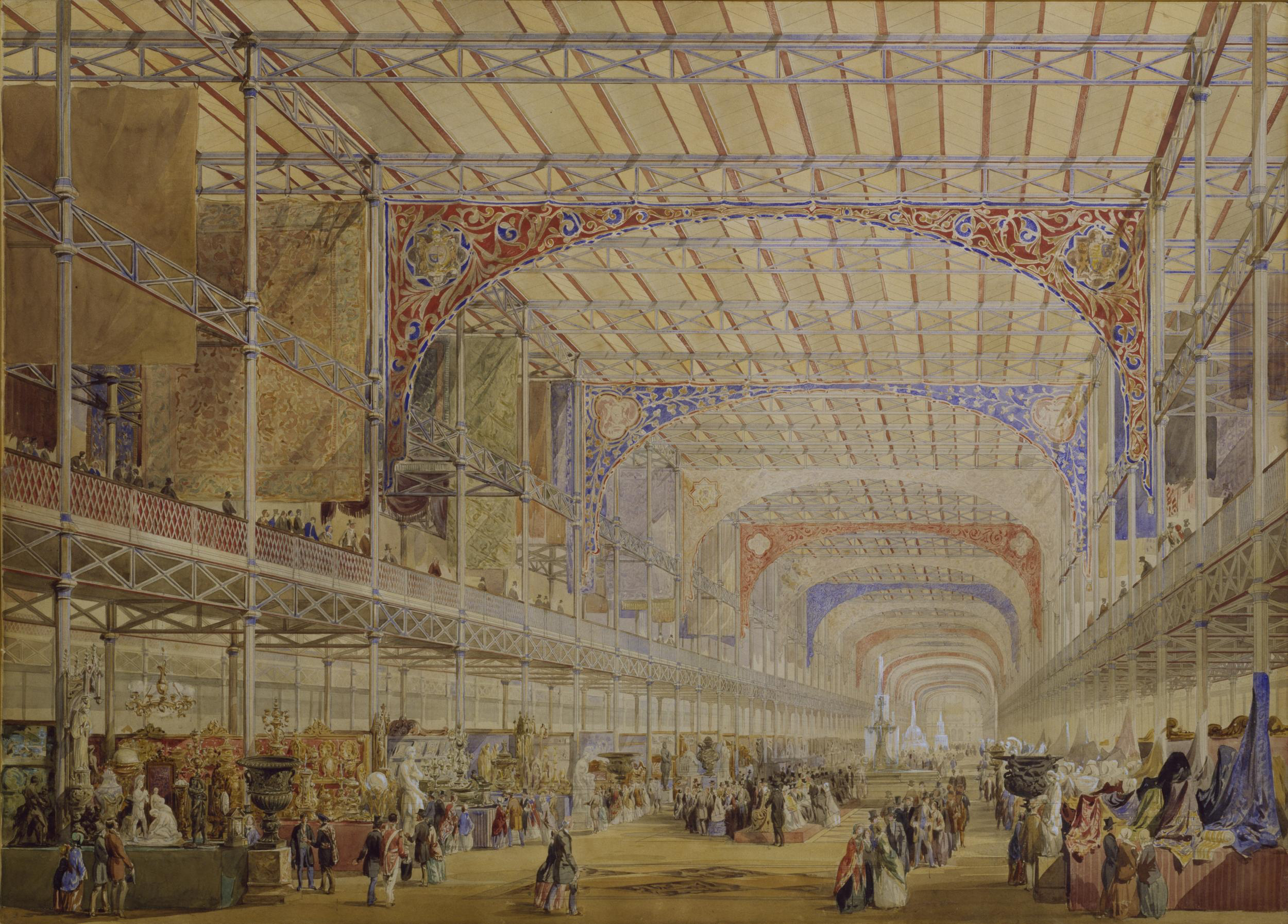
Although a feature of picture-making specifically, Ruskin prefaces this passage by directly contrasting the ‘decomposition of a crystal’, an inanimate thing, as the lowest and therefore least consequential order of the loss of this interconnectedness—termed ‘corruption’—with that of ‘the human body’—deemed ‘the foulest’.[12] Here we can see the development of a dichotomy, drawn from both biology and theology, that would take root in the larger reception of the Crystal Palace, as well as Ruskin’s own critique of it. Evidently, Jones’s contribution to the décor of Joseph Paxton’s structure, which conformed to an Alhambra-esque colour code of primaries—red, yellow, and blue—did little to temper what Ruskin identified as the destructive desire underpinning the building’s appeal, vividly described in an essay written shortly after its inauguration at Sydenham (Fig. 3.1). What proved so dangerous about this new form of architecture, at least in Ruskin’s view, was the desecration of history itself in the name of progress seemingly codified within its glass walls and perpetuated through the effect it wrought upon admiring visitors.[13] A contemporary account of this effect can be found in arguably the most riveting, if parodic, description of the Crystal Palace and its pavilions, entitled ‘Fairyland in ’Fifty-Four’, an article listed as written by W. H. Wills and George Augustus Sala, but sometimes attributed to Charles Dickens and published in his journal Household Words in 1853.[14] Within the account, the visitor is encouraged to venture to the top of the exhibition centre (if they dare) to admire the view, before wandering into the Fine Art Courts:
Pursue its geometrical windings up, and up and up, till you can mount no further. Then approach the railings of the topmost, endmost gallery. Grasp the balustrade firmly; suppress whatever sudden impulse may come over you to turn giddy, to faint away, or to throw yourself headlong from the gallery. Set your lips firm, and look straight ahead—along the glorious length and breadth of the nave of the Crystal Palace … . Grand Cairo, Stamboul, Bagdad, Ispahan, Tyre, Sidon, Rhodes, Nineveh, you possessed … some very magnificent structures … yet … You never could combine magnificence, strength, lightness, space, perspective, out of glass and iron, deal boards and zinc louvres … . ‘Not a frieze, nor a pediment, nor a portico,’ sighs Vitruvius. ‘Not a single Corinthian pilaster or a Doric entablature,’ grumbles Palladio. ‘Where are the Parian marbles, the mahogany, the carving, the gilding, and the enriched mouldings?’ roars Orlando Gibbs. ‘It’s very nice and very pretty, but it’s only a perpetual repetition of a column, a girder, a truss, a gallery, a window, and a ridge-and-furrow roof.’ ‘Of course,’ answers Cosmos Murchison, ‘could it be otherwise? Isn’t it a crystal? And isn’t a crystal an agglomeration of identical forms. Split a crystal, and will not the fractures be precisely of the same shape as the parent piece?’ It is this Fairy-like repetition, this geometrical painting, if I may call it so, that constitutes, in my mind, the chiefest beauty of Crystal Fairy-land. The repetition of girder and gallery and column; the multifarious intersections of shaft and girder, quadrangle following quadrangle, nave and aisles, transept and wings, courts and galleries interlacing, intercepting, in such admirably regular irregularity in such a rigid yet fanciful perspective; all, when taken singly, patterns of sublimity; all, when combined into a whole, a grand spectacle of artistic contrivance, which has left the mark of the modern magician’s wand.[15]
There is a lot to unpack in this passage, not least the implicitly gendered representation of the ‘female’ consumer of architecture as a hysteric on the one hand and the ‘male’ architect as a magician on the other.[16] Moreover, tongue-in-cheek aside, the conflation of the three-dimensional crystalline structure of the building into a two-dimensional ‘geometrical painting’ raises further questions over the Palace’s perceptual stakes and the type of responses it elicited from the bodies in its midst—in this passage, curiously morphing from male to female and back again—a point I will return to.
Although Ruskin would directly decry (what he believed to be) Dickens’s description of the Crystal Palace as a ‘Fairyland’ in a letter to Charles Eliot Norton dated 8 July 1870, the overall impression of the article confirms Ruskin’s later criticism of—and unease over—the employment of mass-produced glass as a material for public architecture.[17] The trouble was that its treatment in the Crystal Palace emphasised glass’s geometric regularity which, as Isobel Armstrong has argued, when filled with objects and visitors, ‘came to epitomize the insecure status of the artefact’ placed within a vitrine, ambiguously caught halfway between ‘commodity’ and ‘thing’.[18] It seemed as though within Paxton’s ‘crinolined bird-cage’, disparate bits of the working-class body, already shattered through the physical effort of making blown glass, became ossified in a ‘mediating’ carapace created out of the breath of thousands of unseen labourers.[19] Within such a shimmering edifice, the social relations implicit to production and exchange give way to the spectral animation of untethered things, no longer traceable to an organic point of origin, like so many rays of light refracting in an imitation diamond. The fractured body here becomes the site of a spectacle so overwhelming that it cannot help but re-enact this estrangement—an effect that Armstrong terms ‘anthropomorphic anamorphosis’—ad nauseam.[20]
This is a powerful image and one that Ruskin observed from a cautious distance. Perhaps it is not incidental that his essay on the Crystal Palace begins with a direct contrast between its imagined, glittering turrets and the modest ‘low larch huts’ scattered along the idyllic view of the Fribourg countryside through which Ruskin states he was walking when reading of its re-opening in The Times.[21] Of course, this dichotomy between nature and culture, or more specifically between science and art, with the latter mystified as a kind of alchemical ‘magic’, would heavily punctuate almost all of the literature devoted to the Crystal Palace, but it would take on a specific tenor in Ruskin’s writing that was both remarkably complex and paradoxically straightforward. For it was not just the building itself that was objectionable—resembling as it did both a ‘magnified … conservatory’, and later, a ‘cucumber frame between two chimneys’—but also the harmful implications of its scale, an unprecedented enormity enabling ‘the exhibition of monuments of art in unbroken symmetry, and of the productions of nature in unthwarted growth’.[22] Yet the importance of location, conversely dismissed by Jones, and the fact that Ruskin wrote his response at a remove, as it were, while he was reportedly in Switzerland, allowed him the rhetorical angle needed to situate this phenomenon as symptomatic of a wider-spread tendency toward both the spectacle of cosmopolitan tourism and the vast sprawl of futurity sweeping Europe more generally. Bemoaning the British public’s disregard for its own national treasures, such as J. M. W. Turner’s recent bequest that remained languishing in the deceased artist’s basement, in favour of such a glittering novelty resembling ‘a colossal receptacle for casts and copies of the art of other nations’, Ruskin also regretted the restoration of Gothic cathedrals in France as having done more harm than good for their preservation. Likening such ignorance to that exhibited by guests at a dinner party who dine on regardless of the epidemic of hunger raging through the streets beyond their windows, both instances appeared to Ruskin as reprehensible displays of cultural insensitivity towards—and disconnection from—a past on the verge of extinction due to the contemporary need to remake said past in the image of its own restless myopia.[23]
Ruskin’s critique of gentrification in this text of intense feeling is more than an architectural tract: it is a jeremiad for the vanishing remnants of a form of material historicity that had formed the backbone of his criticism. Instead of naming and shaming Jones, Ruskin took to task what he saw to be the fateful consequences of the former’s protracted vision, taking it upon himself to warn the public of its excesses as though he were the ant to Jones’s grasshopper. The irony here being that, unlike the insects of Aesop’s fable, both Jones and Ruskin were working towards the same end. Both believed themselves to be guardians of a set of skills integral to a British tradition of handmade craft now endangered by mass production, and regularly travelled abroad to gather examples through which to instruct the public and thereby secure its longevity. The difference lay less in their ideology than in their blame-gaming. Whereas for Jones, faults in architecture were attributable to uneducated consumer demand that led to the overproduction of second-rate crafts—a problem he proposed might be remedied, at least in theory, by a new approach to geometrical pattern in product design—for Ruskin they indicated a more insidious form of growing moral corruption and a shocking lack of hindsight by peers responsible for disseminating the nation’s cultural wealth. ‘Must this little Europe’, Ruskin wonders in the Crystal Palace essay, ‘this narrow piece of the world’s pavement … be utterly swept and garnished for the masque of the Future? … is there not yet room enough for the spreadings of power, or the indulgences of magnificence, without founding all glory upon ruin, and prefacing all progress with obliteration?’.[24] Although, as Kathryn Ferry has argued, Jones’s Alhambra Court ‘was not intended to act as a three-dimensional pattern book’, for Ruskin it embodied the nightmarish idea that history itself, having become a mere furnishing with which to redecorate the present, had ceased to exist.[25]
Part two: a pattern recurring
Ruskin’s cautionary tale seems almost postmodern in its warning against the restoration, or simulation, of old things whose recreation inevitably involves their own destruction. It also strangely chimes with Giorgio Agamben’s reading of the art historian Aby Warburg’s attempt to recuperate the human gesture after its deracination by the production line, which constituted a crisis of identity for the bourgeoisie now fully alienated from their own bodies, by way of an image archive. It was a task which, ironically, Warburg could only perform through reproductions and replicas, through images of objects rather than the objects themselves, not unlike Jones’s encyclopaedia of ‘world’ ornament. As Agamben concludes, at the heart of Warburg’s Mnemosyne Atlas project, left unfinished at the time of his death in 1929, lay the human gesture as ‘a crystal of historical memory, its hardening into a fate, and the strenuous efforts of artists and philosophers … to free it from this by means of a polarizing dynamic’.[26] A dynamic which, carrying within it a metaphorics of geology and geometry, has also animated the discourse surrounding painting, whether gestural or geometric, since the turn of the twentieth century. Ruskin saw it all coming, one might surmise. Yet there is a possible upshot to this conclusion which serves to complicate it. For, in reassessing Ruskin’s apparent prescience, we might begin to rethink the implications of geometric painting particularly, which has come to stand for many artists and art historians alike as the primal—because pointedly representational—site of man’s decline into technocracy since industrialisation.
In 1986, the painter Peter Halley suggested that abstract geometric painting was the missing link between Occidental society’s crisis in the face of mass production and its cannibalisation of all that it encountered, including the image of the Orient, its cultural other. Exemplifying this tendency for Halley were Frank Stella’s paintings of the 1960s and his Moroccans series in particular, in whose symmetrical stripes and Day-Glo colours Halley saw ‘configurations … reminiscent of Islamic tile-work or perhaps Kurdistani carpets’ that foreclosed ‘the possibility of actual influence by a non-Western sensibility’ through a ‘reduction … to its most easily reproduced signs’.[27] In other words, the abstraction performed through the cultural import-export project that is Orientalism appears as just one more side effect of the ‘real abstraction’, in Marxist terms, permeating every aspect of human production and social relations in the post-industrial age.[28] Whereas Ruskin’s fears were laid bare in architectural practice, for Halley it would be abstract painting that most vividly exposed this process.
Which is not to say that Halley refrained from using it. On the contrary, his canvases self-consciously employ a visual vocabulary of ‘cells’, ‘prisons’ and ‘circuits’ rendered in neon colours and hackneyed interior-décor finishes meant to show painting’s ultimate and inevitable collapse into entrapment, cliché, and decoration (Fig. 3.2).[29] Examining how the rise of geometric abstraction over the first half of the twentieth century mirrored the increasing stranglehold of industrial and institutional authority, as outlined by Michel Foucault in Discipline and Punish: The Birth of the Prison (1975), Halley’s early writings are threaded through with a mordant mistrust of modernism’s manifestos and ‘geometric signs’, which he deemed mere ‘classicizing mechanisms’ of this pervasively repressive social order.[30] Noting a shift during the 1960s from this prior model of deskilled production and increased surveillance to one governed by the dystopic logic of consumption and self-regulation, Halley positioned his own practice as a reformulation of ‘Hard-Edge and Colour-Field styles’ which epitomised the new role that painting (as a form and function of history) now played in such a world: ‘For me, those styles, used as a reference to an idea about abstraction and an ideology of technical advance, replace reference to the real’.[31]
I compare Halley and Ruskin here in order to delineate and contextualise a sort of recurrent pattern that appears through thinking about ornamental pattern itself, as it has manifested in certain strands of aesthetic and art-historical theory. Ruskin’s dislike of geometric patterns, or rather, their mechanical-like (and thus lifeless) rigidity, is well known and has been suggested as the ultimate reason behind his distaste for the Alhambra, as well as his upholding of the Ducal Palace in Venice as the prime exemplar of the Gothic arabesque or ‘ribbon ornament’, as Lars Spuybroek has called it, adversely characterised against Jones’s ‘tessellation ornament’ by its curving lines derived from nature and its capacity for ‘variety’.[32] Here the nature-versus-culture debate that would also come to punctuate the history of modern painting and its afterlives finds an early precursor in Ruskin’s ambiguous relationship with ornamental pattern. Yet, I think the peculiar and fraught course that painting would take has at its roots the tenacity of this old and by-now stale distinction, which is very difficult to maintain in practice without devolving into a kind of empty dogma, as Halley’s case has been seen to demonstrate.[33]
Partly due to the precedence of geometric abstraction as the chosen visual vocabulary of the historical avant-garde, and the apparent failure of that venture, it was not until the 1970s and the first waves of feminist art history that pattern was reconsidered—albeit with varying degrees of seriousness—as a critical mode capable of challenging the hierarchical and highly gendered power structures underlying painting’s past. At least, this was the claim made by proponents of a ‘movement’ named Pattern and Decoration, such as Amy Goldin, a painter and critic who had studied art history at Harvard during the 1960s with the well-known scholar of Islamic art, Oleg Grabar (whose own book on the Alhambra was published in 1978).[34] Goldin’s recognition that underneath every pattern lies the ‘pervasive law’ of the grid was as informed by her knowledge of Islamic textiles as by her criticism of modern and contemporary painting, one of her favourite examples of their collision being found in the work of Joyce Kozloff.[35] Unlike Gottfried Semper, who saw pattern-making in the form of textile weaving as the underlying logic of architecture, which in turn governed the development of other arts, for Goldin it was the interval between a repeated motif that formed the appearance of a patterned surface in any medium, as in the spaces seen across a page of typed text. She upheld Andy Warhol’s Death and Disaster series of screen-printed canvases from the mid-1960s as a primary example of how such a use of regulated repetition could alter the emotional responses elicited from painting, in this case ‘undercut[ting] the sense of horror’ conveyed in the image of a car crash. On the other hand, for Goldin it also served to temper the ‘sweetness’ of Warhol’s more innocuous patterns, such as the repetitions of his flower and cow’s-head motifs.[36] This lent pattern a mechanism of disturbance, as though its rhythmical chasms constituted a break with meaning that disrupted painting’s historical, symbolic, and authoritative ties. Although Pattern and Decoration chiefly concerned itself with rehabilitating beauty, a measure of value long derided in modernism, Goldin emphasised the conceptual and political possibilities of pattern as a critical rather than a complicit mode of perception more generally, stakes that had seemed to loosen their grip after Ruskin’s intervention into what Linda Nochlin memorably termed ‘architecture moralisée’.[37]
At this point it is important to distinguish Ruskin’s view of pattern as one not based in ornament or decoration per se, but rather in the visible lines of growth wrought over time, as exhibited in organic forms and registered in art, which might seem a world away from the terms in which Goldin understood it as a disruption of perspectival composition. Yet, despite their obvious differences, both Goldin and Ruskin were ultimately concerned with how pattern, when applied through painting specifically, might allow us to see better by doing away with repressive or misleading points of view and habits of looking. Goldin was concerned with how pattern might inculcate a different form of perception to that offered by the traditionally composed picture, one analogous to a kind of ‘anxious scanning’, as she called it, conditioned by the grid and in keeping with poststructuralist thought. For Ruskin, pattern’s power lay in the onus it put on an artist to apply the highest degree of fidelity to what was knowable (and unknowable) about the world.
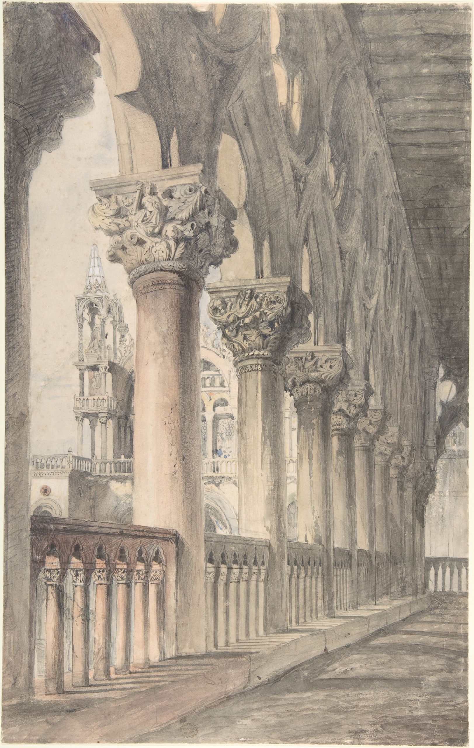
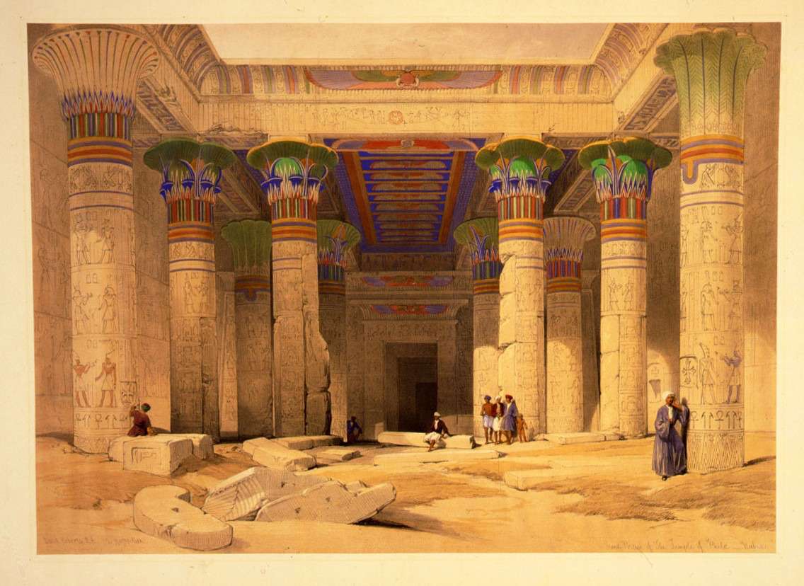
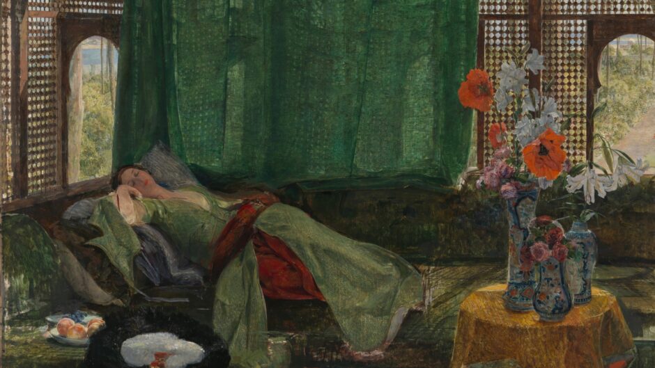
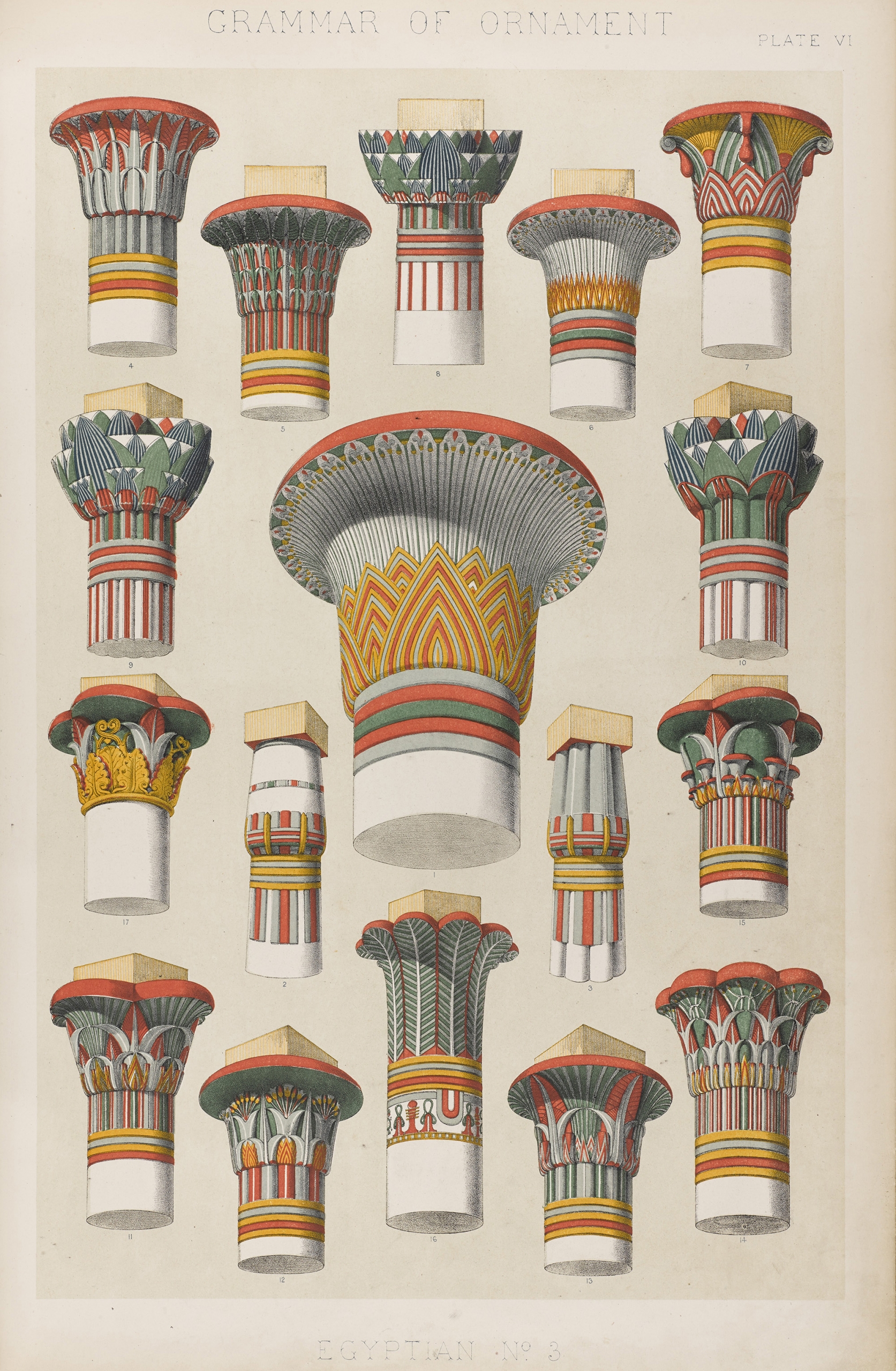
This imperative would come to colour Ruskin’s reception of many contemporary painters who had travelled eastwards in search of inspiration, such as David Roberts, whose painting of Venice’s Ducal Palace in particular Ruskin found to be excessively vague, and set about correcting in his own studies of the building (as in Fig. 3.3). While the lack of care exhibited by certain painters when it came to rendering such details was a common bugbear for Ruskin, I cannot help but think that this was something of an excuse when it came to Roberts. After all, one could hardly acquire a more precise sense of place than that seen in his drawings of Egypt and its architectural wonders, turned into lithographs by Louis Haghe between 1846 and 1849 (Fig. 3.4), which echo closely—too closely for Ruskin perhaps—the Egyptian capitals dissected in Jones’s Grammar (e.g., Fig. 3.5). In fact, the initial verisimilitude detected in Roberts’s work quickly backfired, devolving for Ruskin into a lack of imagination that epitomised the worst aspects of Academic painting. More to his liking was John Frederick Lewis, a painter who travelled to Istanbul in 1840 and settled in Cairo the following year, where he lived in the local custom for another nine years. Although the vast majority of Lewis’s paintings would be completed upon his return to England, they are filled with highly-detailed scenes evoking different spaces of this former life, populated by characters that resembled both the artist himself and his wife, Marian Harper (Fig. 3.6). Mixing obvious reverence for his host culture with private impressions from an inner world of domestic bliss, Lewis’s paintings, although problematic now, appealed to both the wanderlust and empathy of the Victorian ethos, prompting Ruskin to laud Lewis as ‘the painter of greatest power, next to Turner, in the English school’.[38]
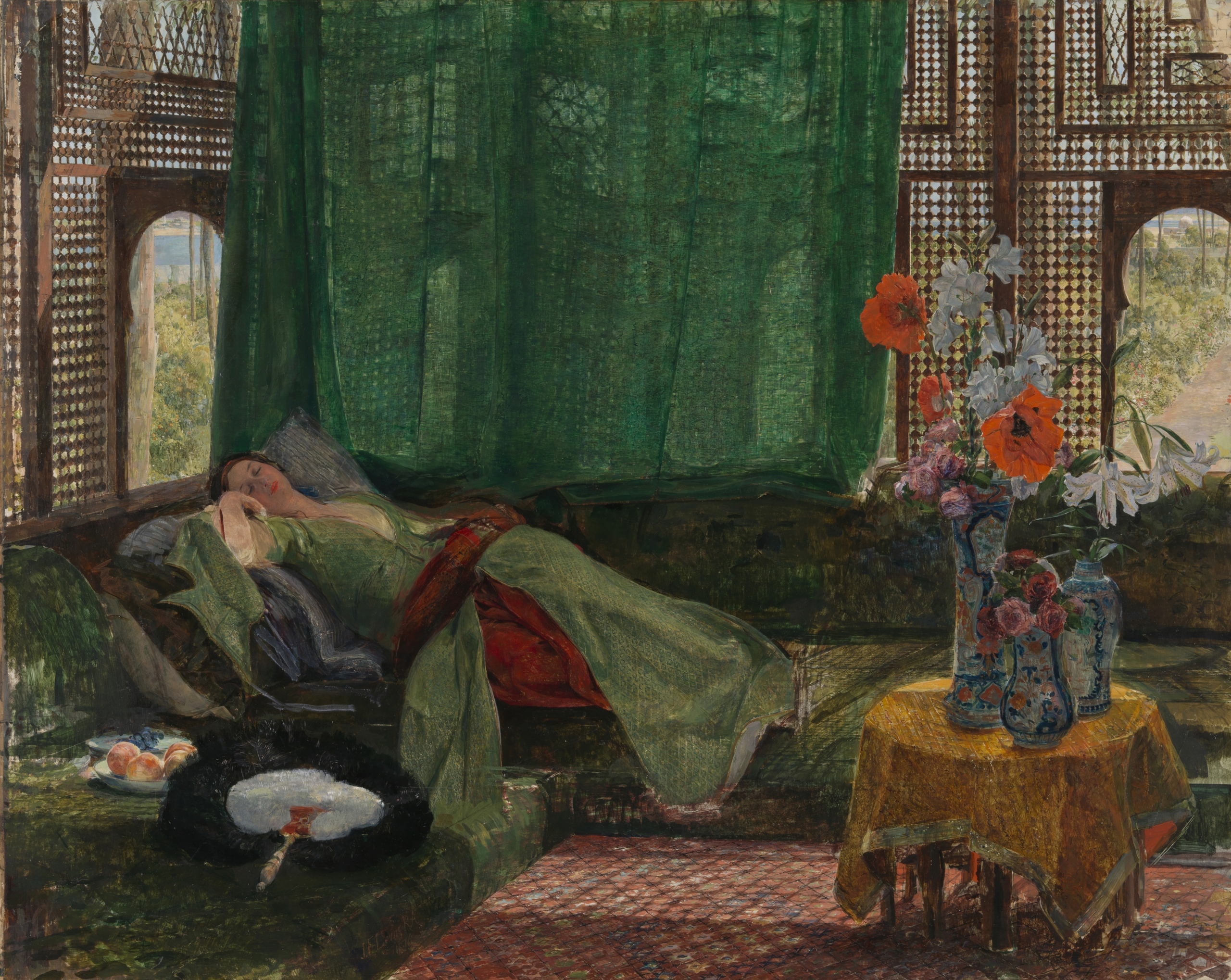
Never mind the fact that Lewis, too, had made a series of sketches after the Alhambra in 1833, at almost exactly the same time as Jones, which were published as part of a larger portfolio several years before the latter’s Plans, Elevations.[39] Something about his technique in watercolour captured Ruskin’s imagination. Yet, Ruskin worried that the medium both Jones and he himself so often favoured for their studies would cause Lewis’s colour to fade over time, and urged Lewis to make the shift to oil painting in order to preserve it, which the artist duly did (no doubt boosting his stature in the salon as well as in the marketplace).[40] The result would be paintings which shimmer like jewels that have caught the North African sunlight within their facets. Fictional though it is, the dabbling of that celestial body falling upon their surfaces appears as a kind of hallmark, or pattern, connecting Lewis’s canvases in a web of painterly sensation. More than a formal or thematic addendum, pattern here becomes the very substance of painting as a practical application of colour capable of exceeding its (and our) perceptual limits, if magnifying the dislocation of the (mostly female) bodies represented within them, as though warping the lines of space and time through its own material logic: a form of refraction not so different, perhaps, to that occurring within the Crystal Palace.
This is one way of looking forward through Ruskin to the kinds of historical preoccupations made manifest in modernism, and modern painting as its perennial avatar, which may yet offer a way of resituating pattern as an integral, if highly volatile, element within it rather than a superficial, extrinsic addendum. One could also pose the reverse: that looking backwards at Ruskin through the treatment of pattern in modern painting might shed new light on his own engagement with this murky subject. For example, that ultimate modern painter of sensation, Henri Matisse, might seem at odds with Ruskin’s concern for pictorial veracity and I grant that this connection may involve a leap of faith. However, spurred by his belief in the potential of Orientalist motifs for painterly expression, Matisse’s packing of the picture plane with pattern, whether flat and schematic or voluminous and suggestive, almost perversely brings back into focus what seemed to be at stake for Ruskin in upholding the flowing figure of the arabesque as a feature of Gothic architecture over the deadening effects of ‘the Alhambra ornament’ and its susceptibility to commodification—a distinction riddled with obvious religious prejudice. Exposed here too are the less appealing aspects of each man’s investment in the hopelessly romantic and ultimately dangerous fallacy of ‘expression’ as a signifier of Western man’s inherent dominion of volition. After all, Matisse’s ‘love’ of the ‘arabesque’, as famously declared in an interview held in 1952, bordered on an obsession spurred by the need for a form that would allow him the utmost artistic freedom.[41] This resulted in an organic shape that was half-leaf and half-curving squiggle, able to morph from a recognisable outline to an almost limitless compositional device spreading itself from surface to surface in terms of what Yve-Alain Bois has called a ‘pneumatic’ sense of expansion, reshaping the space of a painting as it grows.[42] The implied allusion to the creative power of the male artist’s virility, however fragile and illusory, is difficult to ignore.
While undesirable in certain regards from a contemporary point of view, the Ruskin-Matisse connection is also potentially productive, as it shows another way through the looking glass of time and the tangled web of the arabesque. As Cordula Grewe has shown, the time-travelling propensity of this conceptual and formal figure to reappear throughout literary history in different but related guises is one of its defining characteristics.[43] While a largely positive pattern (in both senses of the term) in the fascinating history Grewe unravels, within the history of painting it has served to carry a negative function, epitomising the return of an unwanted past within its complex of curving lines and decorative flourishes. Most unwelcome, too, has become its imagined function as a marker that defines the space where art ends and the world begins, as if the two can ever truly be separated. The remainder of this chapter is not an exercise in defence of (much less a return to) this formalism but an attempt to excise from its contours a view that may, in time, prove meaningful to a new perspective on this old—but arguably not yet redundant—chestnut. In wishing to avoid reducing Ruskin to a modernist narrative he could have never foreseen, I instead want to consider him in light of one that modernism never quite accepted and, more pointedly, feared, in a way not dissimilar to Ruskin’s mistrust of Jones and his encyclopaedic vision of an endless march into the future through the repetition of its primary, if not exactly vital, forms.
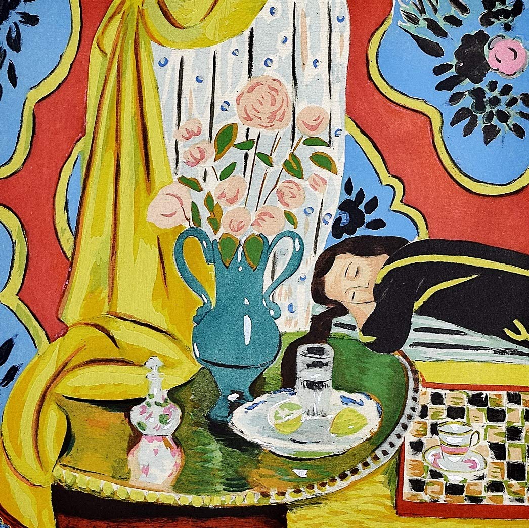
For the artist Bridget Riley, it would be the underlying rigour of Matisse’s almost architectural attention to detail, or what she has called his method of ‘place building’, that gives rise to the psycho-sensorial dimension of his paintings.[44] In a lecture delivered to students at the Slade School of Art in 1996, Riley set about dismantling Matisse’s Harmony in Yellow of 1928, seeing an ‘arabesque’ running diagonally through the heart of its ‘scaffold’ of verticals and horizontals: from the bottom left-hand corner where the folds of the curtain fall across the reflective table top, through the curve of the vase and up to the head of the reclining woman by way of the black shadow cast upon this central, still-life scene (Fig. 3.7).[45] Rather than the repetitive motifs of the wallpaper, it is this hidden pattern that appears as the governing logic of the painting as well as its perceptual crux. Instead of a formal application, pattern here constitutes the very structure of the painting as a culmination of all its other compositional elements, as well as of its imagined subject, the sleeping female figure nestled in among its planes, of which every other depicted object appears as an ‘attribute’.[46] The phantasmagoric, the erotic and the commonplace here converge into a complex that exceeds the sum of its parts, as if bursting open at its seams. Although far from formless, the expanding composition of the picture inevitably leads to its collapse—but also, perhaps, its reconstitution. Or, to put it in terms Ruskin might have used, the law at work in this painting turns from a helpful to a deathly one and back again, in a perpetual perceptual cycle.
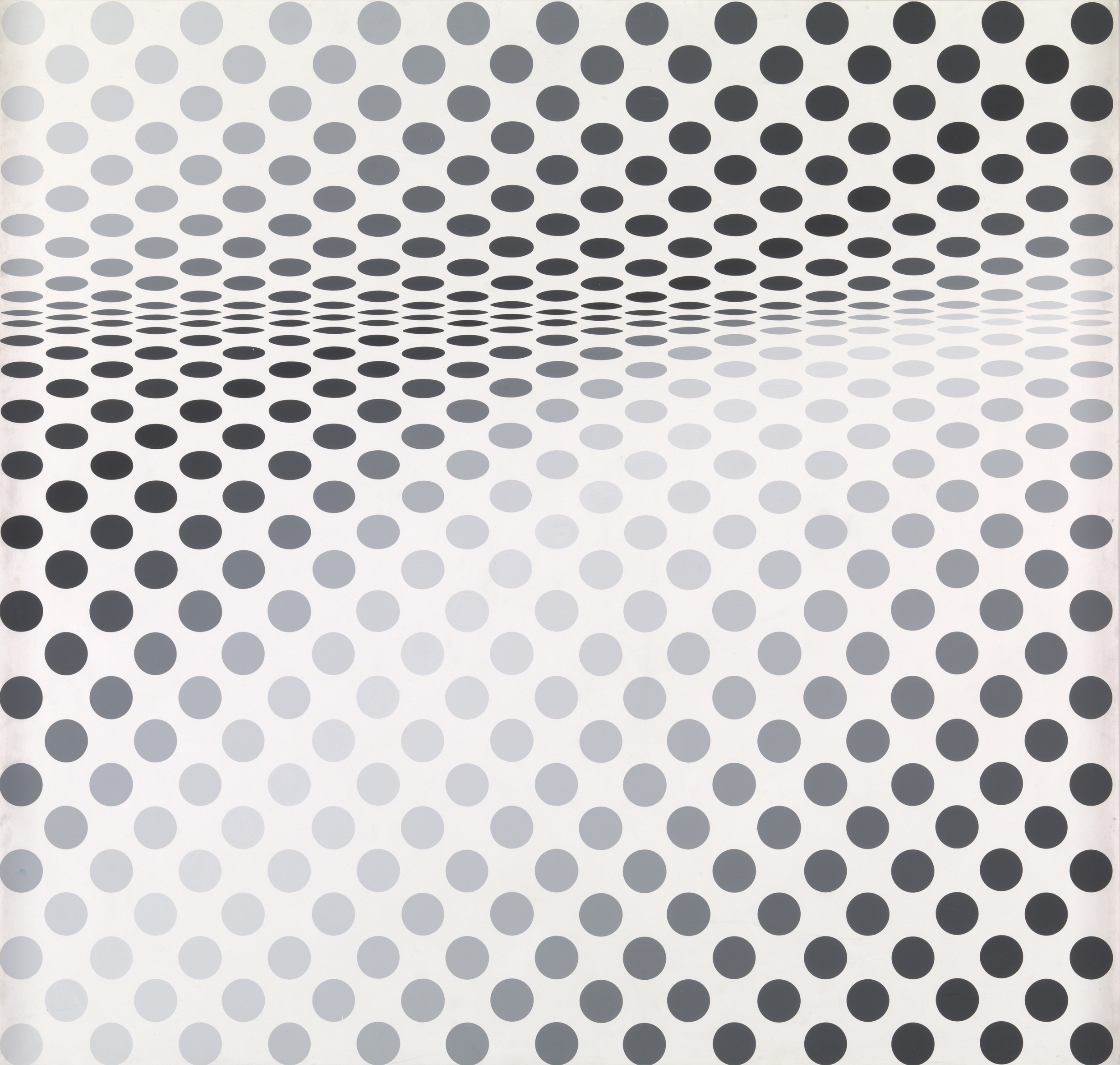
Riley’s own take on this collection of ‘convex and concave arcs’ as an arabesque echoes earlier debates around its aesthetic role as a detail that demarcates pictorial space from the space of reality, as well as the border between art and the world beyond it.[47] While this is not exactly how it functions in the Matisse or in a work such as Riley’s Hesitate, which holds within it a more obvious diagonal orientation, both do make manifest the imaginary role played by the arabesque as a porous borderline between otherwise mutually-exclusive states: between interiority and exteriority, looking and feeling, and, to return to Ruskin, between the part and the whole (Fig. 3.8). Among Riley’s repeated rows of circles undulating on a gradient appears a kind of wave effect set up by their gradual compression within the middle band running horizontally across the painting, creating the impression of a serpentine line—or what William Hogarth famously called the ‘line of beauty’—that ripples through it.[48] Although not as convoluted as Matisse’s arabesque, Hesitate seems to warp space through the very simple means of a contorted circle rendered in greyscale on a white ground and paced at receding intervals so as to create a sense of compression rather than expansion, suggesting it as a complete composition—if seen through Ruskin’s lens—rather than a pattern with the potential to be repeated indefinitely.
When it was first exhibited in New York in 1965, however, Riley’s painting became subject to an extended debate around the susceptibility of so-called ‘optical’ or ‘pattern’ painting to lapse into novelty and spectacle. Derided as an exponent of op art, characterised by an inherent illusionism that caught the eye in a maze of perceptual confusion from which it could not escape, Riley became the reluctant representative of a trend that saw her work literally converted into a set of patterns when the American fabric magnate Larry Aldrich, who owned Hesitate at the time, used it as the basis for a dress design and in so doing re-entrenched, to the artist’s dismay, the old association between pattern, the machine, and the feminine within the realm of consumerism.[49] Termed ‘Riley’s Eye/Body Problem’ by Pamela M. Lee, Riley’s work in particular sparked a debate over the threatened position of the (gendered) body caught within such a turn to unabashed retinal experience and the consumption of spectacle, vividly recalling many responses to the Crystal Palace.[50] Following Riley’s forays into colour during the 1970s, there has been increasing interest in the way her paintings might offer a way out of this deadlock, as well as potentially reinforcing it. Contributing to this effort, I want to suggest that Riley’s work, and in particular her paintings that evoke the arabesque as a complex of formal and conceptual relationships, offers a useful corollary with which to think through some of the threads teased out above.
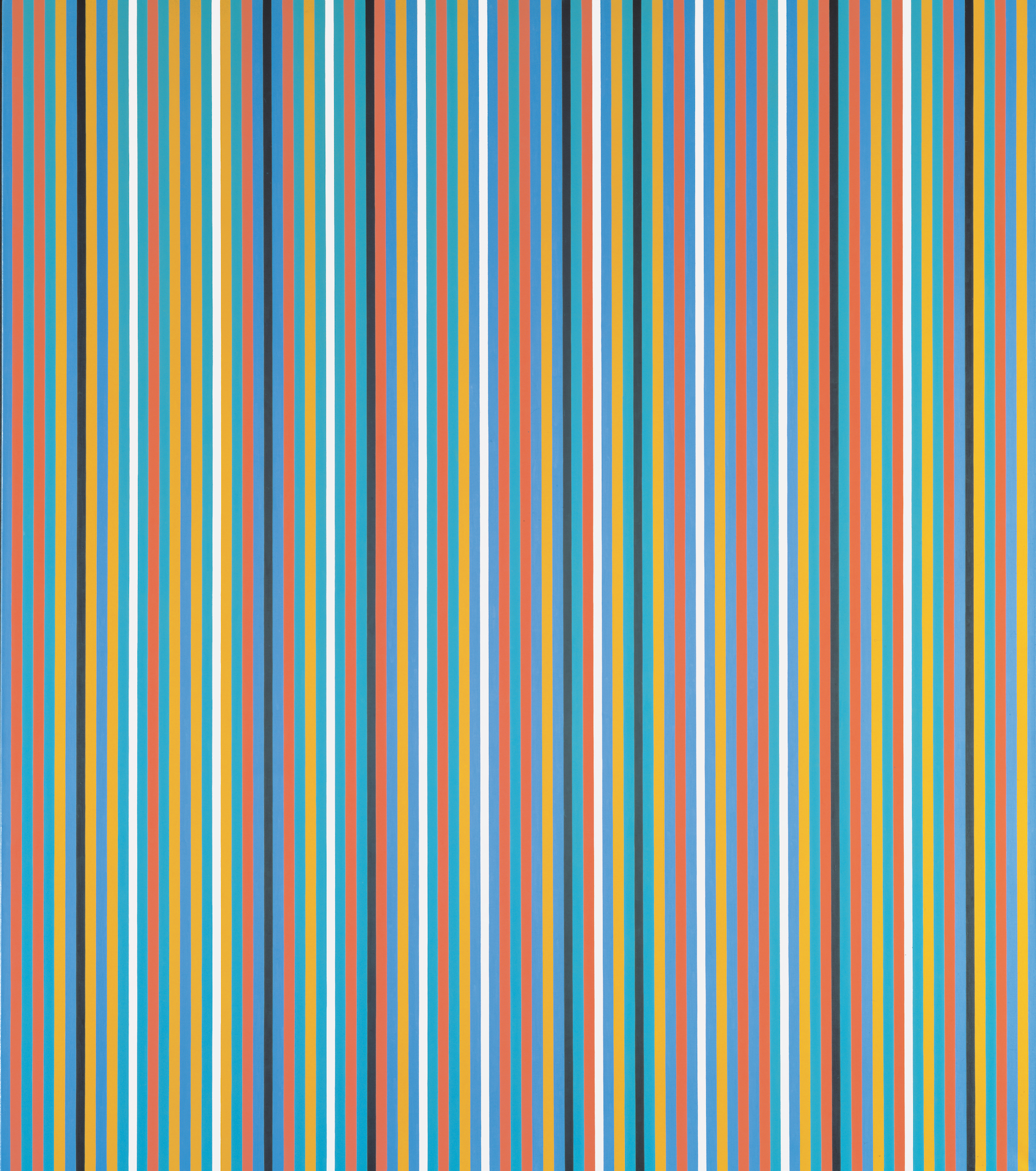
Named after a hotel in which Riley stayed during her trip to Egypt in the winter of 1979, Winter Palace is made up of vertical lines of alternating hues derived from a ‘fixed palette’ consisting of red, green, yellow, turquoise, blue, black, and white, remembered from Riley’s visit to the ancient tombs at Giza that had seemingly ‘united the appearance of an entire culture’ across their vast networks of hidden walls (Fig. 3.9). On the experience of entering these underground lairs whose paint lay still intact, undamaged from the bleaching sun and degrading effects of the desert, Riley wrote: ‘To visit them, one leaves the green valley, crosses the sizzling heat of the desert, and descends deep down into the earth. Gradually one loses all sense of orientation, one has no idea of direction or even how far below ground one is. The actual tomb chambers are plain rectangular cubicles of no architectural distinction, but they blaze with colour and life’.[51] Entering these spaces devoted to death, Riley would see surface after surface pulsating with endless variations of the same colours which together appeared to ‘embody’ the ‘brilliant North African light’ beating down above ground. In contrast to Frank Stella’s stultified stripe paintings, as described by Halley, Riley’s coloured lines of oil paint approximating those remembered from the sight of these ancient sites could be said to transfigure the viewer’s spatial understanding of their immediate context into another, less locatable, locale without regulating the intensity of their bodily affect. While it was this unwieldiness that made Riley’s work so unstable and problematic for many critics during the 1960s, it is also what suggests it as a further—if unexpected—example of the kind of perceptual disruption that Goldin saw as the crux of pattern when realised through painting. Although rooted in a (specifically French) formalist tradition, Riley’s work leads us far beyond its strictures, into a world of sensation that feels unmediated despite being anything but.
If Lewis’s works are at all evoked here then it is through what I have tried to describe, via Ruskin, as the potential of pattern to disperse the rigid undertow of painting and, in this way, reconstitute it in a transformative way. Riley’s description of how she ‘build[s] with sensation directly’ to make her paintings, as though layering pieces of light whose interplay creates its own visual climate, permeates her much later (2004) recollections of experiencing the variously ornamented spaces of the Alhambra.[52] At the Alhambra, the apparent time, labour, and thought gone into the intricacy of its architectural designs cannot contain the ‘clusters of colour sensations, of dynamics that seem to loose their moorings completely from the colour structures that gave rise to them’.[53] Riley here adapts the arabesque as ‘the most synthetic way of expressing oneself in all one’s aspects’, as Matisse put it, by placing the emphasis on its ‘synthetic’ modality rather than its ‘expressive’ capacity.[54] That is, on its plasticity as a means of yielding pattern within painting, rather than as a fixed end, not unlike the imagined life—or ‘active rigidity’—of ornament as a feature of Ruskin’s Gothic.[55] Shifting from surface to surface and space to space, the arabesque’s aptitude to change and its inability to be fully subsumed by either the eye or the mind here momentarily culminates in a mass of coloured curves that suggests an affinity between the space of the work and that in which we physically encounter it—effectively, if fleetingly, reconnecting the body to its experience, only to disperse once more—flitting between the connectivity defining life for Ruskin, and its dissolution.
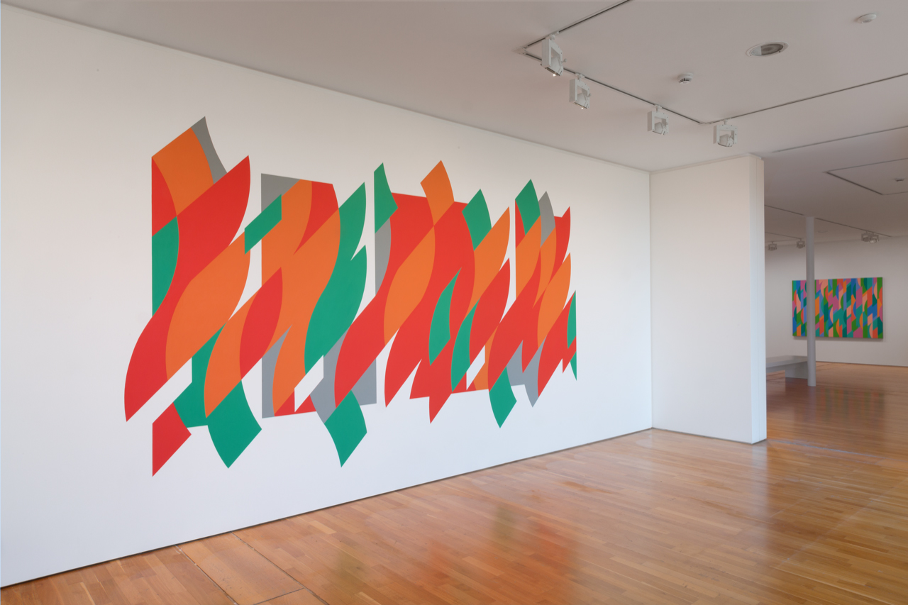
Standing in front of Riley’s Rajasthan, as it was installed at the De La Warr pavilion in Bexhill during the summer of 2015, the painting’s perceived ephemerality, already exacerbated by its application onto a temporary wall not meant to survive beyond the run of the exhibition, played off the glittering waves of the ocean heard lapping through the glass-fronted facade behind one’s back (Fig. 3.10; the ocean is to the far right, out of view). Like glints of light reflecting off the cresting tide, the slits of bare wall read as achromatic scintilla that sit between the arabesque of orangey-red and greenish-blue shapes zigzagging across the central band of the wall. Although just as makeshift as the walls of Jones’s Alhambra Court, Riley’s foray into architectural space touches upon what made the former’s ornamentation so lamentable for Ruskin while finding a way of interlacing this impermanence through the material features of its site, not unlike the way the cut-out tracings in the balcony of the Ducal Palace allow pieces of the sea air to filter through its stones, as depicted in Ruskin’s own studies. Although always susceptible to corruption, painting here re‑emerges as a testing ground for making perceptual patterns of connection through time, a project Ruskin feared may have disappeared long ago.
Looking back through Riley in this way suggests a timeless yet experiential dimension to the now-distant moment encapsulated in the debate between Ruskin and Jones, and the anxieties that arose from it, reappearing as the culmination of over a century’s worth of worry over the psycho-social valences of pattern’s ability to beguile, overwhelm and stultify the body, but also of hope for its potential to reveal new possibilities to the eye. A hope that pivots on the contingent parameters of what pattern allows us to see in the present and what it reveals about the past. Always unclear, however, is what effect, if any, it may have on the future. Yet the question of pattern’s relationship to (and the consequences of its use for) the future, as Ruskin knew, is the one perhaps most worth asking. For pattern suggests history itself, far from a rigid structure, as a malleable set of connections and disconnections unfolding through time, ultimately forming an ever-changing but everlasting pattern in time, for better or worse.
Acknowledgements
I wish to thank the editors for taking a chance on a relative newcomer to Ruskin by inviting me to contribute. Without their unwavering enthusiasm and support this chapter would likely not have been written. Thanks also to the Bridget Riley Studio and Peter Halley for granting image permissions.
Citations
[1] Victor Hugo, Les Orientales (Paris: Charles Gosselin, 1829), p. 292. My translation.
[2] Jules Goury, Owen Jones and Pascual de Gayangos, Plans, Elevations, Sections, and Details of the Alhambra, from Drawings Taken on the Spot in 1834 by Jules Goury, and in 1834 and 1837 by Owen Jones (London: O. Jones, 1842–5); and Owen Jones, ‘Chapter X: Moresque Ornament from the Alhambra’, in The Grammar of Ornament: A Visual Reference of Form and Colour in Architecture and the Decorative Arts (London: Day and Son, 1856).
[3] Ruskin, 9.469 (The Stones of Venice 1, 1851, Appendix 22: ‘Arabian Ornamentation’).
[4] Deborah Howard, ‘Ruskin and the East’, Architectural Heritage 10:1 (1999): p. 39.
[5] Of these, the Alhambra Court would be the only structure ‘dedicated to a single building’. Kathryn Ferry, ‘Owen Jones and the Alhambra Court at the Crystal Palace’, in Mariam Rosser-Owen and Glaire D. Anderson (eds.), Revisiting al-Andalus: Perspectives on the Material Culture of Islamic Iberia and Beyond (Leiden and Boston: Brill, 2007), pp. 227–8.
[6] Owen Jones, ‘The Alhambra Court in The Crystal Palace: Erected and Described by Owen Jones’, in The Fine Arts Courts in The Crystal Palace (London: Crystal Palace Library, Bradbury and Evans, 1854), p. 7.
[7] Jones, ‘The Alhambra Court in The Crystal Palace’, p. 7.
[8] Jones, ‘Chapter X: Moresque Ornament from the Alhambra’, p. 2.
[9] Jones recognised the partial view similarly offered by his Grammar, stating that ‘there are many gaps which each artist … may readily fill up for himself’. Jones, The Grammar of Ornament, p. 2.
[10] Catherine Lanford, ‘Imperialism and the Parlor: Owen Jones’s “The Grammar of Ornament”’, The Wordsworth Circle 32:1, Romanticism and Interdisciplinarity: ‘Centers and Peripheries’: Selected Papers from the 15th Annual Conference of the Interdisciplinary Nineteenth-Century Society (2001): p. 39.
[11] Ruskin, 3.207 (Modern Painters 5, 1860).
[12] Ruskin, 3.205–6.
[13] See Ruskin, 12.417–32 (Reviews, Letters, and Pamphlets on Art, 1844–54, ‘The Opening of the Crystal Palace: Considered in Some of its Relations to the Prospects of Art’, 1854). For more on Jones’s theories about the original colouring of the Alhambra, which abound in Plans, Elevations, and its critical reception, see Ferry, ‘Owen Jones and the Alhambra Court at the Crystal Palace’, pp. 227–45.
[14] See, for example, Laurence Talairach-Vielmas, Moulding the Female Body in Victorian Fairy Tales and Sensation Novels [2007] (London and New York: Routledge, 2016), p. 92.
[15] W. H. Wills and George Augustus Sala, ‘Fairyland in ’Fifty-Four’, Household Words 8:193 (December 1853): pp. 313–6. My emphasis.
[16] The first trope reappears in another article on the Great Exhibition, written by Henry Morley and published in the journal in 1851. See Waters, Commodity Culture in Dickens’s Household Words, p. 106. As Catherine Waters notes in her monographic study on the periodical, as was the contemporary custom for such publications, articles were ‘generally unsigned; but no attempt was made to keep authorship secret’, Commodity Culture in Dickens’s Household Words: The Social Life of Goods (London: Routledge, 2008), p. 2. Aimed at both middle-class and aspiring working-class readers, Household Words was itself founded in the aftermath of the Great Exhibition, and as such stood as both a vehicle for reflection on and a knowing product of a new age ‘of consumer choice on a scale hitherto unknown’ (p. 3). No fewer than three articles dedicated to the Great Exhibition and its social implications appeared in a single volume (vol. 8) in the first year of the periodical’s publication.
[17] Ruskin to Charles Eliot Norton, 8 July 1870, in John Lewis Bradley and Ian Ousby (eds.), The Correspondence of John Ruskin and Charles Eliot Norton (Cambridge: Cambridge University Press, 1987), p. 197.
[18] Isobel Armstrong, ‘Languages of Glass: The Dreaming Collection’, in James Buzard, Joseph W. Childers, and Eileen Gillooly (eds.), Victorian Prism: Refractions of the Crystal Palace (Virginia: The University of Virginia Press, 2007), pp. 57–8.
[19] Architectural critic P. Morton Shand (1937) quoted in Ferry, ‘Owen Jones and the Alhambra Court at the Crystal Palace’, p. 227.
[20] Armstrong, ‘Languages of Glass: The Dreaming Collection’, pp. 59, 63.
[21] Ruskin, 12.417 (Reviews, Letters, and Pamphlets on Art, 1844–54, ‘The Opening of the Crystal Palace: Considered in Some of its Relations to the Prospects of Art’, 1854).
[22] Ruskin, 12.417, 35.47 (Praeterita 1, 1885–6), 12.418.
[23] Ruskin, 12.420, 430 (‘The Opening of the Crystal Palace, 1854’).
[24] Ruskin, 12.429.
[25] Ferry, ‘Owen Jones and the Alhambra Court’, p. 230.
[26] Giorgio Agamben, ‘Notes on Gesture’, in Means without End: Notes on Politics, (trans.) Vincenzo Binetti and Cesare Casarino (Minneapolis and London: University of Minnesota Press, 2000) p. 53.
[27] Peter Halley, ‘Frank Stella… and the Simulacrum’ [1986], in Peter Halley: Collected Essays 1981–1987 (Zürich and New York: Bruno Bischoffberger Gallery and Sonnabend Gallery, 1988), p. 142.
[28] Coincidentally, Agamben has claimed that Marx may have had in mind ‘the impression felt at the Crystal Palace when he wrote the chapter of Capital on commodity fetishism’. Agamben, ‘Marginal Notes on Commentaries on the Society of the Spectacle’, in Means without End, p. 74.
[29] ‘I have tried to employ the codes of Minimalism, Color Field painting, and Constructivism to reveal the
sociological basis of their origins. Informed by Foucault, I see in the square a prison; behind the
mythologies of contemporary society, a veiled network of cells and conduits’. Halley, ‘Statement’ [1983],in Peter Halley: Collected Essays 1981–1987, p. 25.
[30] Halley, ‘The Crisis in Geometry’ [1984], in Peter Halley: Collected Essays 1981–1987, p. 80.
[31] Halley, ‘The Crisis in Geometry’, p. 103.
[32] See Lars Spuybroek, The Sympathy of Things: Ruskin and the Ecology of Design [2011] (London: Bloomsbury: 2016), pp. 75–107. For more on Ruskin’s views on pattern and its relationship to colour in architectural ornamentation see Anuradha Chatterjee, ‘Between Colour and Pattern: Ruskin’s Ambivalent Theory of Constructional Polychromy’, accessed 11 November 2018, doi: 10.24135/IJARA.V0I0.4.
[33] See, for example, Hal Foster’s critique of Halley in ‘Signs Taken for Wonders’ [1986], in Terry R. Myers (ed.), Painting: Documents of Contemporary Art (Cambridge MA and London: MIT Press, 2011), pp. 47–57.
[34] See Arthur C. Danto, ‘Pattern and Decoration as a Late Modernist Movement’, in Anne Swartz (ed.), Pattern and Decoration: An Ideal Vision in American Art, 1975–1985 (New York: Hudson River Museum, 2007), pp. 7–11. As pointed out by Ferry in ‘Owen Jones and the Alhambra Court’ (p. 228), Grabar lamented that no publication had yet managed to surpass Jones’s depictions of the Alhambra’s ornamentation by the time he came to write his own study of it. See Oleg Grabar, The Alhambra (London: Allen Lane, 1978).
[35] Amy Goldin, ‘Pattern, Grids and Painting’, Artforum 14:1, Special Painting Issue (1975): pp. 50–4.
[36] Goldin, ‘Pattern, Grids and Painting’, p. 51.
[37] Linda Nochlin, ‘The Imaginary Orient’, in The Politics of Vision: Essays on Nineteenth-Century Art and Society (New York: Harper and Row, 1989), p. 39.
[38] Ruskin, 35.403 (Praeterita 2, 1886–7).
[39] See John Frederick Lewis, Sketches and Drawings of the Alhambra, made during a residence in Granada, in the years 1833–4. Drawn on Stone by J.D. Harding, R.J. Lane, A.R.A, W. Gauci & John F. Lewis (London: Hodgson, Boys & Graves, 1835). Is it interesting to compare the exacting detail of Jones’s Plates 19–21, of the Hall of the Two Sisters, with Lewis’s far sketchier and whimsical depiction of its entrance, replete with a contemplative figure reminiscent of a knight of the Templar reading below its arches, in Plate 15.
[40] For more on Lewis’s move from watercolour to oils, and Ruskin’s role in this, see Emily M. Weeks, Cultures Crossed: John Frederick Lewis and the Art of Orientalism (London and New Haven: Yale University Press on behalf of the Paul Mellon Centre for Studies in British Art, 2014), pp. 35–6, 142.
[41] ‘Interview with André Verdet’ [1952], in Jack Flam (ed.), Matisse on Art (Berkeley, Los Angeles, and London: University of California Press, 1995), pp. 210–11.
[42] Yve-Alain Bois, ‘On Matisse: The Blinding: For Leo Steinberg’, (trans.) Greg Sims, October 68 (1994): p. 63.
[43] Cordula Grewe, ‘The Arabesque from Kant to Comics’, New Literary History 49:4 (2018): pp. 617–60.
[44] Bridget Riley, ‘Painting Now’ [1996], in Robert Kudielka (ed.), The Eye’s Mind: Bridget Riley, Collected Writings 1965–2009 (London: Thames and Hudson, 2009), p. 300.
[45] Riley, ‘Painting Now’, p. 299.
[46] Riley, ‘Painting Now’, p. 301.
[47] For a discussion of the aesthetic tradition of the arabesque, see Winfried Menninghaus, ‘Hummingbirds, Shells, Picture-frames: Kant’s “Free-Beauties” and the Romantic Arabesque’, in Martha B. Helfer (ed.), Rereading Romanticism (Amsterdam and Atlanta: Rodopi, 2000), pp. 27–46.
[48] For a discussion of Hogarth’s ‘serpentine line’ or ‘line of beauty’ see Michael Podro, Depiction (New Haven and London: Yale University Press, 1998), pp. 111–18.
[49] See Goldin’s discussion of these three interrelated terms in ‘Pattern, Grids and Painting’, p. 50.
[50] See Pamela M. Lee, ‘Bridget Riley’s Eye/Body Problem’, October 98 (2001): pp. 26–46.
[51] Bridget Riley, ‘A Visit to Egypt and the Decoration for the Royal Liverpool Hospital’ [1984], in Kudielka (ed.), The Eye’s Mind, p. 132.
[52] Bridget Riley, ‘The Experience of Painting, talking to Mel Gooding’ [1988], in Kudielka (ed.), The Eye’s Mind, p. 149.
[53] Bridget Riley quoted in ‘The Spirit of Enquiry, in conversation with Jenny Harper’ [2004], in Kudielka (ed.), The Eye’s Mind, p. 179.
[54] Henri Matisse quoted in ‘Interview with André Verdet’, in Flam (ed.), Matisse on Art, p. 210.
[55] Ruskin refers to this quality as ‘the peculiar energy which gives tension to movement, and stiffness to resistance, which makes the fiercest lightning forked rather than curved, and the stoutest oak-branch angular rather than bending, and is as much seen in the quivering of the lance as in the glittering of the icicle’. Ruskin, 9.239 (The Stones of Venice 2, 1853).