As the reopening of The Courtauld Gallery approaches in November we are highlighting the voices of those who have contributed to the Gallery’s transformation. In this blog, Pippa Nissen, Director of Nissen Richards Studio, highlights her studio’s work to design the wayfinding experience at The Courtauld Gallery.
Nissen Richards Studio has been working with The Courtauld for several years now on the interior gallery design for the Courtauld Connects project, looking at how future visitors interact with the building as they move through it. One element of this has been the creation of a new approach to signage and wayfinding, to help take visitors from street level into the entrance hall and then up and through the Courtauld’s thirteen individual gallery spaces.
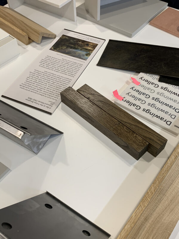
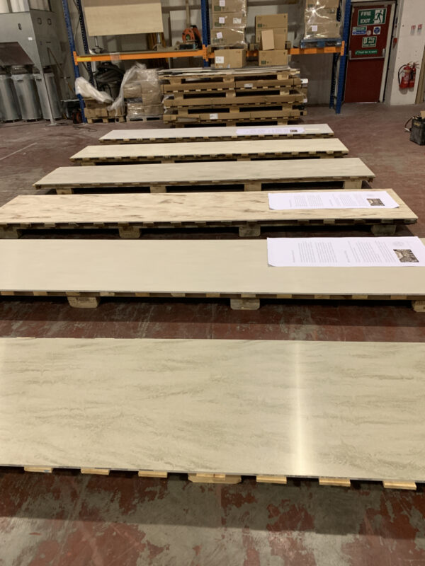
Interior samples for The Courtauld Gallery
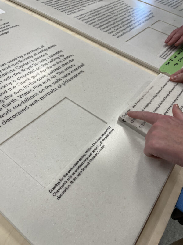
Exploring the possibilities for this with the curators and my studio team meant starting with the non-negotiables, which included using high-quality materials that would reflect the purpose and quality of the building itself and ensuring the panels would be easy to locate and read. The new system needed to be several almost-contradictory things at once: instinctive, integrated and almost invisible, whilst at the same time very much present.
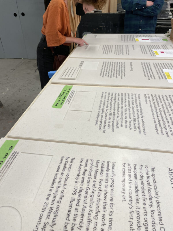
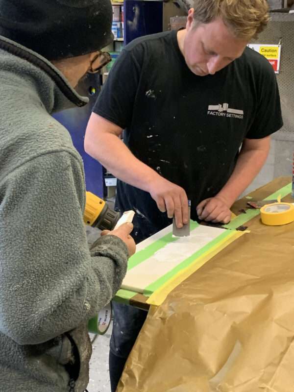
We began the task by assembling potential material choices and seeing how they might perform when interacting with the light in the building and the colours of the art collection itself. We tested out a whole range of materials, from timber and metal to stone, as well as a variety of lettering techniques, but we still weren’t satisfied. Above all, we wanted to create a new system that spoke of art with a crafted process and eventually decided to go the bespoke route, working with Factory Settings, a specialist contractor.
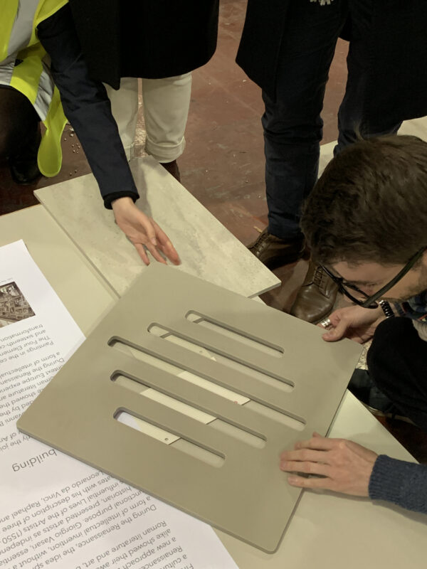
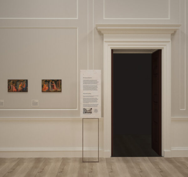
Drawings were created to test the scale and height of the wayfinding signage

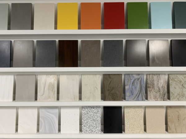
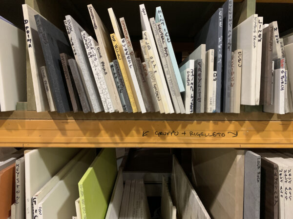
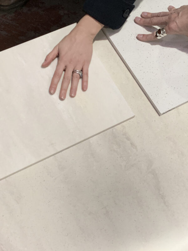
Choosing the colour and texture of the Corian panels
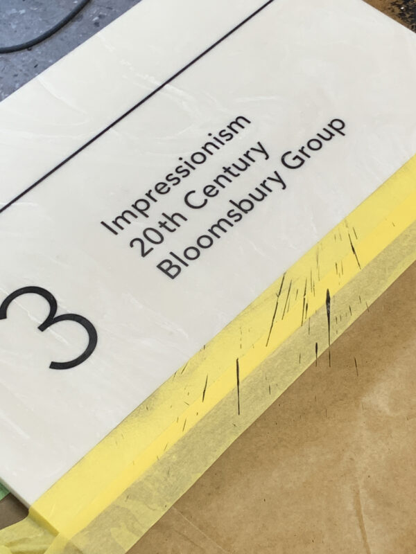
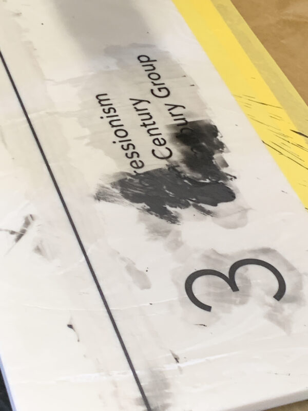
We finally chose Corian for the panels themselves – a seamless material made up of recycled elements, which is not only very stable but safe for use in a gallery environment, alongside so many precious paintings, sketches and objects. We then trialled various different etching tools to ensure the text was really sharp and clear and applied a liquid timber more normally used for French polishing, which had to be burnt into the etched surface. The beauty of this was that it replicated an age-old process using stone – but with a modern twist. The results are both artisanal and artistic and definitely bring the contemporary and innovative together with the old and venerated. Just perfect for The Courtauld!
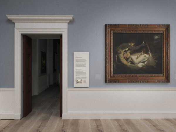
The relationship between the panels in frames, on the walls next to the artwork, and the architectural details, were an important consideration
We’ll be hearing more from Pippa, and other voices from across The Courtauld, in the coming weeks. You can see more of her work using this link.
