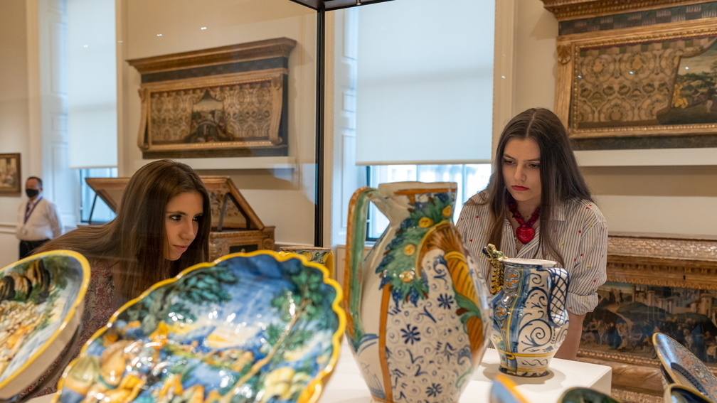
Students and The Courtauld’s collection
Courtauld students are encouraged to study works of art at first hand, and our History of Art courses regularly take place in museums and galleries, including The Courtauld’s own collection.
We asked our BA and MA History of Art students to share with us some of their favourite works of art from The Courtauld’s collection, and you can find them below.
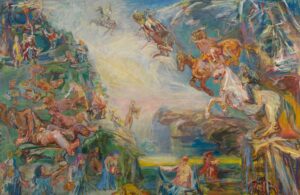
Elliott, second-year student on the BA History of Art course
“I chose this piece not because it is my favourite artwork, but because of what it specifically represents to me. When I first saw this triptych on the third floor of The Courtauld Gallery, I was confronted with conflicting emotions and opinions.
The central panel of The Prometheus Triptych depicts a scene of the Apocalypse with the horsemen as a central motif. While the world was facing nuclear war in the 1950s, Kokoschka’s ambitious and explosive expressionism captured the fear that the nuclear threat made an apocalyptic event seem all too possible. Throughout the painting, the movement of bodies and light intertwine in unconventional ways that create ambiguity. The horsemen of the apocalypse are ogre-like and appear to enjoy causing such havoc.
This painting relates so much of what art history is to me – it enables me to understand the world that we live in. In times that feel uncertain and scary, I process all the bittersweet and beautiful aspects of life through a visual form, no matter what medium.
The artwork is ambitious in terms of its enigmatic loose brushwork and deployment of soft dreamlike colour. It depicts such monumental drama, blending the mythological with biblical narratives. The bold and gestural style are highly emotive elements, which enable it to be relatable in the most human sense of the word. The various figures are depicted in a visual plane that ascends some to the heavens and some to be left behind.
Kokoschka’s adaptation of classical mythology embodies hope and fear for humanity, and that is what makes it so provoking. It represents an element of art that I love: to be challenged by an artwork, to sustain a relationship with it and to be open to having your mind changed. If you dislike an artwork, I challenge you to revisit it often and to be open to exploring new personal perspectives.”
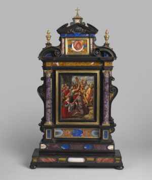
Clara, MA History of Art student (Special Option - Bodies of Knowledge in the Early Modern Netherlands, c.1540 - c.1660)
“Firstly, I am attracted to the frame because of its beauty, which diverts our attention from the painting almost entirely. The frame is composed of ebony and inlaid with Agate, Amethyst, Lapis Lazuli, and Sicilian Jasper. Ebony, a wood native to Mauritius Island, was a sought-after luxury item, while Lapis Lazuli – extracted from the mountains of Afghanistan – was used to make the pigment Ultramarine. Their presence within the frame betrays the wealth of the original owners, but also reveals the vast trading networks existent in sixteenth and seventeenth century Europe. My favourite detail is the top section, because the craftsman has put a small, gilded frame around a red white Agate circle – making it appear like a stand-alone abstract artwork – drawing attention to the aesthetically pleasing forms of the stone.
Secondly, I love how this colourful work brings the history of frames into focus. This is a Tabernacle (or Aedicular) frame, which resembles the structure of a classical temple, later adapted in the architectural designs of Renaissance churches. The shape, and the use of stones, purposefully resemble Italian church altars of the period. This helps highlight the relationship between frames, the history of architecture, and interior design. More specifically in this case, it shows how this frame – by resembling a sacred space – encourages spiritual devotion in the viewer alongside the painting.”

Nadine, MA History of Art student (Special Option - Strolling Isfahan: Masters, Merchants and Monarchs)
“This Mamluk bowl is one of my favourite objects in The Courtauld’s collection, and not just because it’s from Egypt, where I’m from.
The calligraphically inscribed bands of ornamentation that decorate its body are reminiscent of the ornamentation that can be found on Mamluk mosques and mausoleums in Cairo. I like to imagine how it would have been used as a feature of daily life. Engraved details of flowers and vegetal shapes integrated within geometric designs can be seen, tapering off with a threaded row of pointed leaves.
The bowl is made of brass, and would have perhaps been inlaid with silver, though the silver inlay has not survived. This particular metalwork technique comes from the Mamluk period in which there was a scarcity of precious metals. Objects were made of more readily available materials such as brass and then inlaid with precious silver or gold, in beautiful designs that were also popular for their aesthetic value.
I especially love the inscription in Arabic that reads ‘من تمعن في جمالي نزهة العين يراني، لي طراز من الخير، قد حوى كل المعاني‘. This translates to: ‘He who contemplates my beauty will find me a delight to the eye, I have a form which includes all the essence of good’, inviting the beholder to marvel at its beauty.
In Arabic, the poetic rhyming inscription was written to be read, in an intonation that holds a rhythmic quality. This same rhythmic quality can be seen within the design of the bowl itself, in the structure of the engraved patterns that decorate its body.”
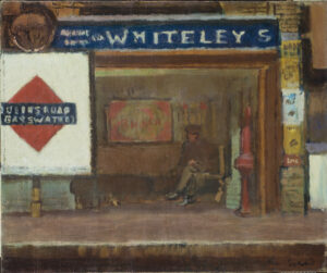
Ellie, MA History of Art student (Special Option - Architectures of Empire: Contested Spaces and their Legacies)
“I find myself drawn to the unique subject matter of this painting. Before Liberty, Harrods or Selfridges, there was Whiteley’s. The shop name stretching across the top of the canvas advertises one of the first department stores in London. Founded in 1865 by the entrepreneur William Whiteley, the store was hugely successful. Located on the suburb of Westbourne Grove, rather than the West End, Whiteley’s catered to the growing communities newly connected to the city centre by the Tube network.
After his dramatic murder on the store’s premise, Whiteley became the most popular waxwork in Madame Tussauds. He was, until the end, at the centre of nineteenth-century London’s commercial culture.
Beneath the primary colours of the Tube signage (the same iconic red and blue used today), the station’s architecture and advertising blend together in smudges of muted reds, yellows and browns. Is the subject the store boldly advertised by the station’s façade? Or is it the cross-legged figure waiting on the platform just below the ‘E’? It is characteristic of Sickert to highlight this less glamorous aspect of modernity, depicting the in-between space of the station platform.
In its prosaic depiction of advertising in everyday life, this painting encapsulates the innovation that made both Whiteley’s store and Sickert’s painting so central to nineteenth-century London, rendering it a fitting tribute to the social transformation enacted by the department store.”
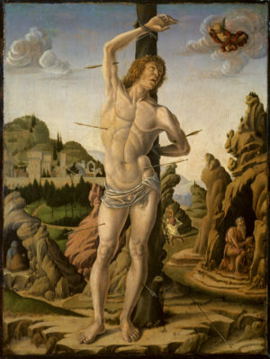
Jacob, MA History of Art student (Special Option - Continuity and Innovation: Reframing Italian Renaissance Art from Masaccio to Michelangelo)
“My favourite work in The Courtauld’s collection is Marco Zoppo’s Martyrdom of Saint Sebastian in a Rocky Landscape. The figure of the saint (died. AD 288) is depicted as a lithe youth, with golden curls and defined musculature. He is naked, save for a cloth which protects his modesty. He is bound by his wrists to a tree and is pierced with six arrows, shot by archers which do not feature in the painting. Sebastian looks heavenward at an angel, who witnesses the event atop a cloud. The figure of St. Sebastian is surrounded by rocky outcroppings, peppered with fallen stones and weeds.
The most interesting element of this painting is the inclusion of three other saints in this surrounding landscape. St. Jerome (d. AD 420) is visible on the right of the painting, dressed in the robes of a hermit and accompanied by his lion. Crossing the river to the left of the Jerome is St. Christopher (d. AD 251), bearing the Christ Child upon his shoulders. Finally, St. Anthony Abbot (d. AD 356) can be seen in a cave on the right of the painting, only his back visible to the beholder.
With the inclusion of these saints, Marco Zoppo creates a fantastical scene where the four saints (all of whom lived at different times and different places) exist within the same imagined space at the same time. It is exciting to speculate why these saints were chosen by the patron. Did the patron have ambitions to go on a pilgrimage under the protection of the patron saint of travellers, St. Christopher? Did the patron’s brother have ambitions to become a cardinal, like Jerome is so often portrayed as? Did the patron have had a personal affinity with Saint Anthony? For me, this is one of the most interesting and intriguing works in the Courtauld Gallery.”
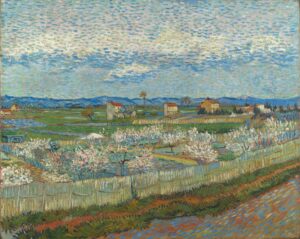
Kylin is a second-year BA History of Art student, originally from Singapore.
“Living abroad in a temperate country for the first time, I was surprised to witness the brief but beautiful existence of these flowers in spring: they appear overnight, and as quickly as they appear they are gone. I love the way Van Gogh has managed to capture this fleeting event!
The short, deliberate dabs of paint help capture an impression of the scene. They seem to have been applied with much energy, and the trees appear as if they were waving in the wind. Looking closer, I spot the hunched-over figure of a farmer in the field too, perhaps harvesting crops or pulling out weeds, with a cart peeking over the fence.”
The path in the foreground curves slightly inward, hinting at a vanishing point. It makes me wonder about what is at the end of this path, and I feel as if I have chanced upon this scene in passing — maybe on a train, or cycling by, managing to catch a glimpse without seeing too much detail. The blue dashes of paint all over the image creates a sense of movement too, as if the scene were slipping by. It feels like I have been let into a brief moment that has since passed; a spring day from many years ago.”
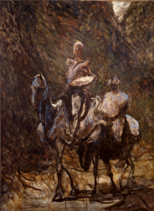
Maria is a second-year BA History of Art student, originally from Spain.
“Unfinished works are always a curious thing to study. They are a precious insight into the otherwise mysterious artistic process and the materials artists used for different works. If found on gallery walls, they can also be a testament to the high demand of the artist’s works, even if they are incomplete. Of course, The Courtauld Gallery features many examples of this, like Perino Del Vaga’s Holy Family, but Daumier’s Don Quixote and Sancho Panza holds a special place in my heart for a few reasons.
Most personally, the famous Spanish characters depicted will evidently remind me of my home country, but the unfinished quality of the piece brings a new maturity to these characters that is often missing from their depictions. The work includes only the underpainting over which Daumier would then develop the rest of the image, but the loose strokes and deep shadows that are characteristic of the beginning stages of a painting bring to light a darker aspect of the same subject matter that the artist represented in other works.
Cervantes’ infamous novel of the same name as its titular character is often regarded as a childish story, dealing with an old man’s foolish journey through the Spanish countryside after coming to believe that he is a knight destined to defend good from evil. Many of the illustrations regarding the story lean in towards more fairytale-like imagery, but in Daumier’s work, the sadness of the characters shines through the burnt umber pigment, and the viewer can see the harsh reality the characters faced, coming to understand the weariness and exhaustion that comes with traveling in the scorching heat.
I can only imagine what made Daumier drop his brush and never finish this painting, but perhaps the end result is unintentionally better than what he had in mind.”